Valve Brand Guidelines
Half-Life, Steam, the Steam Deck — and a bald man with a valve in his head, from a bossless company.
Aa
Two constants: a coral / dark-red palette and a bold sans. Abstract homage — not the Valve wordmark or logo.
The man with a valve in his head
Valve shaped PC gaming twice over.
Valve is a lesson in building the platform, not just the games. Valve Corporation was founded in 1996 by Gabe Newell and Mike Harrington, both former Microsoft employees who’d worked on early Windows, and is based in Bellevue, Washington. Its debut, Half-Life (1998), was a landmark first-person shooter, and Valve went on to create Counter-Strike, Team Fortress 2, Portal, Left 4 Dead, Dota 2 and the VR flagship Half-Life: Alyx. (The long-running “Half-Life 3 / Valve can’t count to three” joke is a genuine fan meme.) (Honest caveats: Valve publishes no brand style guide, so the colours below are observed, and the wordmark typeface is undocumented.)
The bigger story is Steam. Launched in 2003 (originally just a way to update Counter-Strike), Steam grew into the dominant PC game-distribution platform — a digital storefront taking a cut of sales — and is now Valve’s core business. Valve has also made hardware: the failed Steam Machines, the Steam Controller, the Valve Index VR headset, and the hit Steam Deck (2022), a handheld gaming PC.
Valve is as famous for how it works as for what it makes. It’s privately held (Gabe Newell owns a majority, with no outside investors), reportedly among the most profitable-per-employee companies anywhere, and runs a famously flat, “bossless” structure — its 2012 “Handbook for New Employees” describes a company with no formal managers. The identity is unforgettable: the “man with a valve in his head” — a stylised human head with a valve/stopcock (moved from the eye to the back of the head in 2007) — plus the “VALVE” wordmark. A company that changed PC gaming, then changed it again.
Colour
Valve lives in coral and dark red. Click a swatch to copy the hex.
Valve’s palette centres on a warm coral / orange-red ground with a dark-red valve element, plus ink and white. (A correction worth noting: despite a common assumption, Valve’s scheme is not really “black and orange” — the modern wordmark is white on a coral/orange-red ground, and the valve mark is dark red; bright orange mostly belongs to the separate “Source” engine badge.) The coral-red reads as bold, energetic and a little industrial — fitting a company named “Valve” — while staying distinctive rather than corporate. It’s a confident, ownable scheme. The honest caveat: Valve publishes no official brand hex — the colours here are observed approximations, not first-party values.
The lesson is check the real palette, not the assumption. Valve’s scheme is coral and dark red, not the black-and-orange many assume — a reminder to verify. For designers, it’s also a case for a warm, industrial-tinged identity that suits the brand’s name and character. The takeaways: verify a brand’s actual colours rather than relying on memory; pick a palette that suits the name and personality (coral-red for “Valve”); and treat specific hexes as approximate when no official spec is published.
Typography
The wordmark is a bold sans — solid and industrial.
Valve’s bold sans wordmark — “VALVE,” paired with the “man with a valve in his head” mark — is solid and industrial. The strong, even letterforms read as sturdy, confident and no-nonsense, matching a company named for a piece of machinery, while the surreal valve-in-head logo (from an “open your mind” concept) gives the brand a memorable, slightly enigmatic character. In coral-red, the identity feels bold and a bit industrial rather than slick or corporate. It’s an unusual, ownable combination — plain strong type plus a strange, iconic mark. (Because Valve publishes no official font, the honest description is “a bold sans,” not a named face.) The type behaves like the brand: solid, confident and a little mysterious.
Aa
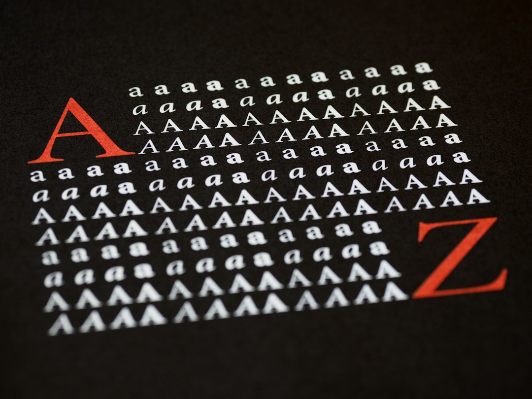
A bold sans — solid and industrial. (Specimen set in Fjalla One, a bold sans in the spirit of the Valve wordmark; the real face is undocumented.)
Owning the platform
Valve’s real product is Steam.
Valve is a lesson in the power of owning a platform. Valve made brilliant games, but its most valuable move was building Steam — the store, launcher and community layer through which most PC gaming now flows. By owning the platform, Valve earns a share of a vast ecosystem it doesn’t have to build the games for, funding an unusually free, flat, experimental company. That structure (no bosses, private ownership, huge profit per employee) is itself part of the brand mythology, alongside the surreal valve-in-head logo. It’s proof that owning the distribution layer — the platform everyone else depends on — can be more powerful and enduring than any single hit product.
For designers and brand-builders, Valve offers a clear takeaway: owning a platform can be more valuable and durable than owning products. The lessons: build the layer others depend on (Steam) for lasting leverage; let a distinctive, even strange identity build mythology (the valve-in-head mark); and remember that company culture (flat, private, experimental) is part of the brand. It’s also a reminder to keep the facts precise — Valve was founded in 1996 by Gabe Newell and Mike Harrington (ex-Microsoft), created Half-Life (1998) and the dominant Steam platform (2003) plus the Steam Deck (2022), is privately held with a famously flat structure, and uses the “man with a valve in his head” logo. Valve owns the platform — proof that the distribution layer can outlast any single game.
Explore & save
Keep Valve’s identity on hand — save it to a board in the Made Good inspiration library.
Valve identity set
Pin the coral palette and the bold-sans spirit to your own board.