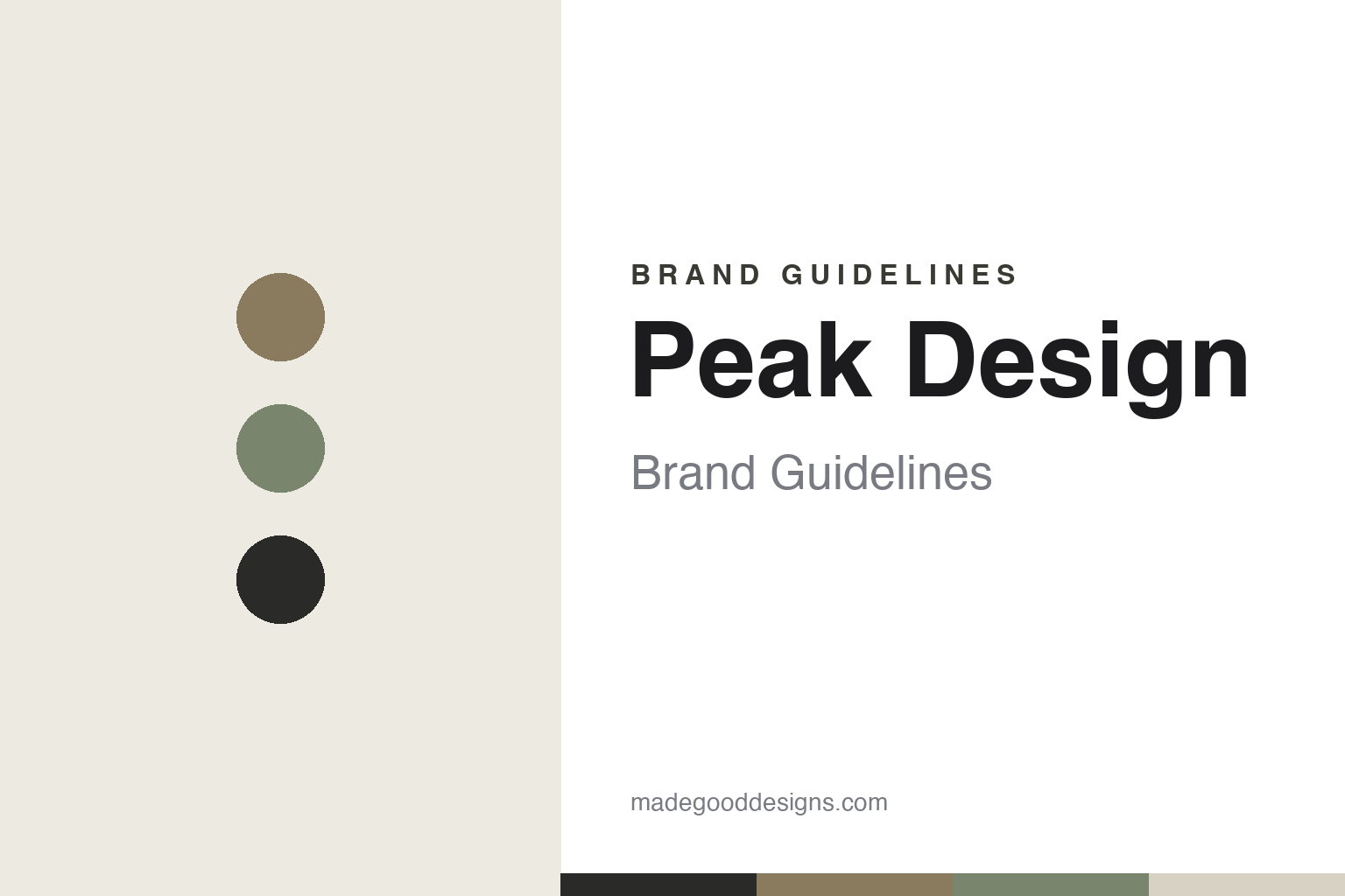
Peak Design Brand Guidelines
The most successful crowdfunder in gear — clever camera bags, muted earthy tones and a B-Corp conscience.
Aa
Two constants: a minimal earthy palette and a clean sans. Abstract homage — not the Peak Design wordmark.
The Kickstarter king
Peak Design perfected crowdfunded gear.
Peak Design is a lesson in building a company, and keeping it, on crowdfunding. It was founded in 2010 by Peter Dering, headquartered in San Francisco, after a round-the-world trip revealed how awkward it was to carry a camera. Its first product, the Capture camera clip, launched on Kickstarter in 2011, raising roughly $360,000 against a ~$10,000 goal. That set the pattern: Peak Design became one of the most successful crowdfunders ever — around 15 campaigns raising $34M+ total — and it still launches flagship products via crowdfunding even as an established, profitable company (its 2025 Roller Pro carry-on raised ~$13.4M, cited as a Kickstarter record for Product Design). (Honest caveats: no official brand hex is published, so the tones below are observed, and the wordmark typeface is undocumented.)
The products are known for clever design, modularity and quality: premium camera bags (the Everyday Backpack and Everyday Sling), straps (the Slide, the Leash), the Capture clip, the Travel Tripod, packing tools, and a Mobile phone ecosystem built on the SlimLink magnetic mount. Peak Design’s reputation rests on genuinely thoughtful mechanisms and materials, not just marketing.
Values are core to the brand. Peak Design is a certified B Corporation, has been carbon neutral since 2018, is a member of 1% for the Planet, and offers a lifetime warranty — an outspoken, independent, values-driven company. (One myth to correct: its famous “knockoff” call-out was the 2021 “A Tale of Two Slings” video targeting an AmazonBasics copy of its Everyday Sling — not a same-named Chinese company.) The identity matches the ethos: a minimal, clean aesthetic, typically black-on-white, with muted, earthy product colourways (named tones like Sage, Bone and Coyote). A brand where design and conscience go together.
Colour
Peak Design lives in minimal, earthy tones. Click a swatch to copy the hex.
Peak Design’s palette is minimal and earthy: a clean black-on-white base with muted, natural product colourways (named tones like Coyote tan, Sage green and Bone). The restrained, natural tones read as sophisticated, understated and outdoorsy — matching premium gear made for photographers and travellers who value quality over flash — and they signal durability and timelessness rather than trend-chasing. It’s a calm, grown-up scheme that lets the clever design and build quality speak, and quietly reinforces the brand’s sustainability-minded, considered ethos. The honest caveat: Peak Design publishes no official brand hex — the earthy tones here are observed approximations, not first-party values.
The lesson is a restrained, natural palette signals quality and conscience. Peak Design’s muted earthy tones feel premium, durable and sustainable. For designers, it’s a reminder that understated, natural colour can communicate “considered, built-to-last” better than bright branding. The takeaways: use muted, natural tones to signal quality and longevity (the earthy colourways); keep the base minimal so the design speaks; and treat specific hexes as approximate when no official spec is published.
Typography
The wordmark is a minimal sans — clean and considered.
Peak Design’s minimal sans wordmark — clean, typically black-on-white — is calm and considered. The simple, even letterforms read as premium, understated and thoughtful, matching gear known for clever mechanisms and quality rather than flashy branding, and the restraint signals confidence: the products don’t need loud logos to prove themselves. Paired with the muted, earthy colourways, the type feels grown-up, durable and design-led — exactly the considered, quality-first, sustainability-minded personality Peak Design cultivates. It’s quiet and refined rather than shouty. (Because the exact face is undocumented, the honest description is “a minimal sans,” not a named font.) The type behaves like the brand: clean, considered and premium.
Aa
A minimal sans — clean and considered. (Specimen set in Hanken Grotesk, a clean sans in the spirit of the Peak Design wordmark; the real face is undocumented.)
Values as a brand
Peak Design pairs design with conscience.
Peak Design is a lesson in weaving values into the whole brand. It doesn’t just make well-designed gear; it stands for something — a B-Corp, carbon-neutral, 1%-for-the-Planet company with a lifetime warranty and a habit of launching openly via crowdfunding. Those commitments aren’t a marketing veneer; they shape how customers feel about the brand and reinforce the perception of quality and integrity. The minimal, earthy identity is the visible expression of that ethos: understated, durable, honest. And the crowdfunding-first approach keeps a direct, transparent relationship with its community. It’s proof that in a premium category, genuine values — clearly lived — can be as much a part of the brand as the products themselves.
For designers and brand-builders, Peak Design offers a clear takeaway: genuine, lived values can be central to a premium brand — and a direct community relationship reinforces them. The lessons: back a premium product with real commitments (B-Corp, lifetime warranty, sustainability); express those values through a restrained, honest identity (minimal, earthy); and keep a direct, transparent tie to your community (crowdfunding). It’s also a reminder to keep the facts precise — Peak Design was founded in 2010 by Peter Dering, launched via Kickstarter in 2011, is among the most successful crowdfunders ever (~$34M+), makes clever camera bags and accessories (the Everyday line), is a certified B Corp with a lifetime warranty, and uses a minimal, earthy identity. Peak Design made values part of the brand — proof that conscience and design can reinforce each other.
Explore & save
Keep Peak Design’s identity on hand — save it to a board in the Made Good inspiration library.
Peak Design identity set
Pin the earthy palette and the minimal-sans spirit to your own board.


