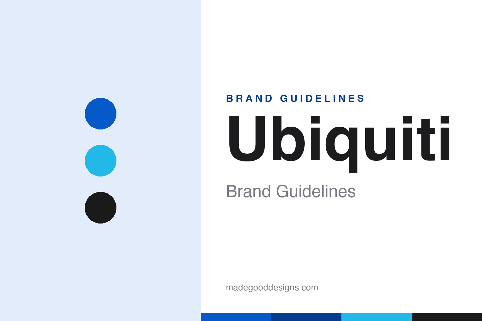
Ubiquiti Brand Guidelines
Enterprise networking made accessible — the UniFi ‘U’, a cult of IT pros, and almost no advertising.
Aa
Two constants: a blue-and-cyan palette and a clean sans. Abstract homage — not the Ubiquiti or UniFi mark.
Enterprise networking for everyone
Ubiquiti made pro gear accessible.
Ubiquiti is a lesson in disrupting an industry with better products and a lean model. It was founded in 2005 by Robert Pera, a former Apple engineer who’d worked on Wi-Fi (reportedly after Apple managers passed on his wireless-range ideas), and is now based in New York (it moved from San Jose in 2015). (A fun fact: Pera also owns the NBA’s Memphis Grizzlies, which he bought in 2012.) (Honest caveats: no widely published official brand hex was found, so the blue below is approximate, and the wordmark typeface is undocumented.)
Ubiquiti makes networking equipment. Its earlier airMAX gear served wireless broadband providers, but the brand became beloved for its UniFi line — Wi-Fi access points, switches, routers and gateways (like the all-in-one Dream Machine), managed through the slick UniFi Network controller and app. The pitch is powerful: enterprise-grade networking at accessible prices, with genuinely good software — and it earned a devoted following among IT professionals, prosumers and home-lab enthusiasts.
Just as distinctive is the business model: Ubiquiti spends little on traditional advertising and sales, relying instead on its community forums, word of mouth and “touchless evangelism,” which keeps margins high. It’s publicly traded (NYSE: UI, after a 2011 IPO), with Robert Pera retaining majority ownership as a billionaire. The identity fits the ethos: a clean, minimal, techy aesthetic built around a distinctive “U” mark (UniFi’s white “U” in a rounded blue square, with signal arcs) in blue and cyan. A brand that let its products and community do the selling.
Colour
Ubiquiti lives in blue and cyan. Click a swatch to copy the hex.
Ubiquiti’s palette is anchored by a clean blue with a bright cyan accent, plus ink and white. The blue reads as technical, trustworthy and professional — right for networking gear that people rely on to keep their homes and businesses connected — while the cyan adds a modern, crisp, techy energy. It’s a minimal, high-clarity scheme that matches the brand’s clean software and hardware design, feeling precise and dependable rather than flashy. That restrained, professional look is a big part of why IT pros and enthusiasts find the UniFi ecosystem so appealing. The honest caveat: Ubiquiti publishes trademark guidelines but no widely published colour spec — the blue and cyan here are observed approximations.
The lesson is a clean, professional palette for a technical brand. Ubiquiti’s blue-and-cyan feels precise and dependable, matching its polished networking ecosystem. For designers, it’s a reminder that a restrained, high-clarity palette can signal technical quality. The takeaways: use a clean, professional primary for technical trust (the blue); add a crisp accent for modern energy (the cyan); and treat specific hexes as approximate when no official spec is published.
Typography
The wordmark is a clean sans with a ‘U’ mark — precise and modern.
Ubiquiti’s identity pairs a clean sans wordmark with a distinctive “U” mark (UniFi’s white “U” in a rounded blue square, with arcs suggesting a Wi-Fi/signal motif). The even, geometric letterforms read as precise, modern and professional, matching networking gear prized for clean software and design, and the “U” gives the ecosystem a simple, ownable, app-friendly icon. In blue and cyan, the whole identity feels technical and trustworthy without being cold — a look that IT pros and enthusiasts genuinely admire. It’s minimal and confident rather than decorative. (Because the exact face is undocumented, the honest description is “a clean sans,” not a named font.) The type behaves like the brand: precise, modern and professional.
Aa
A clean sans — precise and modern. (Specimen set in Sora, a clean geometric sans in the spirit of the Ubiquiti wordmark; the real face is undocumented.)
Letting the community sell
Ubiquiti grew on word of mouth.
Ubiquiti is a lesson in growing through community and product, not advertising. Rather than spend heavily on marketing and a big sales force, Ubiquiti made genuinely good, well-priced products with polished software and let its passionate community — IT professionals, prosumers, home-lab enthusiasts — do the evangelising on forums and by word of mouth. That “touchless” model keeps margins high and builds deep loyalty, because the people recommending Ubiquiti are trusted peers, not ads. The clean, professional identity reinforces the sense of a serious, no-nonsense brand made by and for people who know networking. It’s proof that, with the right product and community, you can build a major brand while spending very little on traditional marketing.
For designers and brand-builders, Ubiquiti offers a clear takeaway: a great product plus a passionate community can replace a big marketing budget. The lessons: invest in product and software quality so the community becomes your salesforce (UniFi); keep the identity clean and professional to match the audience (blue-and-cyan, the “U”); and nurture the community that does the evangelising. It’s also a reminder to keep the facts precise — Ubiquiti was founded in 2005 by ex-Apple engineer Robert Pera (who also owns the Memphis Grizzlies), makes the UniFi networking line beloved by IT pros, grew via a community-driven, low-advertising model, is publicly traded (NYSE: UI), and uses a clean blue-and-cyan identity with a “U” mark. Ubiquiti let its community sell — proof that product and word of mouth can beat an ad budget.
Explore & save
Keep Ubiquiti’s identity on hand — save it to a board in the Made Good inspiration library.
Ubiquiti identity set
Pin the blue-and-cyan palette and the clean-sans spirit to your own board.


