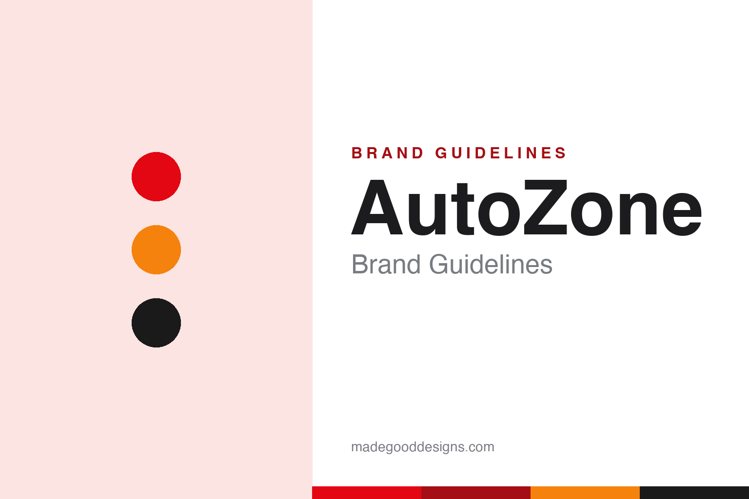
AutoZone Brand Guidelines
A red-and-orange italic ‘Z’, free battery tests and a name born from a trademark fight — DIY car care, bottled.
Aa
Two constants: a red-orange-and-black palette and a bold, italic sans. Abstract homage — not the AutoZone wordmark or ‘Z’.
From Auto Shack to the Zone
AutoZone’s name came from a trademark fight.
AutoZone is a lesson in a service-first retail brand. It opened its first store in 1979 in Forrest City, Arkansas, under the name “Auto Shack” — the concept of J.R. “Pitt” Hyde III, launched as a division of his family’s Memphis-based grocery-distribution firm, Malone & Hyde. The chain was renamed “AutoZone” in 1987, after a trademark-infringement dispute from Radio Shack (Tandy) over the “Shack” name. So the memorable “Zone” name — which became a genuine brand asset — actually emerged from a legal necessity. (Honest caveats: no official brand hex or wordmark typeface is published, so the colours and type here are approximate.)
AutoZone grew into the largest US retailer of aftermarket auto parts and accessories, built around the DIY (do-it-yourself) customer. Its brand is defined as much by free in-store services as by products: free battery, alternator and starter testing; free check-engine-light code reading (“Fix Finder”); battery charging and courtesy installation; and the Loan-A-Tool program that lets customers borrow specialty tools. Those helpful, free services turned a parts store into a trusted partner for weekend mechanics, and they’re central to the brand’s identity.
The design matches the energy: a bold red wordmark with a stylised italic “Z,” in a red-orange-and-black palette, under the long-running tagline “Get in the Zone — AutoZone.” On ownership, AutoZone is publicly traded (NYSE: AZO), headquartered in Memphis, Tennessee — and it’s famous among investors for one of the most aggressive, consistent share-buyback programs in the market (running since 1998), which has made its stock a legendary long-term compounder. It also has a strong private label, Duralast. A helpful, high-energy brand born from a name change.
Colour
AutoZone lives in red and orange. Click a swatch to copy the hex.
AutoZone’s palette is bold and energetic — a fiery red, a warm orange and black, with white. The red reads as high-energy, confident and attention-grabbing (great for a roadside auto-parts sign), the orange adds warmth and a hint of caution/roadwork energy, and the black gives the italic wordmark strength and contrast. Together they’re punchy, masculine and action-oriented, matching a DIY auto-parts brand built on getting the job done. It’s a strong, high-visibility scheme that pops on a storefront. The honest caveat: AutoZone publishes no official public brand hex — the red, orange and black here are observed approximations, not a confirmed spec.
The lesson is bold, high-energy colour for an action brand. AutoZone’s red-and-orange signals energy and getting things done — the right register for DIY car care. For designers, it’s a reminder that a bold, warm palette can match an action-oriented, hands-on category. The takeaways: use a bold, energetic primary for a high-visibility retail brand (the red); add a warm accent for energy (the orange); and treat specific hexes as approximate when no official spec is published.
Typography
The wordmark is a bold, italic sans — fast and confident.
AutoZone’s bold, italic wordmark — with its distinctive stylised “Z” — is fast and confident. The heavy, forward-leaning letters read as energetic, action-oriented and dependable, matching a DIY auto-parts retailer built on speed and getting things done, and the italic gives the mark a sense of motion (fitting for anything automotive). It’s assertive and legible, designed to pop on a roadside sign and to feel capable and no-nonsense. Paired with the red-and-orange palette, it’s all forward momentum. (Because the exact face is a custom italic and undocumented, the honest description is “a bold, italic sans,” not a named font.) The type behaves like the brand: fast, confident and action-oriented.
Aa
A bold, italic sans — fast and confident. (Specimen set in Archivo Black, a heavy sans in the spirit of the AutoZone wordmark; the real face is a custom italic and undocumented.)
Service turns parts into loyalty
AutoZone made free help its differentiator.
AutoZone is a lesson in turning free service into a competitive advantage. Auto parts are a commodity, easy to price-compare — so AutoZone differentiated on help: free battery and code testing, courtesy installation, tool loans, and knowledgeable staff who make DIY car care feel achievable. Those services build trust and loyalty that price alone can’t, turning a parts store into a partner people return to. The bold red-and-orange identity signals that helpful, get-it-done energy, but the real brand is the free assistance at the counter. Service, given generously, is a moat.
For designers and brand-builders, AutoZone offers a clear takeaway: generous, free service can differentiate a commodity retailer. The lessons: compete on help, not just price, in a commodity category (free testing, Loan-A-Tool); match the identity to the energy (bold red-and-orange, an italic “Z”); and turn even a name forced by circumstance into an asset (the memorable “Zone”). It’s also a reminder to keep the facts precise — AutoZone opened in 1979 as “Auto Shack,” was renamed AutoZone in 1987 after a Radio Shack trademark dispute, is the largest US aftermarket auto-parts retailer built on DIY and free services, uses the “Get in the Zone — AutoZone” tagline, and is publicly traded (NYSE: AZO) with a famous share-buyback record. AutoZone made service the differentiator — proof that generous help can turn a commodity into loyalty.
Explore & save
Keep AutoZone’s identity on hand — save it to a board in the Made Good inspiration library.
AutoZone identity set
Pin the red-orange-and-black palette and the bold-italic spirit to your own board.


