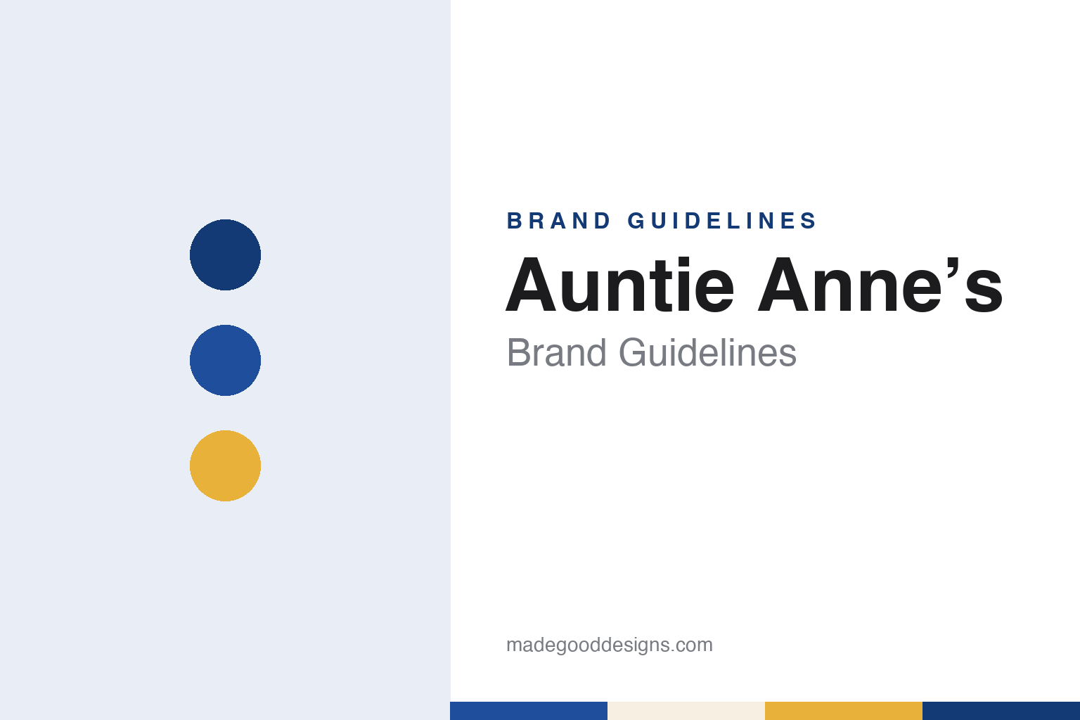
Auntie Anne’s Brand Guidelines
A farmers’ market pretzel stand named for an aunt.
Aa
Two constants: a twist blue, pretzel gold and dough cream palette and a rounded counter sans register. Abstract homage — not an Auntie Anne’s product or mark; no pretzel, halo or logo is reproduced.
A market stand
Downingtown, 1988, and a name taken from the family.
Auntie Anne’s began in February 1988 as a small pretzel stand at a farmers’ market in Downingtown, Chester County, Pennsylvania. The International Directory of Company Histories, in its profile of Auntie Anne’s, Inc., says Anne Beiler grew up in an Amish family in Lancaster County and married Jonas Beiler, and that the couple moved back to Pennsylvania in 1987 hoping to open a free marriage and family counselling centre for the Amish community there. To help pay for it, Anne took a job managing a concession stand at a farmers’ market in Maryland, where she began rolling pretzels. The company’s own history page tells the same story in its own words: “Auntie” Anne Beiler started baking pretzels to help fund her husband’s wish to provide free family counselling, and he later opened the counselling centre.
Within a year she had rented a stand of her own in Downingtown. The Directory says Beiler, who had many nieces and nephews, named it Auntie Anne’s when it opened, and that the early menu also carried pizza, stromboli and ice cream. A delivery of supplies that went wrong led to a spell of experimenting with the pretzel recipe, and with extra ingredients suggested by Jonas the recipe changed; within a few months pretzels were all the stand sold, and Beiler rolled them in front of her customers as a kind of performance. A second stand opened in Harrisburg in July 1988, which Wikipedia places at the Broad Street Market.
Franchising began in early 1989. The Directory says the earliest licence went to Beiler’s brother, Jake Smucker, who opened a shop in Middletown, Pennsylvania, and that the business moved from farmers’ markets into shopping malls in November 1989. In those years it was a family affair: a sister made the pretzel mix by hand, a brother delivered it, and Jonas and a brother-in-law built the shops. When openings began to outpace the family, Beiler turned to Francorp, a franchising consultancy in Olympia Fields, Illinois, whose consultant David Hood drew up a policy manual and a franchise contract; Hood later joined the company and became its president, the Directory says.
Colour
From Gap to Lancaster, then into Focus Brands.
Through the 1990s the stands spread through enclosed malls and then into train stations, airports and outlet centres. Wikipedia records a store at Penn Station in New York in 1995, the year the brand also opened in Jakarta, Indonesia. The Directory says the company continued to play up its Pennsylvania Dutch roots, with Amish operators among its franchisees, and quotes Beiler telling Restaurant Business in 1998: “It’s very un-Amish, what I’ve done.” It also records a pretzel kit for baking at home, sold for the 1999 Christmas season; a licensee, Pretzel Japan Corporation, opening in Yokohama’s Mosaic Mall in March 2000; and a 2000 test of a children’s concept called Cookie Farm, decorated with farm animals and a windmill vending machine whose proceeds went to the Children’s Miracle Network.
The head office was in the village of Gap, Pennsylvania, where Beiler grew up. In October 2006 the company announced a move to downtown Lancaster, into the former Lancaster Post Office, a 1927 building listed on the National Register of Historic Places in 1982. Wikipedia says the building kept its original brass doors, high ceilings and skylights.
In October 2010 Nation’s Restaurant News reported that the private-equity firm Roark Capital had announced that one of its portfolio companies, Focus Brands, was acquiring Auntie Anne’s, then based in Lancaster, to join Carvel, Cinnabon, Schlotzsky’s and Moe’s Southwest Grill. Bill Dunn, Auntie Anne’s president and chief executive, told the magazine that the partnership would help the pretzel brand grow. Wikipedia dates the completed purchase to November 2010 and says Heather Leed Neary became the brand’s president in 2015.
In February 2024 Focus Brands changed its own name to GoTo Foods, Restaurant Business reported; chief executive Jim Holthouser announced it at the company’s franchisee conference in Las Vegas, and the Atlanta-based group kept its restaurant brands under their existing names. GoTo Foods has owned Auntie Anne’s since 2010, and in October 2026 its website listed the brand alongside Carvel, Cinnabon, Jamba, McAlister’s Deli, Moe’s and Schlotzsky’s. Abroad, Wikipedia notes recipes adjusted to meet halal requirements in Malaysia and dates the brand’s arrival in Australia, at Westfield Parramatta, to July 2025.
Typography
Design and documentation.
A mall treat shop has to be read from a distance and in a hurry. Many of its customers are walking past, often with somewhere else to be, so the name above the counter, the colour of the canopy and the shape of the sign do most of the work before anyone reaches the menu board. In a food court or on a concourse, a kiosk may stand only a few steps from a rival, which puts weight on a short name, a strong colour and a sign that can be seen from the escalator.
Up close, the identity moves onto smaller things: the cup, the cone sleeve, the spoon, the napkin, the take-home tub and the paper bag. These are the pieces that leave the shop, and they often carry the brand further than the storefront does. The counter itself, with its freezer cases, mixing stations or display glass, is part of the show.
Each guide in this group looks at who started the name, who owns it now, and how its signs, cups, characters and packaging have been described in dated sources, and marks plainly what rests on the company’s own word.
Aa
A rounded counter sans — the register of a menu board above a rolling table. (Specimen set in Fredoka, a rounded sans-serif STAND-IN; NOT the Auntie Anne’s logo.)
Auntie Anne’s
A halo, a twist and a counter in full view.
The rolling counter has been part of the brand since the Downingtown stand, where, the Directory says, Beiler twisted pretzels in front of customers. Later store designs put that view of the dough at the centre of the shop.
In 2014 the chain introduced a new store prototype developed with the design firm Tesser, whose president and chief creative officer, Tré Musco, was quoted on the project. rd+d magazine, reporting in July 2014, described wood tones on the storefronts, blue pendant lighting with a copper inner accent, copper-finished ovens and blue electric mixers placed in full view, with a palette of warm whites, rich blues, copper and blonde woods that the magazine said recalled traditional country bakeries and kitchens. Front counters were moved back so that customers felt they were stepping into the kitchen. Wall graphics read “Baked from Scratch” and “Simple Fresh Original”, and the menu boards were made to look like blackboards, with lettering that looked handwritten and pictures of old-style lemonade. The prototype was tested at Park City Center in Lancaster before being offered to franchisees for gradual remodelling.
In June 2025 GoTo Foods unveiled a modular refresh. Nation’s Restaurant News reported that the logo dropped the halo that had long been part of it, leaving a sleeker pretzel twist; Restaurant Business added that the letter A became more prominent below the twist and that the colours were bolder. Mike Freeman, GoTo Foods’ president of brands, spoke in a statement of “vibrant blues, playful twists, and a sleek logo”. The stores gained a mural in the company’s blue and yellow, a digital “Now Rolling” sign that lights up when pretzels are being made, frozen drink machines moved to the front and marked areas for mobile-order pickup. Freeman told Restaurant Business the format was a “kit of parts” meant to work streetside, in airports, arenas and campuses as well as in malls.
For a design guide, Auntie Anne’s shows how a family nickname and a counter where the dough is rolled in view can carry a brand from a market stall to a multi-brand franchisor, with both of its documented redesigns keeping the twist and the rolling table at the front. Compare it with Cinnabon, its sister brand at GoTo Foods, and Wetzel’s Pretzels, a California pretzel chain built for the same malls. For this guide we use twist blue, pretzel gold and dough cream with a rounded sans, an unofficial interpretation; no product or logo is reproduced.
Explore & save
Keep Auntie Anne’s’s identity on hand — save it to a board in the Made Good inspiration library.
Auntie Anne’s identity set
Pin the Auntie Anne’s twist blue, pretzel gold and dough cream palette and the rounded counter sans register to your own board.