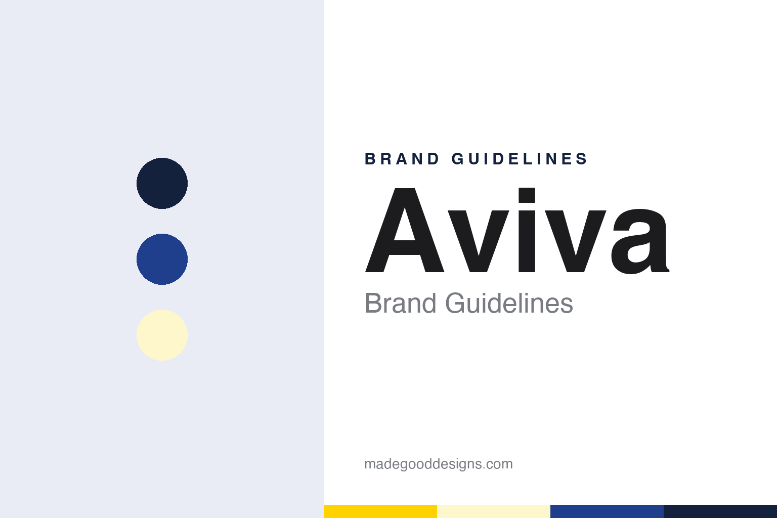
Aviva Brand Guidelines
A palindrome in place of a dozen older names.
Aa
Two constants: a yellow, blue and pale yellow palette and a Rounded sans register. Abstract homage — not an Aviva asset or mark; no logo, triangle or wordmark is reproduced.
Norwich, London and Perth
Fire offices, a Victorian merger and two late-twentieth-century ones.
Aviva is a young name for an old collection of insurers, and several of its ancestors changed their names along the way. English Wikipedia describes the company as the result of the merger of hundreds of insurance companies over several centuries, and traces its history back to the Hand in Hand Fire & Life Insurance Society, set up in London in 1696. That society’s name, the same article says, came from its logo of two joined hands under a crown, so the group’s family tree starts with a symbol as well as a name. Hand in Hand became part of Commercial Union in 1905. Another ancestor, English Wikipedia says, was founded in 1906 as the Red Cross Indemnity Assurance Company and renamed the White Cross Insurance Association in 1912, because international law restricted use of the red cross name and symbol; it joined Commercial Union in 1968. The Railway Passengers Assurance Company began in 1848 as the Universal Railway Casualty Compensation Company, set up to insure travellers on the new railways.
The other branches are almost as long. Norwich Union began in 1797 as the Norwich Union Society for the Insurance of Houses, Stock and Merchandise from Fire. Commercial Union was founded in 1861 after rises in premiums that followed the Tooley Street fire in London, according to English Wikipedia, and General Accident began in 1885 in Scotland. The trade magazine Life Insurance International, writing in May 2008, gave the same 1797 and 1861 dates for the Norwich Union and Commercial Union names.
The modern group was put together in two steps. Commercial Union and General Accident merged in 1998 to form CGU. Then, English Wikipedia says, Norwich Union merged with CGU in 2000 to create CGNU plc, a name built from the initials of both partners.
The decision to replace CGNU came quickly. English Wikipedia records that in April 2002 the company’s shareholders voted to change its name to Aviva plc, and Life Insurance International reported in 2008 that the Aviva name was adopted in July 2002. After 2002, English Wikipedia says, group operations traded under the uniform Aviva brand, but a few strong local brands were kept, Norwich Union in Britain and Hibernian in Ireland among them.
Colour
A coined word and a cathedral spire.
The new name was made up rather than inherited. English Wikipedia calls Aviva a coined palindrome derived from viva, the Latin for alive, and says it was designed to be short, memorable and work worldwide. It reads the same in either direction.
The logo tied the coined word back to the group’s English roots. English Wikipedia says the new company’s logo incorporated a triangle based on the spire of Norwich Cathedral, the landmark of the city where Norwich Union had been founded more than two centuries earlier.
The palette on this page pairs a bright yellow with a strong blue as our own unofficial interpretation.
For six years after 2002 the group ran two layers of branding in Britain. The group name was Aviva, but customers in the United Kingdom still dealt with Norwich Union for long-term savings and general insurance, as English Wikipedia notes. In Ireland the Hibernian name played the same role, and in Poland the group traded as Commercial Union.
That arrangement ended with one announcement. English Wikipedia says that in April 2008 Aviva said it would adopt the Aviva name as its worldwide consumer-facing brand, and that the Norwich Union brand would be phased out in the United Kingdom. The relaunch that followed was supported by an advertising campaign featuring celebrities including Bruce Willis and Alice Cooper, according to the same article.
Typography
Insurers, banks and their marks.
Insurance identities have an unusual job: they sell a promise that may not be called on for decades, so the visual language tends to signal permanence rather than novelty. Many of the long-established houses reach for heraldry — eagles, lions, shields and robed allegorical figures — borrowing the vocabulary of civic seals and coats of arms to suggest that the company will still be standing when a policy matures. Over time, many of those emblems have been simplified, flattened and redrawn for screens, often keeping a single recognisable silhouette while losing the fine engraving of the originals.
A second family of marks reduces the name to a single letter or a short set of initials, which travels across languages and reads at small sizes on an app icon. Blue recurs across the sector because it is widely read as calm and dependable, though reds and deep greens also appear. Sponsorship adds another layer: stadium and arena naming rights, shirt deals and long-running mascot or character campaigns have put insurance names in front of audiences who never read a policy document, and the end of such a deal can be as visible as its start.
Aa
A rounded sans — after a short coined name built to read the same either way. (Specimen set in Nunito Sans, a sans STAND-IN; NOT the Aviva logo or its typeface.)
Aviva
Norwich Union, Hibernian and Commercial Union retired.
The trade press covered the change as the end of an era. On 1 May 2008 Life Insurance International reported that Norwich Union and Hibernian, both wholly owned subsidiaries of Aviva, would have their names changed to Aviva within two years, in the final phase of the company’s move to a single worldwide brand. It added that the Polish unit, Commercial Union Poland, would also be rebranded under the Aviva banner. The magazine said Hibernian traced its name to 1816, when Norwich Union opened its office in Ireland.
The same report quoted the group chief executive, Andrew Moss, explaining the reasoning. By investing in a single name, he said, Aviva would amplify the global impact of its advertising and sponsorship spending, and being a well-known international brand would open doors when entering new markets and working with partners. Life Insurance International also noted that the same single-brand approach was being applied to the group’s asset managers, which were being brought together as Aviva Investors.
The change was set to run over the two years that Life Insurance International described, after which a name born in Norwich in 1797 would survive only inside the history of a group called Aviva, marked by a shape borrowed from the city’s cathedral. The magazine also traced the strategy to an initiative, “One Aviva, twice the value”, unveiled by Moss in October 2007, a few months after he became chief executive in July 2007.
The Aviva story is a clear example of a group deciding to stop running parallel names. The coined word was introduced in 2002 above several older brands, and from 2008 it replaced them in the countries where they still survived.
For a design guide, Aviva shows how a coined palindrome and a shape drawn from a cathedral spire can carry a group whose roots run back to seventeenth-century fire offices. Compare Barclays, another London financial name with a long history behind a single mark, and HSBC, which also brought many local names under one brand. For this guide we use yellow, blue and pale yellow with a sans, an unofficial interpretation; no product or logo is reproduced.
Explore & save
Keep Aviva’s identity on hand — save it to a board in the Made Good inspiration library.
Aviva identity set
Pin the Aviva yellow, blue and pale yellow palette and the Rounded sans register to your own board.