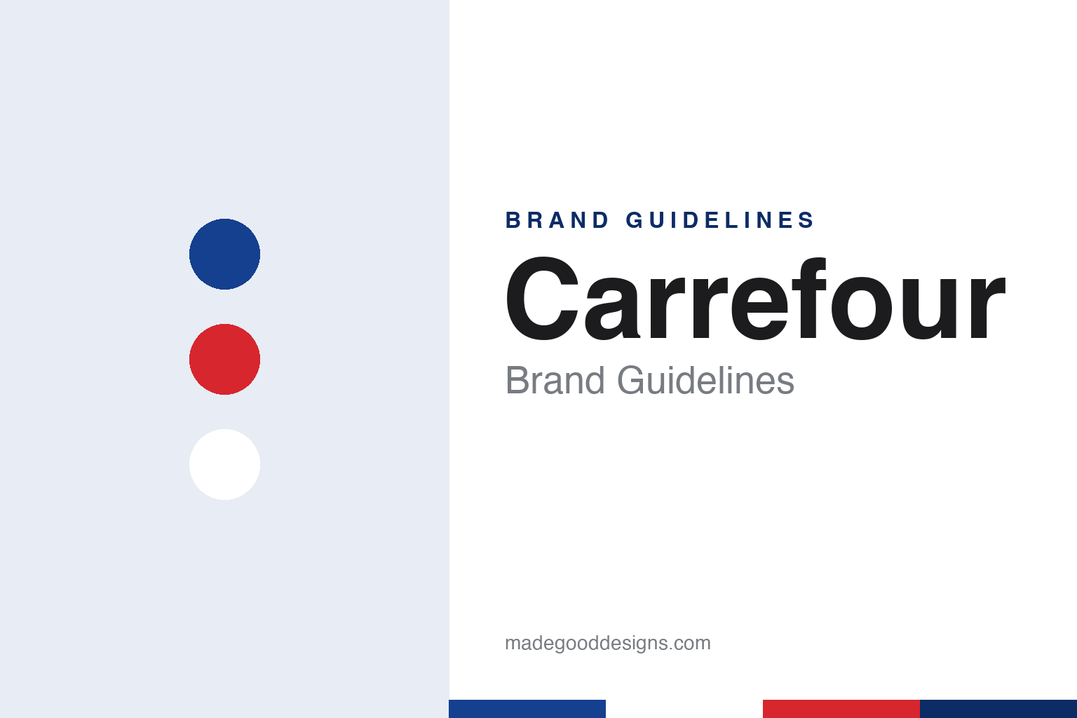
Carrefour Brand Guidelines
From a haberdasher’s basement in Annecy to a red and blue arrow mark.
Aa
Two constants: an arrow blue, arrow red and white palette and a rounded sans register. Abstract homage — not a Carrefour product or mark; no logo, sign or packaging is reproduced.
A crossroads in Annecy
A haberdasher, two wholesaler brothers and a store at a junction.
Carrefour was created in 1959 by three partners: Marcel Fournier and the brothers Jacques and Denis Defforey. Le Monde, in a June 2013 article by Juliette Garnier, describes Fournier as having taken over his family’s haberdashery in Annecy, and the Defforey brothers as the sons of a food wholesaler from Lagnieu in the Ain. According to Le Monde, the three joined forces in mid-May 1959 on a plan for a self-service store, and began cutting prices in the basement of the Fournier haberdashery.
French Wikipedia adds the detail of the earliest sites. It says a grocery opened in January 1960 in the small basement of the Fournier shop, and that its success led to a supermarket in June 1960 at the junction of the avenue du Parmelan and the rue André Theuriet in Annecy. English Wikipedia says that this early store stood near a crossroads, and that the name comes from it: carrefour is the French word for a crossroads.
The next step was a much larger format. Le Monde reports that the store at Sainte-Geneviève-des-Bois, in the Essonne south of Paris, opened on 15 June 1963. It was built by Bouygues and sold food and non-food goods together on a self-service basis, with petrol on the same site; Le Monde quotes Hervé Defforey, son of the co-founder Denis Defforey, recalling the crowds on the car park on the opening day. The format became known in French as the hypermarché, and Carrefour opened another large store at Vénissieux, near Lyon, in 1966, French Wikipedia says.
The company soon looked beyond France. English Wikipedia says Carrefour began opening stores outside the country in 1969, starting in neighbouring Belgium, and expanded to other continents during the 1970s.
Colour
From Savoy colours to the tricolour arrows, and a 2009 redraw.
The Carrefour logo has a documented design history. French Wikipedia says the original mark was a red circle containing two white arrows converging on a black “Carrefour” wordmark, and that the three colours were those of the arms of Savoy, the region where the company opened its Annecy supermarket in 1960.
In 1966, for the opening of the Vénissieux store, the company changed the mark. French Wikipedia, citing the retail trade magazine Points de vente in 2008, says the marketing director Étienne Thil and the typographer Jacques Daniel designed a new combination mark in the colours of the French flag. Its icon was a white “C” cut out of a lozenge that was red on the left and blue on the right, and the wordmark was set in a typewriter-style face. French Wikipedia says the lozenge was soon trimmed and the black outlines removed, which made the two arrows, one red and one blue, more prominent than the letter between them.
That figure-and-ground effect is the core of the mark. The white “C” is formed by the space between the two arrows rather than drawn as a shape, and French Wikipedia reads the arrows themselves as a second reference to the crossroads in the company’s name, pointing in opposite directions.
In September 2009, for the brand’s fiftieth anniversary, Carrefour adopted a redrawn logo by the agency Wolff Olins, according to French Wikipedia, which cites the French design blog Idée Visuelle. The icon kept its structure, but the edges of the arrows and the “C” were softened and the colours lightened, and the wordmark became rounder. Different store formats received different colour palettes in gradients.
The business behind the logo also changed. In 1999 Carrefour merged with Promodès through a share exchange, English Wikipedia says, and the group headquarters is now in Massy, in the Paris region. Alexandre Bompard has been chairman and chief executive since July 2017.
Typography
Design and documentation.
A retail identity is read in passing, often from across a street, so it tends to lean on a few repeated signals rather than a single mark. A founder’s name above the door is a common one: a surname turned into a wordmark carries a sense of a particular person and place long after the business has changed hands. The shopfront works at the scale of architecture, where fascia lettering, window frames, awnings and the material of the building itself become part of how a name is remembered.
The carrier bag moves that identity out of the shop and along the pavement, so bag colour can matter as much as the logo itself. A consistent house colour lets a fleet of vans, a loyalty card, a till receipt and a website feel like one voice. Inside, signage and wayfinding do quieter work: department names, aisle markers and shelf labels need a typeface that stays legible at a distance and under strip lighting. Reading these pieces together, rather than the logo alone, gives a fuller picture of how a shop presents itself.
Aa
A rounded, friendly sans — the register of an aisle sign and a store-front fascia. (Specimen set in Nunito, a sans-serif STAND-IN; NOT the Carrefour logo.)
Carrefour
A name from a street junction and a letter made of negative space.
Carrefour’s identity begins with a common French noun. The name, English Wikipedia says, comes from the crossroads near the early Annecy store, and the company has kept that single word through the move from a haberdasher’s basement to large stores near Paris and Lyon, the expansion abroad from 1969 and the merger with Promodès in 1999.
The second element is the logo’s logic. The arrows of the original Savoy-coloured mark and the red and blue arrows of 1966 both refer to the meeting of roads in the name. French Wikipedia credits the 1966 version to Étienne Thil and Jacques Daniel and describes the white “C” as a letter formed by the gap between two shapes. In that reading, the initial of the brand is present in the negative space rather than drawn as a shape.
The third is colour. The original mark used red, white and black, the colours of the arms of Savoy, and the 1966 redesign moved to red, white and blue, the colours of the French flag, according to French Wikipedia. The 2009 update by Wolff Olins kept the same structure and softened it, with lighter colours and gradients that changed from one store format to another. In each version the colours were tied to a place: initially the region where the company started, later the country.
The fourth is continuity of form. Across more than five decades, the icon’s basic arrangement of two arrows around a white letter has stayed in use, while the wordmark beside it moved from black type to a typewriter-style face and then to a rounder design.
For a design guide, Carrefour shows how a name taken from a street junction can become a symbol of two arrows and a letter made from the space between them. Compare it with Aldi and Lidl, two other European grocery names with guides in this series. For this guide we use arrow blue, arrow red and white with a rounded sans, an unofficial interpretation; no product or logo is reproduced.
Explore & save
Keep Carrefour’s identity on hand — save it to a board in the Made Good inspiration library.
Carrefour identity set
Pin the Carrefour arrow blue, arrow red and white palette and the rounded sans register to your own board.