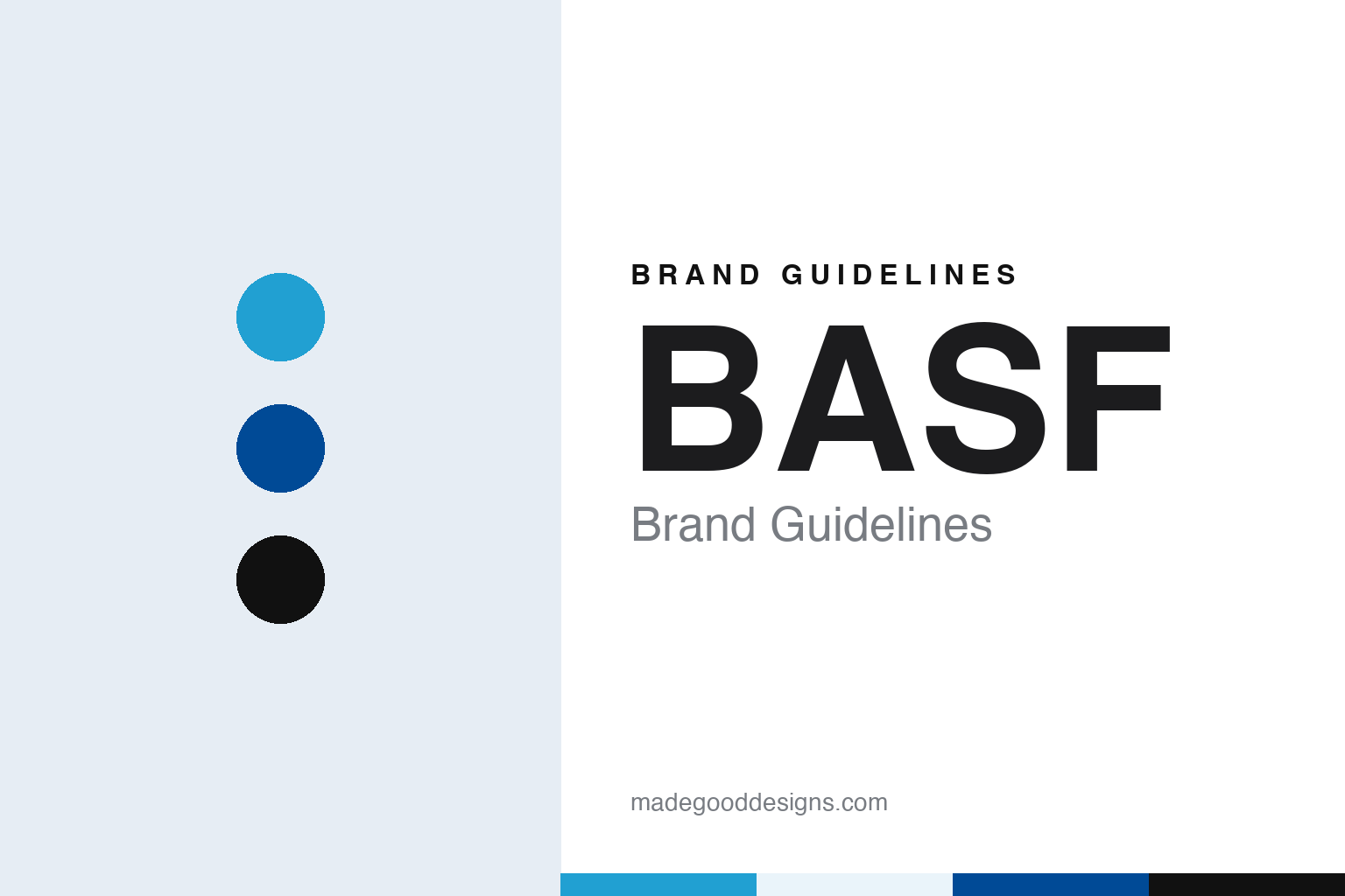
BASF Brand Guidelines
Four initials, two squares and a claim kept in English.
Aa
Two constants: a blue, dark blue and black palette and a Neo-grotesque sans register. Abstract homage — not a BASF asset or mark; no logo, symbol or wordmark is reproduced.
A name in initials
Baden, aniline and soda, 1865.
BASF is a name made of initials. They stand for Badische Anilin- und Soda-Fabrik, German for “Baden Aniline and Soda Factory”, and the company was founded by Friedrich Engelhorn on 6 April 1865 in Mannheim, in the state of Baden, according to Wikipedia. It began as a dye manufacturer.
The long name was a precise description. It named the region, Baden, and two of the materials at the centre of the business, aniline and soda, and it ended with the plain German word for factory. Over time the company came to use the initials alone as its name, and the long form survives as the explanation of the letters. Its shares are listed in Frankfurt, London and Zurich, Wikipedia says, and the company delisted its American depositary receipts from the New York Stock Exchange in September 2007.
The works did not stay in Mannheim. Wikipedia says the plant was erected on the other side of the Rhine at Ludwigshafen, and in 1866 dye production also moved to the BASF site there. Ludwigshafen has remained the company’s headquarters, Wikipedia says.
The company’s corporate history includes long periods under other names. In 1925, Wikipedia says, BASF merged with several other German chemical companies into the conglomerate IG Farben, and in 1952 BASF was refounded under its own name. From that point the four initials again stood for an independent company.
For a time the initials also reached households. Wikipedia notes that BASF sold BASF-branded consumer electronics products until it left that business in the 1990s, and that the company has had a lower public profile since. Its oil and gas exploration and production has been carried out through a subsidiary with a name of its own, Wintershall Dea, according to Wikipedia.
Colour
Two squares in front of the letters.
The current BASF logo took shape in 2004. On 10 December 2003, the trade magazine Leather International reported that from March 2004 BASF would change the way it looked, with new colours, new design elements and a new logo. The new logo kept the well-known letters BASF and placed two matching squares in front of them.
The magazine quoted Jürgen Hambrecht, then chairman of the board of executive directors, on the meaning of the squares: “They represent partnership and collaboration to ensure mutual success,” he said. “One square complements the other, and together the two form a whole.” The logo was completed by a claim in English, “The Chemical Company”.
BASF’s brand portal describes the same structure today. It says the lettering “BASF”, the square components and the claim form an inseparable unit, that the three components always appear together, and that the claim is used in English all over the world and never translated. It calls the two reverse mirror-image squares an additional symbol of partnership and intelligent solutions.
The portal is specific about colour. The BASF logo, it says, has no colour of its own and includes no corporate colour; the impression of colour comes from the background. In most media the logo appears in white on one of the corporate colours, and where a corporate colour cannot be used, as on letter paper, it is black on white. The logo appears only on a uniform, single-colour background, never on images, gradients or patterns, and where colour cannot be used at all it can be etched, embossed or moulded in its original form.
The 2003 report had already pointed in this direction. Leather International listed new colours as an important component of the changed corporate design, alongside the new design elements and the logo, so the squares and the colour system arrived together in March 2004.
Typography
Industrial names, symbols and colours.
Industrial company names tend to start as descriptions of people or processes. Many began with a founder’s surname, a pair of partners’ names joined by an ampersand, or a long legal title that listed what the firm made and where. Over time those titles were shortened in everyday use, and the short form often became the official name: a surname on its own, or a set of initials that customers and staff had been using for decades.
The marks that sit beside those names are usually simple shapes. Squares, ovals, diamonds and plain rules recur because they print cleanly on drums, sacks, vehicles, signage and paperwork, and because they hold their shape at very small and very large sizes. Many identities rely on a single corporate colour, applied across a wordmark and a few supporting elements, rather than a broad palette.
Mergers and spin-offs test these systems. When companies combine, the new group must choose whether to keep one name, join two, or invent a third; when a group later splits, each part needs a name and mark of its own. Those decisions, and the dates on which they took effect, are often the clearest record of how an industrial brand has changed.
Aa
A neo-grotesque sans — after four capital initials and two squares. (Specimen set in IBM Plex Sans, a sans STAND-IN; NOT the BASF logo or any BASF typeface.)
BASF
From “The Chemical Company” to “We create chemistry”.
The claim changed ahead of the company’s 150th anniversary. On 5 September 2014, the German trade site chemie.de reported that BASF was introducing “We create chemistry” as the new claim in its logo, derived from a company strategy of the same name announced in 2011. It quoted chief executive Kurt Bock describing the step as a move “from ‘The Chemical Company’ to ‘We create chemistry’”, and saying that the new claim referred not only to science but also to the chemistry between people, which he called the core of the BASF brand.
The roll-out was staged, the report said. Initially the new claim would appear in the logo mainly at events connected with the anniversary, and from 1 January 2015 it was to be used throughout BASF. The other elements of the corporate design, including the six corporate colours, were to stay unchanged. For the anniversary year the company also launched an online platform called Creator Space, where customers, scientists, the public and BASF experts could exchange ideas on three themes, urban living, smart energy and food, and planned live and virtual “co-creation” events around it.
The brand portal now allows some flexibility. It says that in certain areas, including health, care, nutrition and agriculture, the claim is no longer mandatory but optional, while elsewhere the logo is not to appear without it.
Leadership has passed through several hands since the 2004 redesign. Wikipedia lists Jürgen Hambrecht as chairman from 2003 to 2011, Kurt Bock from 2011 to 2018, Martin Brudermüller from 2018 to 2024 and Markus Kamieth from 2024. Over the same years the company absorbed businesses with names of their own: Wikipedia lists the purchase of the Engelhard Corporation and of Johnson Polymer, completed on 1 July 2006, the Degussa construction chemicals business in 2006, Ciba, completed on 9 April 2009, and Cognis, completed in December 2010.
For a design guide, BASF shows how a long descriptive name can be compressed to initials, and how a logo with no colour of its own can let a palette of corporate colours carry the brand. Compare 3M, another industrial company known by a shortened form of a longer name, and Siemens, a German industrial brand with its own signature colour. For this guide we use blue, a dark blue and black with a sans, an unofficial interpretation; no product or logo is reproduced.
Explore & save
Keep BASF’s identity on hand — save it to a board in the Made Good inspiration library.
BASF identity set
Pin the BASF blue, dark blue and black palette and the Neo-grotesque sans register to your own board.