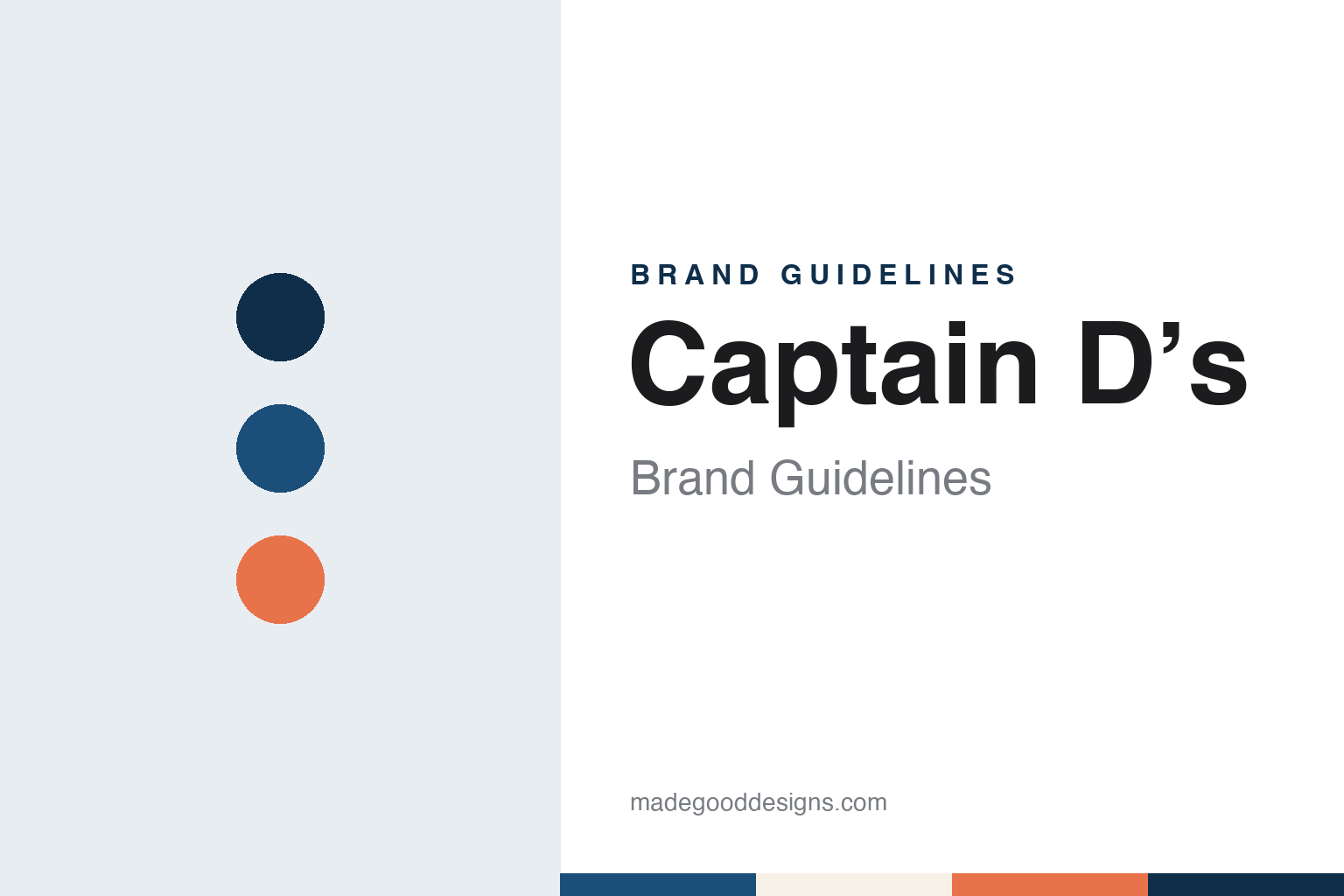
Captain D’s Brand Guidelines
The Nashville seafood chain that began as Mr. D’s.
Aa
Two constants: a harbour blue, buoy coral and sand palette and a nautical slab serif register. Abstract homage — not a Captain D’s product or mark; no logo, sign or packaging is reproduced.
Mr. D’s
A Shoney’s partner, a Nashville suburb and a hamburger stand that went to sea.
Captain D’s began on 15 August 1969 as Mr. D’s Seafood and Hamburgers in Donelson, Tennessee, near Nashville. Both the company’s own history page and English Wikipedia give that date and place, and Wikipedia names the founder as Raymond L. Danner Sr., the owner of Danner Foods, who also held a KFC franchise.
Danner came to seafood through another restaurant business. The Los Angeles Times, writing about the Shoney’s chain on 11 January 1994, described him as a hard-driving entrepreneur who had bought the franchise rights for some of Alex Schoenbaum’s Shoney’s restaurants in 1959 and eventually became Schoenbaum’s partner. Wikipedia says Danner started Mr. D’s after he was unable to expand the territory of his Shoney’s Big Boy franchise, which was limited to the south-eastern United States.
The two businesses soon joined. According to the Los Angeles Times, Shoney’s merged with Danner Foods in Nashville in 1971 to become Shoney’s Big Boy Enterprises; Schoenbaum and Danner later sold the Big Boy trademark to Marriott and renamed the company Shoney’s Inc. in 1976. Wikipedia says Captain D’s was held by Shoney’s Inc. from that point, and that Danner was president of the company in the mid-1970s.
The seafood chain took its nautical name in the same period. The company says that in 1974 it changed the name to Captain D’s Seafood to focus more on fish, shrimp and side dishes. Wikipedia, citing a report in The Tennessean of March 1975, dates the announcement of the new name, together with the launch of a national franchising programme, to 1975. “Mr. D” became a captain, and the hamburger dropped out of the name. The company says that by the 1980s Captain D’s had become known as a place where families could gather, and Wikipedia records a Kids’ Birthday Club and children’s comic books among its 1970s programmes.
Colour
Shoney’s, Sagittarius and a run of private-equity owners.
After the Shoney’s years, Captain D’s passed through a series of investment owners. Wikipedia says Sagittarius Brands acquired the chain in January 2005, citing the Nashville Post. Nation’s Restaurant News confirmed in November 2007 that Captain D’s had a new owner in Nashville-based Sagittarius Brands, and a sister chain in the California-based Del Taco.
Ownership changed again in the following decade. Wikipedia says Sagittarius sold Captain D’s to the buyout firm Sun Capital Partners in 2010, and that Sun Capital sold it to an affiliate, Centre Partners, in 2013. Phil Greifeld was appointed chief executive on 13 September 2010, according to Wikipedia, and he was still chief executive in 2022. In the same period Captain D’s took over the Grandy’s restaurant chain as a subsidiary, Wikipedia says.
Nation’s Restaurant News reported on 23 May 2022 that Centre Partners, a New York-based private-equity firm, had completed its acquisition of Captain D’s for a second time, having sold the Nashville-based brand to Sentinel Capital Partners in 2017 after first acquiring it in 2013. Terms were not disclosed. Centre Partners said it was partnering with Greifeld again, and that the management team had invested alongside the firm and would remain in their roles. Centre Partners has owned Captain D’s since 2022.
The restaurant format has continued to change under these owners. Wikipedia, citing Fast Casual in November 2020, says the company announced an Express prototype, a small building served through drive-thru and walk-up windows, with the first unit planned for College Park, Georgia, in 2021, and that a double drive-thru restaurant opened in Tupelo, Mississippi, in 2021. The menu centres on fried and grilled fish and shrimp, with chicken, hush puppies and Southern-style sweet tea, Nation’s Restaurant News noted in 2022.
Typography
Design and documentation.
Counter-service chains in general carry their identity on a small set of surfaces that a customer handles or reads in a few minutes: the sign above the door, the menu board behind the counter, the cup or bowl that leaves the shop, and the bag or napkin that goes with it. Because the same name has to work on a tall roadside sign and on a printed lid, these marks tend to be drawn as short words or simple shapes that survive being shrunk, embroidered on a uniform or lit from behind.
Colour does a second job on the menu board. A counter-service chain can use a set of colours to group drinks or dishes by flavour or category, so the palette becomes a way of reading the menu as well as a way of recognising the shop. Storefronts add materials, lighting and furniture, and a refit can change how a chain feels without any change to its name.
Each guide below records who started the brand, who has owned it since, and how its name, logo, cups and shops have changed, using dated independent sources and marking what rests on the company’s own word.
Aa
A nautical slab serif — the register of a harbour sign and a menu board. (Specimen set in Roboto Slab, a slab-serif STAND-IN; NOT the Captain D’s logo.)
Captain D’s
A captain’s title, repeated rebrands and a coastal dining room.
The rename of the 1970s turned “Mr. D” into a captain and gave the chain its nautical persona. The company says that during the 1980s and 1990s it evolved both its logo and its building design, and Wikipedia repeats that the logo and building design changed in those decades.
The brand has been reworked several times since. Nation’s Restaurant News reported on 5 November 2007 that the chain had begun its latest rebranding effort in August 2006, less than four years after a previous brand revamp launched in early 2003. The 2006 programme brought a new logo, a new trading name — Captain D’s Seafood Kitchen, where it had been simply Captain D’s Seafood — a new menu and a new store design. The supporting television campaign was created by the agency o2 ideas of Birmingham, Alabama, and first aimed at the Nashville market.
Nation’s Restaurant News described the spot in detail. Shot in stop-motion, it begins with a seaside artist painting a picture of a fish; the painted fish then “swims” through crowds, helped along by passers-by, until it ends up on a poster outside a Captain D’s restaurant. A voice-over opens with the line “Change. It can come in waves, or as a single stroke,” and introduces the “all-new, surprisingly different Captain D’s Seafood Kitchen.” The trade magazine’s columnist found the animation entertaining but wanted a stronger focus on the food.
Later work moved the coastal theme indoors. The company says that in 2012 it rolled out a new restaurant redesign intended to create a coastal ambiance, and it now describes its restaurants as having a “beachy” design meant to transport guests to the coast. The current company name is again simply Captain D’s, and its history page uses the nautical voice throughout, with headings such as “The Captain Is Born” and “Changing With The Tides”.
For a design guide, Captain D’s shows how a single change of title — from a mister to a captain — can give a seafood chain a lasting theme, and how that theme can be refreshed through new logos, trading names, stop-motion advertising and coastal interiors. Compare it with KFC, the chain its founder franchised, and Arby’s, another American quick-service brand. For this guide we use harbour blue, buoy coral and sand with a serif, an unofficial interpretation; no product or logo is reproduced.
Explore & save
Keep Captain D’s’s identity on hand — save it to a board in the Made Good inspiration library.
Captain D’s identity set
Pin the Captain D’s harbour blue, buoy coral and sand palette and the nautical slab serif register to your own board.