Jamba Brand Guidelines
The San Luis Obispo juice bar that became a one-word smoothie brand.
Aa
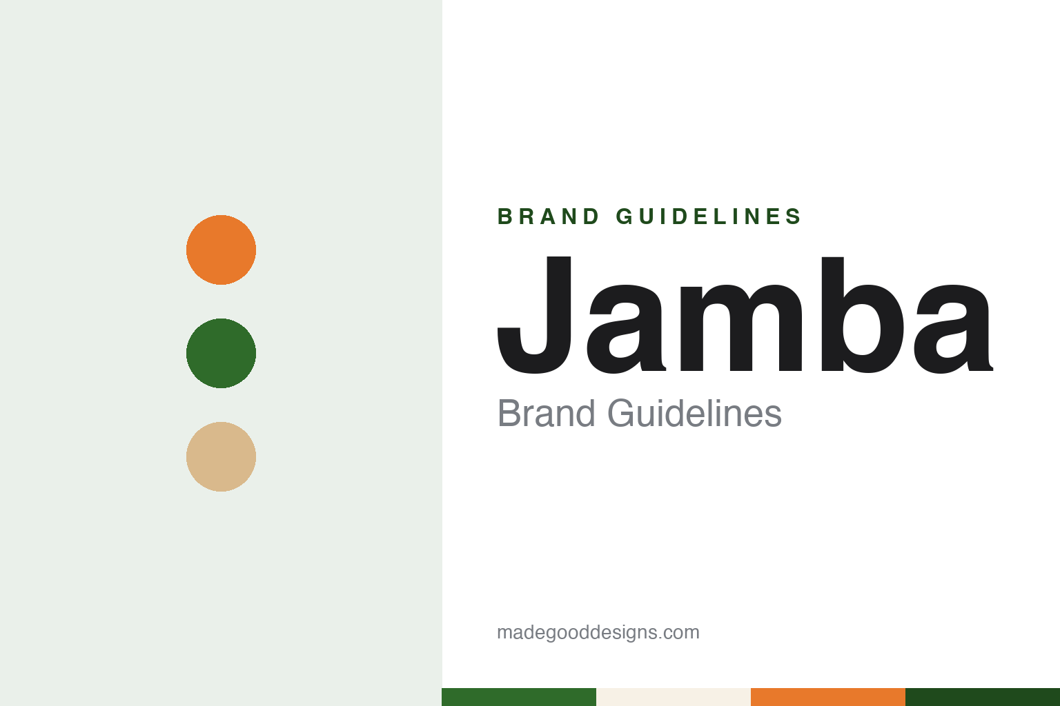
Two constants: a leaf green, citrus orange and light wood palette and a rounded counter sans register. Abstract homage — not a Jamba product or mark; no cup, sign or logo is reproduced.
Juice Club
A San Luis Obispo juice bar and a borrowed word for celebration.
Jamba began under another name. English Wikipedia, citing the company’s own history page, says the first shop opened on 31 March 1990 in San Luis Obispo, California, close to the campus of California Polytechnic State University, and was called Juice Club. Its founder was Kirk Perron, who had worked as a supermarket manager and was a keen cyclist; Wikipedia says the business was incorporated the same year as Juice Club, Inc., in San Luis Obispo.
Juice Club grew at first through franchising. Wikipedia says Perron later moved away from that model in favour of company-owned stores. In 1995 the chain changed its name to Jamba Juice. The company has said the new word comes from a West African word for “celebration”; Wikipedia repeats that account and cites a company press release from April 2015.
The chain added a rival in 1999: Wikipedia records the purchase of Zuka Juice, another juice-bar chain, on 24 March that year. In March 2006 Jamba Juice merged with Services Acquisition Corp. International, a listed acquisition company headed by Steven Berrard, and on completion the combined business took the name Jamba, Inc. The juice bars kept trading as Jamba Juice.
Jamba Juice also tried putting its name on products sold away from its shops. Wikipedia says a licensing arrangement with Nestlé to sell ready-to-drink Jamba beverages was announced in December 2007, and that the two companies suspended the line in December 2008, citing manufacturing and supply problems. In May 2016 the company announced that its headquarters would move from Emeryville, in the San Francisco Bay Area, to Frisco, Texas, a move reported at the time by the Dallas Business Journal.
Colour
Focus Brands, GoTo Foods and a shorter name.
In 2018 Jamba changed hands. Verdict Foodservice reported on 14 September 2018 that Focus Brands, the Atlanta-based franchisor owned by the private-equity firm Roark Capital Group, had completed its acquisition of Jamba, Inc., and that Jamba would operate as a wholly owned subsidiary. Focus Brands chief executive Steve DeSutter said in the company’s statement that Jamba added “a premium beverage and lifestyle concept” to its family of snack and restaurant brands. Focus Brands has owned Jamba since 2018.
The owner itself later changed its name. Wikipedia, citing Nation’s Restaurant News of 20 February 2024 and Restaurant Business, says Focus Brands announced in February 2024 that it was renaming itself GoTo Foods. Its other brands include Auntie Anne’s, Cinnabon, Carvel, Schlotzsky’s, McAlister’s Deli and Moe’s Southwest Grill, and the group is based in the Atlanta area of Georgia.
A further change to the identity came the following year. CNN Business reported on 6 June 2019 that Jamba Juice was dropping the second word of its name and would be known simply as Jamba. The company said its fans had been calling it Jamba for years, and that the new name better reflected a menu that had grown beyond juice to include smoothies, bowls and food. CNN said the change was part of a wider modernisation that also brought a new mobile app, delivery through third-party services and plant-based options such as oat milk.
Outside the United States the brand trades in several markets. Wikipedia, citing Time Out Tokyo, records the opening of a Jamba store in Tokyo’s Shibuya district on 4 August 2020, and lists Jamba locations in Australia, the Philippines, Taiwan, South Korea, Thailand, Indonesia and Hong Kong as well.
Typography
Design and documentation.
Counter-service chains in general carry their identity on a small set of surfaces that a customer handles or reads in a few minutes: the sign above the door, the menu board behind the counter, the cup or bowl that leaves the shop, and the bag or napkin that goes with it. Because the same name has to work on a tall roadside sign and on a printed lid, these marks tend to be drawn as short words or simple shapes that survive being shrunk, embroidered on a uniform or lit from behind.
Colour does a second job on the menu board. A counter-service chain can use a set of colours to group drinks or dishes by flavour or category, so the palette becomes a way of reading the menu as well as a way of recognising the shop. Storefronts add materials, lighting and furniture, and a refit can change how a chain feels without any change to its name.
Each guide below records who started the brand, who has owned it since, and how its name, logo, cups and shops have changed, using dated independent sources and marking what rests on the company’s own word.
Aa
A rounded counter sans — the register of a menu board and a printed cup. (Specimen set in Fredoka, a rounded sans-serif STAND-IN; NOT the Jamba logo.)
Jamba
A new logo, a three-part slogan and calmer stores.
The 2019 rename came with a full set of new identity pieces. CNN Business reported that Jamba introduced a new logo, a new loyalty programme and a new slogan, “Smoothies. Juices. Bowls.”, which lists the menu in three short words rather than describing it. The same report said the chain’s stores would begin to be remodelled later in 2019, with interiors using light wood and calmer colours in place of the bright oranges and greens the chain had been using, and with coolers added so that customers could collect orders placed online.
Before that, the company had already tested a different kind of shop. Wikipedia says Jamba opened the Jamba Juice Innovation Bar in Old Pasadena, California, on 14 July 2016, replacing an existing store with a larger concept location designed by the architect Barbara Bestor of Bestor Architecture. It sold bowls, toasts and other food alongside smoothies, had a larger seating area with Wi-Fi, and was decorated with mirrored wall art, photographs of fruit and a set of screens showing video greetings. Wikipedia says the concept closed on 3 January 2017 and the site became a standard Jamba store.
Advertising has also drawn attention. In July 2009, Wikipedia says, citing Fast Company, a Jamba Juice campaign was criticised for resembling the style of the cartoonist David Rees’s “Get Your War On” series.
For a design guide, Jamba shows how a chain can shorten its name to the one word its customers already used, and pair that with a new logo, a slogan built from the menu itself and a change of store materials from bright colour to light wood. Compare it with Pinkberry, a Los Angeles frozen-yogurt chain whose interiors were part of its identity from the first shop, and Baskin-Robbins, another counter-service dessert chain. For this guide we use leaf green, citrus orange and light wood with a sans, an unofficial interpretation; no product or logo is reproduced.
Explore & save
Keep Jamba’s identity on hand — save it to a board in the Made Good inspiration library.
Jamba identity set
Pin the Jamba leaf green, citrus orange and light wood palette and the rounded counter sans register to your own board.