Baskin-Robbins Brand Guidelines
31 flavors, a number hidden in the logo, and pink spoons — an ice cream chain built on a clever count.
Aa
Two constants: a pink-and-brown palette and a rounded, friendly sans. Abstract homage — not the Baskin-Robbins BR logo or wordmark.
31 flavors
Baskin-Robbins built a brand on a single, brilliant number.
Baskin-Robbins’ whole identity rests on one clever idea: “31 flavors” — one flavour for every day of the month, so you could have a different scoop every day. Introduced in 1953 (the tagline developed by the Carson-Roberts agency), it turned choice and variety into the brand’s defining promise, and stores still rotate around 31 flavours at a time from a library of well over 1,400 created over the years. That single number is so central that it’s literally hidden in the logo: in the modern “BR” monogram (introduced in the 2006 rebrand), the pink portions of the “B” and “R” form the number “31.” It’s one of the most delightful hidden-message logos in branding. (Honest caveats: the wordmark’s typeface isn’t officially documented, so don’t name a font; and no official brand hex is published, so the pink and brown here are approximate — and note the colours have shifted by era.)
The founders were family. Baskin-Robbins was created by two brothers-in-law, Burt Baskin and Irv (Irvine) Robbins (Baskin married Robbins’s sister). Irv opened Snowbird Ice Cream in 1945 in Glendale, California, and Burt opened Burton’s Ice Cream Shop in 1946 in Pasadena; they merged their businesses in 1953 to form Baskin-Robbins (the surname order reportedly settled by a coin toss). From those Southern California roots it grew into one of the world’s largest ice cream chains.
The look is famously pink and brown — cherry pink and chocolate brown — a warm, playful, sweet-shop palette (the original 1940s–50s décor even used pink-and-brown polka dots), completed by the iconic pink “taster” spoons that let you sample before you choose. (A precise, era-dependent point: the original and the current (2022-onward) identity are pink-and-brown, but the 2006 “hidden 31” logo actually used pink-and-blue; the pink-and-brown was restored in 2022.) On ownership: Baskin-Robbins is owned by Inspire Brands, which acquired Dunkin’ Brands — the former parent of both Dunkin’ and Baskin-Robbins — in 2020. A brand built on a number, a hidden logo and a lot of pink.
Colour
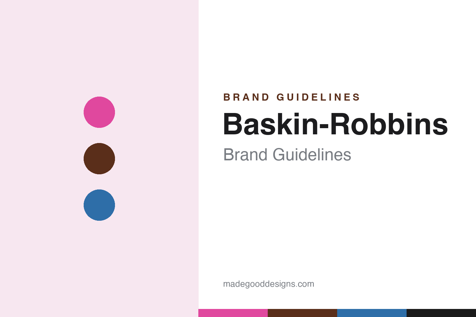
Baskin-Robbins lives in pink and brown. Click a swatch to copy the hex.
Baskin-Robbins’ signature palette is cherry pink and chocolate brown — a warm, playful, sweet-shop combination that reads as fun, friendly and appetising. The pink is cheerful and inviting (often associated with cotton candy and bubblegum, though that flavour meaning is interpretation rather than official); the brown grounds it in chocolate. Together with the pink “taster” spoons, it’s a palette that makes an ice cream parlour feel joyful and kid-friendly. The honest caveat: Baskin-Robbins publishes no official public brand hex, and the palette has shifted by era (pink-and-brown originally and from 2022; pink-and-blue in the 2006 era), so treat the values here as approximations of the classic pink-and-brown look.
The lesson is a warm, playful palette for a joyful category. Baskin-Robbins’ pink-and-brown feels fun and appetising, perfectly matching an ice cream parlour built on variety and delight. For designers, it’s a reminder that a warm, sweet, friendly palette can define an experience — and that even the smallest touch (the pink spoons) can become an iconic brand asset. The takeaways: use a warm, playful palette to match a joyful, indulgent category; turn a small detail into a signature (the pink spoons); and treat specific hexes as approximate, noting era changes, when no official spec is published.
Typography
The wordmark is a rounded, friendly sans — with a hidden 31.
Baskin-Robbins’ identity centres on the “BR” monogram — a bold, rounded, friendly mark whose pink sections cleverly form the number “31.” That hidden number is the whole point: it makes the logo playful, memorable and rewarding to “get,” and ties the mark directly to the brand’s core promise of 31 flavours. The lettering is warm and approachable, matching a fun, family-friendly ice cream chain rather than a serious food brand. Over the years the exact type and colours have been refreshed (a 2022 rebrand restored the pink-and-brown and a bolder serif-ish monogram), but the hidden 31 has carried through. (Because no official typeface is documented, the honest description is “a rounded, friendly monogram with a hidden 31,” not a named font.) The type behaves like the brand: playful, friendly and cleverly hiding its big idea in plain sight.
Aa
A rounded, friendly sans — with a hidden 31. (Specimen set in Fredoka, a rounded sans in the spirit of the BR monogram; the real logo is custom, with the “31” hidden in the pink.)
A number hidden in plain sight
Baskin-Robbins turned its core idea into a hidden-logo delight.
Baskin-Robbins is a lesson in building an identity around a single, ownable idea. “31 flavors” isn’t just a fact — it’s the brand’s entire promise (endless variety, a new flavour every day), and the brand expressed it everywhere: in the name recognition, the rotating flavours, the pink spoons for sampling, and — most cleverly — a logo with the number 31 hidden in the pink of the BR. That hidden-message logo is a masterstroke: it rewards attention, reinforces the core idea, and makes the brand feel fun and smart. It’s proof that a strong central concept, expressed with wit, can make a brand instantly memorable.
For designers and brand-builders, Baskin-Robbins offers a clear takeaway: a single strong idea, cleverly embedded in the identity, is powerful and delightful. The lessons: find one ownable idea (31 flavours = endless choice) and build the whole brand around it; embed it in the logo in a witty, rewarding way (the hidden 31); and use warm, playful design and signature touches (pink spoons) to match the joy of the category. It’s also a reminder to keep the facts precise — “31 flavors” means one for each day of the month (from 1953); the hidden 31 is in the pink of the BR (2006 rebrand); the founders are Burt Baskin and Irv Robbins (Snowbird 1945, Burton’s 1946, merged 1953); the classic and current palette is pink-and-brown (the 2006 era was pink-and-blue); and it’s owned by Inspire Brands. Baskin-Robbins hid its big idea in plain sight — proof that a clever, single-minded identity delights and endures.
Explore & save
Keep Baskin-Robbins’s identity on hand — save it to a board in the Made Good inspiration library.
Baskin-Robbins identity set
Pin the pink-and-brown palette and the rounded-sans spirit to your own board.