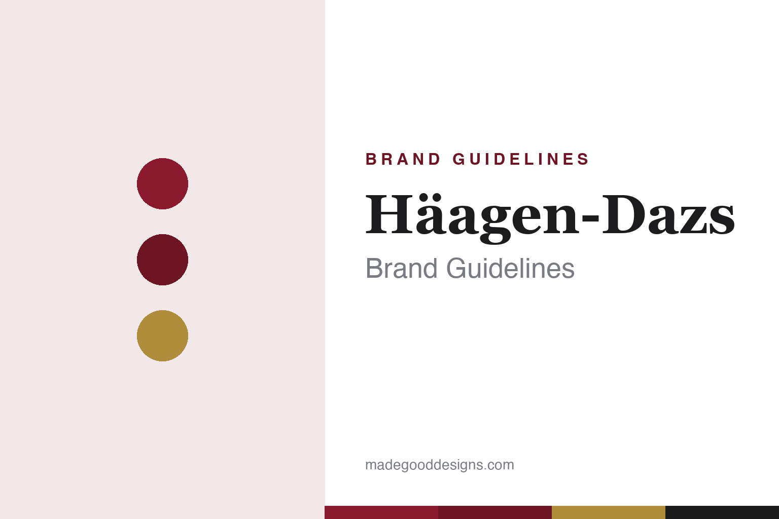
Häagen-Dazs Brand Guidelines
A burgundy wordmark, a fake Danish name and an umlaut that means nothing — premium ice cream, invented in the Bronx.
Aa
Two constants: a burgundy-and-gold palette and an elegant serif. Abstract homage — not the Häagen-Dazs wordmark.
A name that means nothing
Häagen-Dazs is a made-up name designed to sound old-world European.
Häagen-Dazs is the classic case of “foreign branding.” The name is completely invented — it means nothing in any language. Founder Reuben Mattus assembled it from nonsense syllables until he liked the sound, precisely because a foreign-sounding name would signal old-world craftsmanship and premium quality to American buyers. His own words: “Häagen-Dazs doesn’t mean anything. [But] it would attract attention, especially with the umlaut.” Crucially, it is not real Danish — Danish doesn’t use the umlaut (ä is German), and the “zs” digraph is Hungarian, not Danish — so it’s linguistically impossible as actual Danish. Mattus chose a Danish-sounding name as a tribute to Denmark (which he admired for protecting its Jews in WWII) and even printed a map of Denmark on early cartons. And the umlaut over the first “a” is purely decorative — a fake diacritic with no phonetic function, added simply to “attract attention.” (Honest caveats: the burgundy wordmark is custom lettering with no documented typeface, so don’t name a font; and no official brand hex is published, so the burgundy here is an approximation.)
The reality behind the fake-European name is thoroughly American. Häagen-Dazs was created by Reuben Mattus, a Polish-Jewish immigrant, and his wife Rose, in the Bronx, New York, around 1960 — as the premium line of their family ice cream business (Senator Frozen Products). It started with just three flavours: vanilla, chocolate and coffee. (Note the first retail store opened in Brooklyn in 1976 — that’s the shop, not the founding, which was the Bronx.)
What Häagen-Dazs actually invented was a category. It essentially created “super-premium” ice cream: high butterfat, very low overrun (little whipped-in air, so it’s dense and creamy), few additives, natural ingredients, small pint packaging and a premium price. The fake-Danish name and burgundy livery were the signals of that premium quality; the dense, rich product delivered on the promise. Today the brand has split ownership that’s easy to get wrong: General Mills owns Häagen-Dazs everywhere except the US and Canada, where it is operated by Froneri (formerly via Nestlé/Dreyer’s). So the US-market brand is not General Mills — a neat final twist for a brand built on a clever illusion.
Colour
Häagen-Dazs lives in burgundy and gold. Click a swatch to copy the hex.
Häagen-Dazs’ palette is a deep burgundy/maroon, historically paired with gold accents and cream. The rich, dark burgundy reads as mature, sophisticated and premium — the colour of fine wine and old-world luxury — which is exactly the perception the whole brand is engineered to create. Gold adds a touch of indulgence; cream keeps it appetising. It’s a grown-up, upscale palette that, together with the fake-European name, sells the idea of premium craftsmanship. The honest caveat: Häagen-Dazs publishes no official public brand hex — the burgundy is community-sampled around a deep maroon — so treat the values here as approximations rather than a confirmed spec.
The lesson is a palette engineered for premium perception. Häagen-Dazs’ deep burgundy and gold, like its invented name, are designed to signal old-world luxury and justify a premium price. For designers, it’s a reminder that colour (mature, dark, rich) can create upscale perception just as powerfully as a name or a story. The takeaways: use deep, rich, mature colours (burgundy, gold) to signal premium quality; align every cue — name, colour, packaging — behind one perception; and treat specific hexes as approximate when no official spec is published.
Typography
The wordmark is an elegant serif — old-world and premium.
Häagen-Dazs’ elegant serif wordmark, in deep burgundy, is the finishing touch on its old-world illusion. The refined serif letterforms read as traditional, European and upscale — reinforcing the fake-Danish name’s promise of premium, craftsmanship and heritage. Paired with the decorative umlaut (which has no linguistic function but adds an exotic, “foreign” flourish), the type completes an identity meticulously designed to feel like an old European maker rather than a 1960s Bronx start-up. That deliberate elegance is the whole strategy: every element, including the type, sells the perception of premium. (Because the exact face isn’t documented, the honest description is “an elegant serif,” not a named font.) The type behaves like the brand: refined, old-world and premium — the look that made the illusion work.
Aa
An elegant serif — old-world and premium. (Specimen set in Cormorant Garamond, a refined serif in the spirit of the Häagen-Dazs wordmark; the real face is undocumented.)
Selling a perception
Häagen-Dazs proved that branding can create premium out of thin air.
Häagen-Dazs is the definitive lesson in branding as perception. There was nothing Danish, European or old-world about a Bronx ice cream maker — but Reuben Mattus understood that an invented, foreign-sounding name, a decorative umlaut, an elegant serif and a deep burgundy livery could make people believe the product was premium and craft-made. And because the actual ice cream was genuinely superior (dense, rich, super-premium), the perception stuck and the brand created a whole category. It’s a masterclass in how packaging, name and design can build a premium position — as long as the product delivers.
For designers and brand-builders, Häagen-Dazs offers a powerful (and slightly cheeky) takeaway: design and naming can create a premium perception — but the product has to back it up. The lessons: a foreign-sounding name and upscale visual cues (elegant serif, deep colour, small premium packaging) can signal quality and justify a higher price; every element should align behind one perception; and the illusion only works if the product genuinely delivers (Häagen-Dazs’ super-premium formula did). It’s also a reminder to keep the facts precise — the name is entirely invented and not Danish (the umlaut is decorative, the “zs” is Hungarian, not Danish); Häagen-Dazs was created by Reuben and Rose Mattus in the Bronx around 1960; it pioneered “super-premium” ice cream; and it’s owned by General Mills internationally and Froneri in the US/Canada. Häagen-Dazs sold a perception and delivered on it — proof that great branding, backed by a great product, can create premium from thin air.
Explore & save
Keep Häagen-Dazs’s identity on hand — save it to a board in the Made Good inspiration library.
Häagen-Dazs identity set
Pin the burgundy-and-gold palette and the elegant-serif spirit to your own board.


