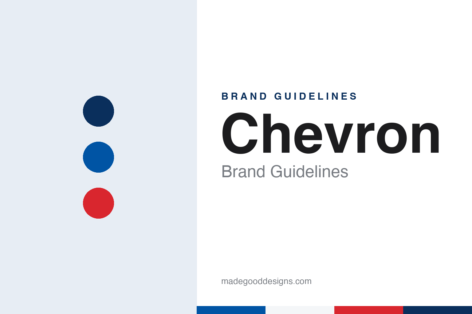
Chevron Brand Guidelines
The Socal ad shape that became a company name.
Aa
Two constants: a chevron blue, signal red and sky palette and a clean corporate sans register. Abstract homage — not a Chevron product or mark; no sign, chevron or logo is reproduced.
Pacific Coast Oil
From Pico Canyon to Standard of California.
Chevron traces itself to the oil fields north of Los Angeles and the boardrooms of San Francisco. English Wikipedia says a predecessor called Star Oil struck oil at Pico Canyon in the Santa Susana Mountains in 1876, and that in September 1879 Charles N. Felton, Lloyd Tevis, George Loomis and others formed the Pacific Coast Oil Company, which took over Star Oil’s assets. The San Francisco Chronicle, in a history box printed on 10 May 2005, set out the names the company has carried since: Pacific Coast Oil Co. from 1879; Standard Oil Co. (California) from 1906; Standard Oil Co. of California, better known as Socal, from 1926; Chevron Corp. from 1984; ChevronTexaco Corp. from 2001; and Chevron Corp. again from 2005. The same article called the Bay Area Chevron’s home since 1879.
The Standard years shaped the brand that followed. Wikipedia says that after the 1911 break-up of Standard Oil, Standard Oil Co. (California) was one of the pieces, and that under the terms of the break-up it could initially use the Standard name within its home territory on the Pacific coast, plus Nevada and Arizona, and had to trade under another name elsewhere. The Standard trademark is still held today in a group of western and south-eastern states; because American trademark law works on a use-it-or-lose-it basis, Wikipedia says, the company keeps a Standard-branded Chevron station in each of them.
That other name became Chevron. Wikipedia says the name came into use for some of the company’s retail products in the 1930s, and that a further name, Calso, was used between 1946 and 1955 in states outside its West Coast home. The Chronicle explained in 2005 that the Chevron name refers to the shape of an old Socal advertising logo, so the word describes a mark before it describes a company.
The logo followed the name slowly. English Wikipedia’s account of the logo says the earliest version carried the legend “Pacific Coast Oil Co.”, that later versions showed the word Standard, and that in 1968 the company added the word Chevron to its logo. The gallery in the same article dates one version of the mark from 1948 to 1968 and its successor from 1968.
The decisive change came in 1984. The New York Times reported on 6 March 1984 that Gulf Oil and the Standard Oil Company of California had signed an agreement for Standard of California to buy Gulf, adding that the company was commonly known as Socal. Wikipedia says that the same year Standard Oil of California changed its legal name to Chevron Corporation, since it had already been using the Chevron retail brand for decades.
Colour
Texaco, ChevronTexaco and Chevron again.
The next merger added a second station brand. English Wikipedia says Chevron announced its purchase of Texaco on 15 October 2000 and completed it in 2001, when the company became ChevronTexaco. Texaco had begun in Beaumont, Texas, as the Texas Fuel Company, and the San Francisco Chronicle noted that it took Texaco as its corporate name in 1959, years after moving its headquarters from Texas to New York.
The combined name lasted until 2005. The Chronicle’s David R. Baker reported on 10 May 2005 that ChevronTexaco had shortened its name the previous day to Chevron Corp., the name it used before the 2001 purchase. The move, he wrote, would not do away with the Texaco brand, which would stay on American service stations while the company running them was called Chevron. The company spokesman Michael Barrett told the paper: “It’s one image. It’s just Chevron.” On the same day the company unveiled changes to its logo, adding new details in texture and shading while keeping the basic design, and the Chronicle photographed a worker mounting the new logo at the headquarters in San Ramon.
Advertising gave the brand characters of its own. The San Francisco Business Times reported in December 1997 that television commercials with talking cars, designed by the advertising agency Young & Rubicam, had appeared in May 1995, and that a year later Chevron stations began selling toy versions of the cars. The paper said that the toys had been aimed at children but that adults had started collecting them too, and it quoted Glenn Weckerlin, manager of Chevron brand strategy: “This is a promotion that pays for itself and lets us extend the brand. It allows people to take part of Chevron home.” English Wikipedia says the commercials promoted Chevron with Techron, its petrol additive. The company says its slogan “the human energy company” launched in September 2007.
The company has since moved away from California. English Wikipedia says its earlier headquarters stood at 555 Market Street in San Francisco, where it had been based since 1879, before it moved to a campus in San Ramon. The Texas Tribune reported on 2 August 2024 that Chevron had said it would move its headquarters from San Ramon to Houston before the end of that year. Wikipedia describes the company’s head office today as office towers in downtown Houston, and records that it withdrew its station brands from Kentucky and the Mid-Atlantic states in 2010.
Typography
Design and documentation.
A fuel brand is met mostly at the roadside, and much of its identity is built for people moving at speed. The canopy over the pumps is a large branded surface, carrying a band of colour and a name or mark along its edge so that it reads from the road and at night under its own lights.
The tall sign at the entrance, often called a price pylon or price sign, does two jobs: it carries the brand’s mark at the top and a set of changeable figures below it. In a brand system the mark and the frame stay fixed while the figures change, so the sign is designed around the space the numbers will take.
At the pump itself the brand appears again on toppers, panels and nozzle labels, at a scale meant for someone standing beside the car. Forecourt colour ties these pieces together: the same hues on canopy, pumps, kiosk and sign let a station read as one place from a distance.
Each guide looks at how one name has carried its mark across those surfaces, who has owned it and how its signs have changed, and marks plainly what rests on the company’s own word.
Aa
A clean corporate sans — the register of a canopy fascia and an annual report. (Specimen set in Archivo, a sans-serif STAND-IN; NOT the Chevron logo.)
Chevron
A shape, a name and two forecourt brands.
The Chevron identity starts with a shape. According to the San Francisco Chronicle, the name refers to the outline of an old Socal advertising logo, and the company let that word grow from a product name in the 1930s into the corporate name in 1984. Wikipedia’s account adds that the company traded under other names where it could not call itself Standard, and Chevron was one of them.
The Standard name has not been given up. Wikipedia says the company still owns the Standard Oil trademark in its old territory and keeps it in use with a Standard-branded Chevron station in each of those states, so a driver can still find the older name on a canopy owned by the newer one. The same logic applies to Texaco: when ChevronTexaco went back to being Chevron in 2005, the Chronicle reported that Texaco signs would remain on stations, so the company runs two forecourt identities under one corporate name.
The logo has changed in steps rather than leaps. Wikipedia’s outline runs from a legend reading “Pacific Coast Oil Co.” to versions carrying the word Standard, then to the 1968 mark that added Chevron, and on to the version the company updated in 2005 with texture and shading while keeping its basic design.
The talking cars of the 1990s took the brand into toy boxes. The San Francisco Business Times reported that the toys sold at Chevron stations became collectibles among adults as well as children, extending an advertising campaign into something people kept at home. Another name from the family lives on abroad: Wikipedia says that in 2023 Chevron agreed with Hindustan Petroleum to sell Chevron lubricants in India under the Caltex brand.
For a design guide, Chevron shows how a mark can turn into a name, and a name into a company, while older identities such as Standard and Texaco are kept in use beside it. Compare it with Exxon, another Standard Oil successor that coined a name to cross state lines, and Shell, a forecourt brand built on a single shape. For this guide we use chevron blue, signal red and sky with a sans, an unofficial interpretation; no product or logo is reproduced.
Explore & save
Keep Chevron’s identity on hand — save it to a board in the Made Good inspiration library.
Chevron identity set
Pin the Chevron blue, signal red and sky palette and the clean corporate sans register to your own board.