CMA CGM Brand Guidelines
Two sets of initials, one Marseille name, blue and red.
Aa
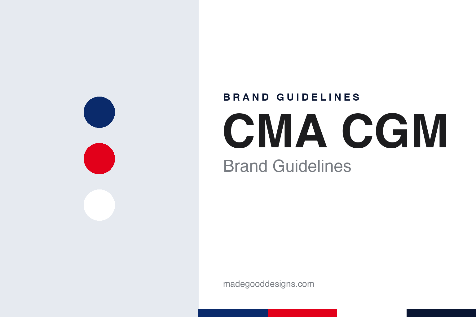
Two constants: a harbour blue, flag red and white palette and a Condensed sans register. Abstract homage — not a CMA CGM asset or mark; no logo or wordmark is reproduced.
Two companies in one name
A Marseille start and a state line.
The name is two acronyms side by side. Wikipedia explains that CMA CGM joins the initials of two predecessor companies: Compagnie Maritime d’Affrètement, roughly the Maritime Chartering Company, and Compagnie Générale Maritime, the General Maritime Company. The group keeps both sets of letters in its wordmark rather than choosing one, so the brand still spells out the merger it came from.
The first half began in Marseille in 1978. In an article published on 24 June 2018, The Maritime Executive reported that Jacques Saadé moved to Marseille that year and created CMA, which began with four employees, a single ship and one service between Marseille and Beirut. The magazine said he launched a service linking northern Europe and Asia in 1986 and opened CMA’s first office in Shanghai in 1992. FreightWaves, reporting the same month, added that his ships first crossed the Suez Canal in 1983.
The second half had state roots. Wikipedia says Compagnie Générale Maritime operated from 1974 as the merged successor to two older French lines, Messageries Maritimes and Compagnie Générale Transatlantique, and was owned by the French state until 1996. Wikipedia traces those two lines back to the middle of the nineteenth century: Messageries Maritimes was created in 1851, and Compagnie Générale Maritime in 1855, renamed Compagnie Générale Transatlantique in 1861, both partly backed by the French state through contracts to carry mail. FreightWaves reported that Saadé acquired CGM when it was privatised in 1996 and then merged the two companies, which led to the CMA CGM Group in 1999. The Maritime Executive listed later takeovers of ANL in 1998, Delmas in 2005, and Comanav and US Lines in 2007.
The company stayed with the family. The Maritime Executive reported that on 7 February 2017 Jacques Saadé appointed his son Rodolphe Saadé chief executive of the group, and that he named him chairman of the board later the same year. Rodolphe Saadé has led CMA CGM as chairman and chief executive since 2017, and the group’s head office remains in Marseille, the city where the first half of the name began.
Colour
An eighth logo in French colours.
The current mark dates from June 2017. On 29 June 2017 the Chilean maritime news site MundoMarítimo reported that CMA CGM had presented a new strategy, called Shipping the Future, and a new corporate image to match. The Sri Lankan business paper Daily FT carried the same announcement on 24 July 2017. Both reports said the company described the new logo as the eighth since it was founded in 1978, and that the mark was meant to express the power and energy of the group.
Both papers gave the same design details. The logo, they reported, is built on a unique typography and two new colours that recall the national colours of France, and it was designed by the branding company Brandimage. All the brands of the CMA CGM Group, the company said, would adopt the new typography, to bring coherence to the group’s different businesses. A separate campaign visual, which the company said symbolised its values of initiative, boldness, imagination and integrity, was developed by the agency DDB Dubai. The company said the visual was turned towards the future and innovation, and was meant to show the group’s energy and its ability to innovate, while reinforcing its image around the world.
The launch used the company’s own building as a billboard. Daily FT and MundoMarítimo both reported that a large adhesive visual was fixed to the seafront side of the CMA CGM Tower in Marseille for the launch, and that the new ambition was to be carried by employees in the group’s offices around the world and on social networks.
Typography
Hulls, funnels and boxes.
Container shipping carries its identity at a scale few other industries share. A brand surface here may be a hull hundreds of metres long, a funnel visible from across a harbour, or the corrugated steel side of a box that will be stacked, lifted and trucked through dozens of countries before it comes home. Colour does most of the work. A single hull colour, repeated across a fleet, lets a ship be recognised long before any lettering can be read, and a container colour does the same job in a stack of thousands where every box is the same size and shape.
The funnel mark is one of these devices: a symbol or band painted on the smokestack so that a ship could be told apart at sea and in port. Many lines still treat it as the core of their mark. Names painted in tall capitals along the hull work as a second, slower layer, read from the quayside or from the air. Port cranes, terminal gates, reefer units and the doors of individual boxes add further surfaces, often in harsh light, salt air and grime, which favours flat colour, simple shapes and heavy, legible lettering over fine detail.
Aa
A tight, condensed sans — after a wide wordmark of initials. (Specimen set in Barlow Condensed ExtraBold, a sans STAND-IN; NOT the CMA CGM logo or its typeface.)
CMA CGM
A tower as a brand surface.
The group’s most visible brand surface is a building. Wikipedia says Zaha Hadid was chosen to design the CMA CGM headquarters in November 2004, that construction began in July 2006 and that the tower opened in September 2011. The Maritime Executive wrote in 2018 that Jacques Saadé kept strong ties to Marseille and that the tower he built there had become a symbol of the city.
The design press recorded the building in detail. In an article dated 25 March 2013, Dezeen described Hadid’s 33-storey tower for the French shipping company, completed in 2011, with a glazed facade and a seam of tinted glass running up its centre. The darker glass tapers outwards near the top, the magazine said, giving the impression of swelling upper storeys, although the body of the building is rectilinear and only curves outwards at its base. Dezeen placed it in Marseille’s Euroméditerranée development zone in the north of the city, and said Zaha Hadid Architects also designed a 135-metre-long annex joined to the tower by a curving glass bridge. The images were by the London photographers Hufton + Crow.
The tower also appeared in the 2017 relaunch. Daily FT and MundoMarítimo reported that the campaign visual was fixed to its seafront side, which put the new mark on the building most closely tied to the group in Marseille.
For a design guide, CMA CGM shows how a company can turn a merger into a name, a national palette into a logo and a headquarters into a landmark. Compare Maersk, a Danish line whose mark is a single star on blue, and DHL, a logistics brand that kept its founders’ initials. For this guide we use harbour blue, flag red and white with a condensed sans, an unofficial interpretation; no product or logo is reproduced.
Explore & save
Keep CMA CGM’s identity on hand — save it to a board in the Made Good inspiration library.
CMA CGM identity set
Pin the CMA CGM harbour blue, flag red and white palette and the Condensed sans register to your own board.