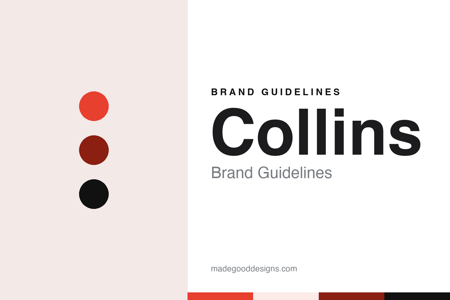
Collins Brand Guidelines
A founder’s surname, followed by a colon.
Aa
Two constants: a red, brick and ink palette and a display serif register. Abstract homage — not a Collins asset or mark; no logo, icon or wordmark is reproduced.
From Ogilvy to a studio of his own
New York, 2008.
Collins is a brand and experience design company based in New York. English Wikipedia says the designer Brian Collins founded it in 2008, and that it is styled COLLINS:, with a colon after the name. The colon turns a plain surname into something closer to the start of a sentence, as if the studio’s name were always about to introduce the next piece of work.
Brian Collins came to the studio after a long period inside a large advertising network. Wikipedia says he graduated from the Massachusetts College of Art and Design, ran a small studio of his own in Massachusetts early in his career, worked for The Duffy Design Group in Minneapolis and then FCB in San Francisco, and in 1998 became senior partner and chief creative officer of a new design and brand identity division at Ogilvy & Mather in New York. He led that division for about ten years, Wikipedia says, before setting up Collins.
The studio had a second founder. Leland Maschmeyer’s biography on the board pages of The One Club for Creativity describes him as co-founder of Collins, a former co-chief creative officer and its current chief executive. The same biography says that between 2016 and 2021 he worked at Chobani, first as chief creative officer and then as chief brand officer, before returning to the studio. Adweek, in reports from January 2018 and February 2019, gave Brian Collins’ own title as chief creative officer and co-founder.
Wikipedia says the company’s early work included the design of the CNN Grill and the brand and design development of Microsoft’s retail stores, a project carried out in partnership with The Martin Agency and the architecture firm Gensler. From the start, then, the studio worked alongside agencies and architects rather than alone.
Colour
A surname on two coasts.
A studio named after a founder ties its reputation to a person, and Collins has kept that link while adding partners, offices and a second founder at the top. The studio’s own website sits at wearecollins.com, an address that turns the surname into a plural, collective “we”. That small shift matters for a firm whose name is also shared by publishers, dictionaries and many other companies.
The studio’s footprint has grown to two coasts. Adweek’s AgencySpy column reported on 5 January 2018 that Collins had made nine hires across its New York and San Francisco offices, which the studio linked to recent growth. Brian Collins said in a statement quoted by Adweek that the company was expanding its East and West Coast presence. The new roles included a managing director in New York, business and development staff, and, in San Francisco, the designer Karin Soukup, who joined from a period as a freelance design director after working at the design firm IDEO.
A year later the San Francisco office was growing again. Adweek reported on 27 February 2019 that Collins had hired Victoria Thomas as business director and Louis Mikolay as associate creative director for San Francisco, and that both reported to Soukup, by then managing partner for brand experience design. Mikolay relocated from London, where he had been a creative director at the studio Koto.
Job titles like managing partner and co-founder, and the presence of a second city on the studio’s pages, are part of how a design firm presents itself to clients. In the Adweek reports, Collins described itself through the people it hired and the clients they would serve, rather than through a list of services. Brian Collins was quoted in 2019 saying the studio believed a diversity of backgrounds leads to diversity of thought and of work.
Typography
Names, websites and offices.
A design studio’s name is one of its first design decisions. Some studios carry the surname of a founder, a choice that ties the business to a person and to that person’s reputation. Others pick an invented or borrowed word, which can travel more easily between countries, survive changes of leadership and leave room for the people who join later. Both routes have to work as a wordmark, a web address and a line in a client’s credits.
Because a studio sells the work it does for others, its own brand surfaces are unusual. The studio website is often the main shop window, and its case-study pages do much of the talking: each one sets client work inside the studio’s own grid, typefaces and tone of voice. Job advertisements, talks, social posts and short films about the studio’s process add to the picture.
Offices and partnership structures can also become part of the identity. A second or third office changes how a studio describes itself, and a group of partners or a new owner can change who signs the work. For a designer, the useful lesson is how a studio keeps a consistent voice while showcasing many other brands.
Aa
A display serif — after a studio that signs its work with a surname. (Specimen set in DM Serif Display, a serif STAND-IN; NOT the Collins logo or any Collins typeface.)
Collins
Client work, dated.
Like many design studios, Collins is known to the public mainly through work that carries other companies’ names. Wikipedia says the studio produced a global redesign and identity system for Spotify in 2015. Adweek listed Spotify among the studio’s clients in January 2018, alongside Coca-Cola, the insurer Chubb, the retailer Target, Dropbox and an exhibition about the Muppets at the Museum of the Moving Image. In February 2019 it listed Coca-Cola, Dropbox, Facebook, Mailchimp and Target as clients.
The Dropbox project is documented in some detail. It’s Nice That, in a news story by Jenny Brewer dated 4 October 2017, reported that Dropbox had unveiled a rebrand by its in-house team working with Collins, and that Collins had worked alongside the studios Instrument, XXIX, Sharp Type and Animade. The logo was no longer a literal box but an abstracted version made of flat diamond shapes. Collins changed the brand’s typography, including the wordmark, to Sharp Grotesk, chosen for its range of weights and widths, and paired it with a bolder colour palette and pencil-drawn illustration.
Dezeen, in a story by Gunseli Yalcinkaya dated 11 October 2017, called Collins a New York agency and said the logo came in a range of colours as well as the original blue and white. It reported that the new colour pairings drew criticism on social media. Dropbox’s creative director Aaron Robbs and vice president of design Nicholas Jitkoff told Dezeen the system let the company dial colour from a standard Dropbox blue up to something far louder.
For a design guide, Collins shows how a studio can keep a founder’s surname, add a single mark of punctuation and let the client work carry the rest. Compare Koto, a London studio named after a Japanese word, and Dropbox. For this guide we use red, brick and ink with a serif, an unofficial interpretation; no product or logo is reproduced.
Explore & save
Keep Collins’s identity on hand — save it to a board in the Made Good inspiration library.
Collins identity set
Pin the Collins red, brick and ink palette and the display serif register to your own board.