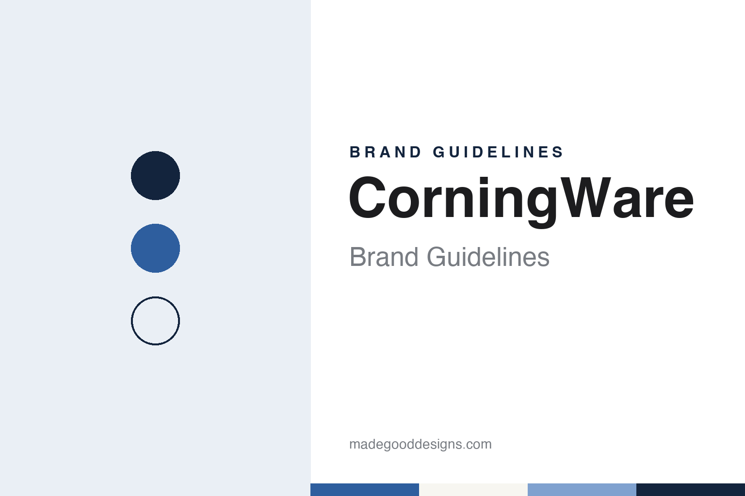
CorningWare Brand Guidelines
A white dish that went from freezer to flame, with a blue flower on its side.
Aa
Two constants: a cornflower blue, French white and petal blue palette and a Mid-century serif register. Abstract homage — not a CorningWare product or mark; no dish, pattern or logo is reproduced.
Corning, 1953–58
An overheated furnace and a dish that bounced.
CorningWare came out of a laboratory accident at Corning Glass Works in upstate New York. The New York Times, in its obituary of the Corning scientist S. Donald Stookey published on 6 November 2014, told the story in his own words. Experimenting one day in 1953, Stookey put a piece of photosensitive glass into a furnace he meant to heat to 600 degrees. “When I came back, the temperature gauge was stuck on 900 degrees,” he said, and the glass had turned a milky white. When he grabbed it with tongs it slipped and fell to the floor. “The thing bounced and didn’t break,” he said. “It sounded like steel hitting the floor.”
What Stookey had made was a glass-ceramic, a material formed as glass and then turned partly crystalline by heat. According to the Times, Corning announced in May 1957 that it had trademarked the material as Pyroceram, and showed a cone it had developed for a guided missile, saying the material was harder than carbon steel and would let radar signals pass through. The paper quoted a 1957 New York Times article listing the uses Corning expected for it, from jet engines and chemical processing to “home cookware.”
The kitchen was where the name became familiar. The Times obituary says Corning’s marketing teams soon tested prototypes of CorningWare with consumers: they fried pork chops in one of the new dishes on a stovetop, moved the dish into the oven, and then dropped an ice cube onto the hot dish to show how it handled sudden changes in temperature. “By 1958,” the paper wrote, “CorningWare was being sold in stores.”
That demonstration is the core of the brand’s promise. CorningWare was sold on the idea that one white dish could go from the cold to the heat and onto the table, and the name joins the maker’s town to the plain English word for kitchen goods. Stookey, the Times said, joined Corning in 1940 and retired from the company in 1987.
Colour
Blue Cornflower and French White.
CorningWare’s signature image is a flower. English Wikipedia, citing Debbie and Randy Coe’s 2008 book Corning Pyroceram Cookware, says an earlier pattern, Wheat, was test-marketed in 1958 but did not test well and was dropped in favour of Blue Cornflower. According to the same source, Blue Cornflower was designed by Joseph Baum, an artist at the Charles Brunelle advertising agency in Hartford, Connecticut, and became the trademark of Corning’s consumer products for three decades: a small blue flower printed on the side of a white square casserole.
The original logotype also told the user something. English Wikipedia illustrates the original Corning Ware logotype and describes a stylised burner symbol that marked pieces as safe to use on a range top, so the mark doubled as a piece of instruction. The article adds that dozens of later decorations followed, among them Floral Bouquet, Spice O’ Life and Shadow Iris, many of them matched by Corelle dinnerware designs.
Another long-running look is plain white. The CorningWare website archived in 2012 promoted French White, a fluted white bakeware line, alongside newer lines such as etch and SimplyLite, and by 2016 the site grouped its range into sets and open stock including French White, Stovetop, Etch, CW by Corningware and the amber Visions cookware.
The current site, in October 2026, still leads with that mix. Its collections are French White, French Colors, a new line called Contour, and a new Cornflower Blue collection of casserole dishes that brings the flower back to the shelf, with Visions cookware sold alongside. The site’s line for the brand is “Bake. Serve. Bring everyone together.” Those product names and descriptions are the company’s own.
Typography
Design and documentation.
The brands in this group make the everyday objects of the kitchen: glass dinnerware and bakeware, jars for home canning, and the bins that stand in the corner of the room. Kitchen housewares brands sit at many different points in the trade, from names that began in a single glassworks or workshop to labels that have passed between several owners, and a single brand can be sold everywhere from a hardware store to an online marketplace.
A housewares brand’s identity is often carried less by a logo than by a product form, a pattern or a package, because the company behind the name may have changed hands, moved its production or licensed its name to others. That makes the questions behind each name worth asking plainly: who started it, who owns it now, and where its products are actually made.
Each guide separates what independent sources record from what the company says about itself — its founding story, its owners over time, where its products are made and how its patterns and packaging have changed — and marks plainly what rests only on the company’s own word.
Aa
A warm, slightly formal serif — the voice of a mid-century cookbook. (Specimen set in Libre Baskerville, a serif STAND-IN; NOT the CorningWare logo.)
CorningWare
A Corning name, licensed to others.
CorningWare has been made by companies other than Corning since 1998, while the name stayed with Corning. The Herald-Mail reported on 2 April 1998 that Corning Inc. had finalised the sale of its consumer products company to Borden Inc., and that the plant in Martinsburg, West Virginia, which then made Visions and Corning Ware cookware, would carry on under the new owner.
The trademark arrangement has been stated plainly on the brand’s own pages. The CorningWare website footer archived in 2012 said that CORNINGWARE was a registered trademark of Corning Incorporated used under licence by World Kitchen, LLC, and a World Kitchen press release of 3 April 2017, announcing that an affiliate of Cornell Capital had agreed to acquire the company, repeated that Pyrex and CorningWare were Corning trademarks used under licence.
After that, CorningWare followed the same path as its sister brands. CBC News reported on 4 March 2019 that Corelle Brands, which it described as owning Pyrex, CorningWare, Snapware and Corelle, would merge with Instant Brands, the maker of the Instant Pot. CNN reported that Instant Brands filed for Chapter 11 protection on 12 June 2023. Davis Polk, the company’s lead counsel, says the housewares business emerged on 27 February 2024 as Corelle Brands, based in Downers Grove, Illinois, with Corningware in its portfolio, and Manufacturing Dive reported in October 2024 that Centre Lane Partners, which also owns Anchor Hocking, had acquired that division.
Today the company sells CorningWare and Corelle through one shared online shop, whose footer reads “Corelle & Corningware Official Site.” The palette here is our own interpretation of the brand’s signature look: a cornflower blue, a French white and a lighter petal blue.
For a design guide, CorningWare shows how a single printed motif on a white body can become a brand’s mark for decades, and how a maker can bring that motif back when it wants to recall its history. Compare Pyrex, the other Corning glass name licensed with it, and Corelle, the dinnerware brand that matched its patterns. For this guide we use cornflower blue, French white and petal blue with a serif, an unofficial interpretation; no product or logo is reproduced.
Explore & save
Keep CorningWare’s identity on hand — save it to a board in the Made Good inspiration library.
CorningWare identity set
Pin the cornflower blue, French white and petal blue palette and the Mid-century serif register to your own board.