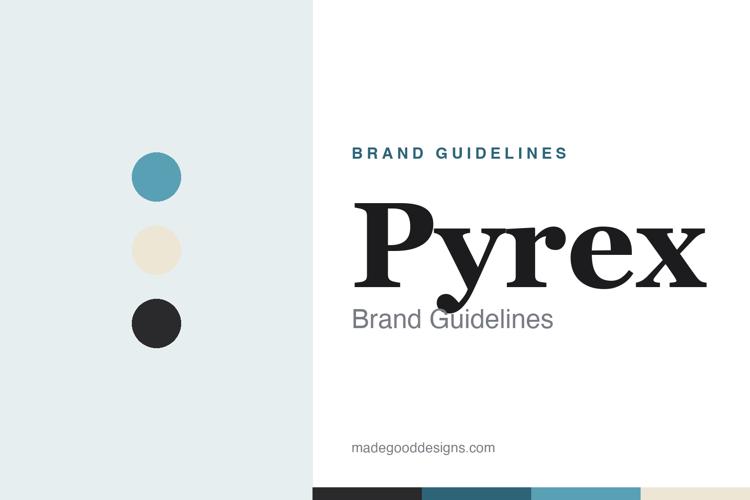
Pyrex Brand Guidelines
Glass you can bake in — a 1915 kitchen experiment, a century of heritage, and the borosilicate question.
Aa
Two constants: a glass-blue-and-cream heritage palette and a classic serif. Abstract homage — not the Pyrex wordmark.
Glass you can bake in
Pyrex proved glass could bake.
Pyrex is a lesson in a kitchen experiment becoming a category. It was introduced by Corning Glass Works in 1915 (debuting with a pie plate). The origin story is charming and real: Corning physicist Jesse Littleton gave his wife Bessie a cut-down “Nonex” (a Corning borosilicate) battery jar to bake in after her ceramic dish broke — it worked beautifully, proving that heat-resistant glass could be used for baking. (An honest note on the name: it likely derives from “Nonex” and an early “pie” play, per Corning’s own telling — not simply the Greek “pyr” for fire, a common oversimplification. Two more: no official brand hex is published, and the wordmark typeface is undocumented.)
Here is the genuinely important, widely-misunderstood story — the borosilicate-versus-soda-lime question. Original Pyrex was borosilicate glass, prized for excellent thermal-shock resistance. Today the product reality is split by region and manufacturer: the US line (made by World Kitchen and now Instant Brands) uses tempered soda-lime glass, while the European line (made by International Cookware) remains borosilicate. ⚠️ But the popular shortcut — that uppercase “PYREX” vs lowercase “pyrex” reliably tells you the glass type — is itself a documented myth: Corning had already begun making soda-lime Pyrex in the 1940s–50s, and the lowercase trademark only appeared in 1975. So capitalisation is a rough branding artifact, not a guaranteed test of composition — and “vintage is always borosilicate” isn’t reliable either.
Pyrex is famous for clear glass measuring cups, mixing bowls and bakeware, and vintage patterned opal-ware is cult-collectible (some pieces fetching hundreds to thousands). On ownership: the US line ran Corning → World Kitchen → Instant Brands (the maker of Instant Pot, which itself filed Chapter 11 in June 2023); the European line is owned by International Cookware. An honest, useful nuance: the Pyrex trademark is still owned by Corning, licensed to the manufacturers. The identity is heritage and clean — glass tones, a classic wordmark. Glass you can bake in.
Colour
Pyrex lives in glass-blue and cream. Click a swatch to copy the hex.
Pyrex’s identity reads through glass tones — the cool blue-green of clear glassware and the warm creams of vintage opal-ware — with charcoal for contrast. The palette is heritage and clean: it evokes a century of kitchen glass, the nostalgia of patterned mid-century bowls, and the honest clarity of the material itself, rather than any loud modern brand colour. It reads as trustworthy, familiar and timeless — fitting a product families keep and pass down. The honest caveat: Pyrex publishes no single official brand hex (there is no one signature “Pyrex blue”), so the glass-blue and cream here are an original, unofficial interpretation, not first-party values.
The lesson is a material can set a heritage palette. Pyrex’s glass-and-cream tones reflect the product itself and its vintage collectibility. For designers, it’s a reminder that a product’s material and history can lead the colour story. The takeaways: let the material and heritage set the palette (glass tones, opal cream); lean on nostalgia for a long-lived brand; and treat specific hexes as unofficial when no single brand colour exists.
Typography
The wordmark is a classic heritage serif spirit — trustworthy and timeless.
Pyrex’s identity carries a classic, heritage, trustworthy spirit — a feel befitting a glassware name that has been in kitchens since 1915. A classic serif captures it well: the timeless letterforms read as dependable, familiar and enduring, matching a brand built on a century of trusted kitchen glass, and the restraint suits a heritage household staple. Set against glass-and-cream tones, the type feels nostalgic and reliable — exactly the trustworthy, timeless personality Pyrex cultivates. It’s classic and heritage rather than trendy, mirroring the enduring glassware. Because the exact wordmark has varied across eras and isn’t a single documented face, the honest description is “a classic heritage serif spirit,” not a named font. The type behaves like the brand: trustworthy, timeless and familiar.
Aa
A classic heritage serif spirit — trustworthy and timeless. (Specimen set in Domine, a classic text serif in the heritage spirit of the Pyrex identity; the real wordmark has varied across eras.)
Heritage and the fine print
Pyrex shows why details matter.
Pyrex is a lesson in heritage brands and the honesty of the fine print. For over a century Pyrex has traded on trust — glass you can bake in, a name your grandmother used — and that heritage is a genuine asset. But Pyrex is also a case study in how a beloved name can outlive a specification change: the quiet shift of the US line from borosilicate to tempered soda-lime glass, and the widespread (incorrect) belief that capitalisation reveals the composition, show how consumer trust in a heritage brand can drift away from the underlying reality. The lesson is two-sided: heritage and nostalgia are powerful brand equity (and Pyrex has them in abundance), but a brand carries a responsibility to be precise about what the product actually is, because the trust is easily strained when the fine print changes and the marketing doesn’t. For a “brand guidelines” homage, the honest move is to celebrate the heritage and get the borosilicate/soda-lime nuance right. Heritage sells; precision keeps it honest.
For designers and brand-builders, Pyrex offers a clear takeaway: heritage is powerful equity, but a brand must stay precise about what it actually is. The lessons: lean on genuine heritage and nostalgia (a century of trusted kitchen glass); be honest and clear when the specification changes (borosilicate vs soda-lime by region); and correct the myths rather than exploit them (capitalisation is not a material test). It’s also a reminder to keep the facts precise — Pyrex was introduced by Corning in 1915, the US line is now tempered soda-lime while the European line stays borosilicate, and the trademark is still Corning’s. Pyrex shows why details matter — proof that heritage and precision must travel together.
Explore & save
Keep Pyrex’s identity on hand — save it to a board in the Made Good inspiration library.
Pyrex identity set
Pin the glass-and-cream palette and the heritage-serif spirit to your own board.


