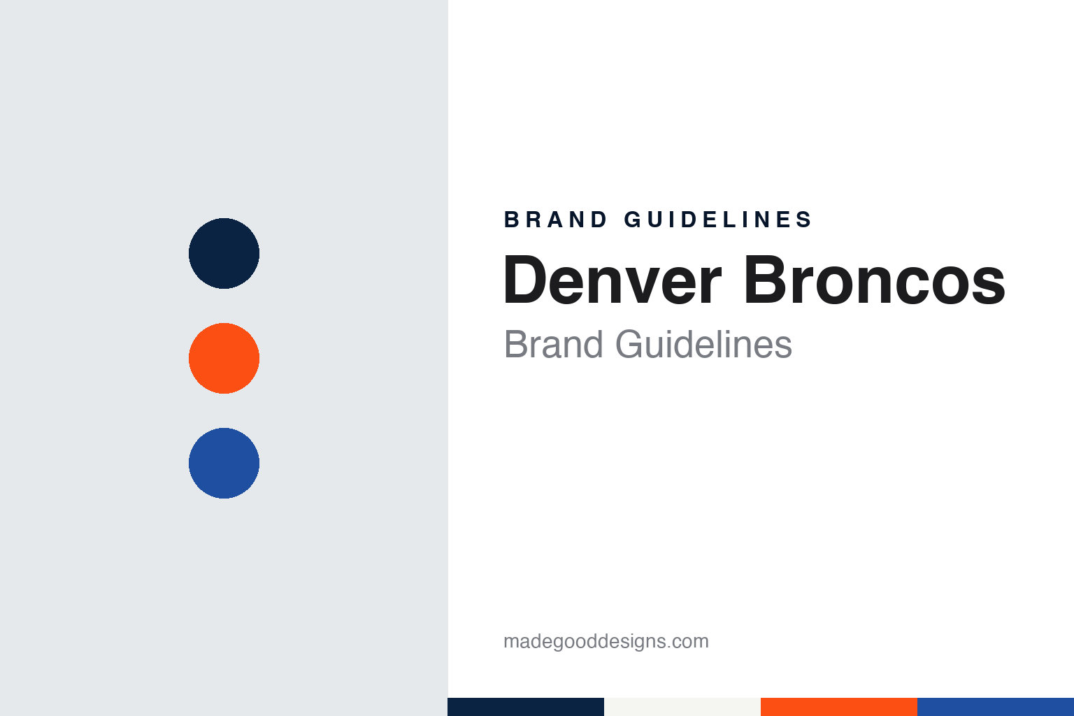
Denver Broncos Brand Guidelines
Striped socks on a bonfire, an orange crush, and a horse with a fiery eye.
Aa
Two constants: a midnight navy, sunset orange and legacy royal palette and a trailhead slab serif register. Abstract homage — not a Denver Broncos product or mark; no helmet, uniform or logo is reproduced.
Mustard, brown and stripes
A baseball man, a name essay and some second-hand kit.
The Denver Broncos were founded by Bob Howsam, a minor-league baseball owner who had built Denver’s Bears Stadium in the 1940s. The Pro Football Hall of Fame’s team history says Howsam was awarded a charter franchise in the new American Football League on 14 August 1959, and English Wikipedia gives the same date. The team began play in 1960 at what Wikipedia calls Mile High Stadium, and the Hall of Fame notes that the club played on the same plot of ground for 41 seasons.
The name came from the public. In ESPN’s NFL Nation guide to the origins of every team name, published on 2 February 2022, Jeff Legwold wrote that a contest was held to name the new franchise and that the winner was a short written argument by Ward M. Vining on why the team should be called the Broncos.
The original uniforms became a story of their own. The Hall of Fame says Howsam, severely limited financially, dressed his inaugural team in used uniforms from the defunct Copper Bowl, a college game in Tucson, Arizona, and that what made them especially easy to mock were the vertically striped socks. Wikipedia describes the set as white and mustard yellow jerseys with brown helmets and brown trousers. The Museum of Jerseys, a uniform-history site, wrote on 9 September 2019 that the team wore mustard and brown with striped stockings in its opening two seasons.
The stripes did not survive. The Hall of Fame says that when Jack Faulkner took over as head coach and general manager two years later, the socks were destroyed in a public burning ceremony. Wikipedia says that in 1962 the club also unveiled a new logo featuring a bucking horse and changed its colours to orange, royal blue and white, with orange helmets and either orange or white jerseys; the Museum of Jerseys likewise dates orange with royal blue and white trim to 1962. In 1968, Wikipedia says, the logo was redrawn so that the horse burst out of a letter “D”, and the helmets turned royal blue. The defence of the late 1970s was nicknamed the “Orange Crush”, after the orange soft drink of that name, and Wikipedia says the label originated in 1977.
Colour
From Howsam to Bowlen to Walton-Penner.
Howsam did not keep the club long. Wikipedia says Gerald Phipps bought the team from him in May 1961 and sold it in 1981 to the Canadian financier Edgar Kaiser Jr., and that in 1984 it was bought by another Canadian, Pat Bowlen. Bowlen placed ownership in a family trust and remained in day-to-day control until 2014, when team president Joe Ellis took charge, Wikipedia says.
On 1 February 2022 the Broncos announced that the team was for sale, and on 7 June 2022 that a group led by the former Walmart chairman Rob Walton had agreed to buy it. Wikipedia says the league approved the purchase on 10 August 2022, and that the group, known as the Walton-Penner Family Ownership Group, includes Walton, his daughter Carrie Walton Penner and her husband Greg Penner, the Walmart chairman, whom the league recognises as the controlling owner. The Associated Press, reporting in April 2024, described Carrie Walton Penner as a co-owner. The Walton-Penner group has owned the Broncos since 2022.
The stadium has had several names. Mile High Stadium was the home from 1960 to 2000, and since 2001 the team has played next door in a new stadium, Wikipedia says, opened as Invesco Field at Mile High, renamed Sports Authority Field at Mile High in 2011 and Broncos Stadium at Mile High in 2016, and called Empower Field at Mile High since September 2019. The stadium displays references to its altitude of 5,280 feet, a mile above sea level. In September 2025, Wikipedia says, the club named Burnham Yard, a former railyard in downtown Denver, as the preferred site for a future stadium.
The club’s live mascot also fed the design. Wikipedia says Thunder, the club’s live animal mascot, was the inspiration for putting a horse-head profile on the helmets in 1997.
Typography
Design and documentation.
An American football club’s identity has to work at very different scales. The helmet logo is the mark people see first: a single shape on a curved shell, read from the upper deck and on a phone screen, so it is usually a bold silhouette with a clear outline and few colours. A wordmark then carries the name on jerseys, sidelines and broadcasts, often in a custom or heavily modified typeface with its own numerals for the back and shoulders of the jersey.
Alternate uniforms give clubs room to play. Throwback sets bring back earlier helmets and stripes for a game or a season, and all-over single-colour “colour rush” style sets push one team colour across helmet, jersey and trousers. Each alternate has to stay recognisable on television next to the opposing side, which is why contrast between home and away kits matters so much.
Sideline apparel — coaches’ jackets, caps, hoodies and staff polos — extends the same marks into retail, away from the field. In the stadium, the palette moves onto end-zone paint, the midfield logo, ribbon boards, wayfinding and concourse signs, where large flat areas of colour and simple type need to read from a distance and in floodlight.
Aa
A trailhead slab serif — the register of a park sign and a nameplate. (Specimen set in Zilla Slab, a slab-serif STAND-IN; NOT the Denver Broncos logo, wordmark or nameplate font.)
Navy, Nike and the horse head
A 1997 overhaul, an orange return and a mountain-themed update.
The 1997 overhaul was a sharp break with the club’s past. Wikipedia says the new logos and uniforms were unveiled on 4 February 1997, with navy blue replacing royal blue. The Museum of Jerseys called the move to navy seismic, and wrote that because it came before league-wide supplier agreements the new look was seen as Nike flexing its design muscles; some critics, it said, thought the panelling on jerseys and trousers was meant to suggest the Nike swoosh. Writing for the team’s website on 31 March 2019, Andrew Mason said the club had wanted a more dynamic, modern look to appeal to a younger generation and had worked with Nike, its uniform supplier, on the design. Mason quoted Bowlen, as published in the Colorado Springs Gazette-Telegraph at the unveiling, saying he felt that playing in uniforms that had essentially been the same for 30 years was not moving the club forward.
The new mark was a profile of a horse’s head with an orange mane and navy outlines. Wikipedia says the team president and Nike’s art director, its creators, described it at the launch as “a powerful horse with a fiery eye and mane.” The Museum of Jerseys quoted Bowlen’s statement that the aim was “a strong, sleek look, a clear identification and an aggressive attitude”. An all-navy combination was shown at the launch and worn in two 1997 preseason games, the site said, before the navy trousers were shelved until 2003; the former tight end Shannon Sharpe later said quarterback John Elway had vetoed them.
Orange came back by stages. An orange alternate jersey arrived in 2002, and from 2012 it became the primary home jersey, with navy moving to the alternate role, according to both Wikipedia and the Museum of Jerseys. On 22 April 2024, the Associated Press’s Arnie Stapleton reported, the club unveiled the “Mile High Collection”, which kept the horse-head helmet logo but added a dark navy helmet in a finish the team calls “metallic satin” and a throwback orange set with the old royal blue “D” helmet. The AP said the colours were named sunset orange, summit white and midnight navy; that Carrie Walton Penner had led a team group to Nike’s headquarters in Beaverton, Oregon, to meet the designers; that an orange “5280” marks the helmet bumpers; that the nameplate lettering is a nod to national park signage in Colorado; and that the neck tag is a triangle inspired by Rocky Mountain summit markers.
For a design guide, the Denver Broncos show how a club can move a long way from its origins, from second-hand mustard and burnt socks to a navy horse head drawn with its kit supplier, and then pull local landscape back into the details. Compare it with Nike, which worked on both the 1997 and 2024 designs, and NFL, the league the AFL club joined in 1970. For this guide we use midnight navy, sunset orange and legacy royal with a slab serif, an unofficial interpretation; no product or logo is reproduced.
Explore & save
Keep Denver Broncos’s identity on hand — save it to a board in the Made Good inspiration library.
Denver Broncos identity set
Pin the Denver Broncos midnight navy, sunset orange and legacy royal palette and the trailhead slab serif register to your own board.