Deutsche Post Brand Guidelines
A horn, a yellow and a letter service.
Aa
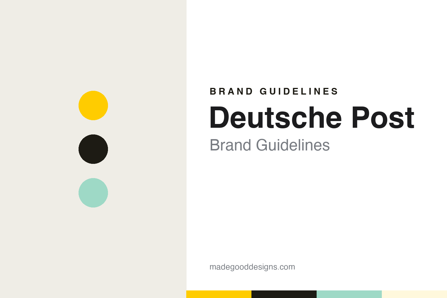
Two constants: a post yellow, black and mint palette and a Humanist sans register. Abstract homage — not a Deutsche Post asset or mark; no post horn, logo or wordmark is reproduced.
From Bundespost to AG
A state postal service turned into a company.
Deutsche Post is the brand of the German letter post, and its history runs back through the state. Wikipedia describes the group behind it as the successor to the federal postal authority, the Deutsche Bundespost, with roots in the imperial post of earlier centuries. The German news agency dpa, reporting in September 2026, traced the core business back further still, to the letter carriage of the Thurn und Taxis family in the fifteenth century.
The modern company dates from the 1990s. On 2 January 1995, Wikipedia says, the postal arm of the Bundespost, Deutsche Bundespost Postdienst, became Deutsche Post AG, a joint-stock company in which the German state kept a large stake. That was the step that turned a government postal service into a business with its own board, accounts and brand.
The listing followed five years later. Deutsche Post went public on the Frankfurt Stock Exchange on 20 November 2000, according to Wikipedia, and the German business daily Börsen-Zeitung, writing in September 2013, dated the flotation to November 2000 as well. In January 2001 the London paper Financial News, in an article republished by Post & Parcel, looked back on the privatisation and noted the group’s full name at the time: Deutsche Post World Net. The article said the offer had been priced during difficult markets and that retail demand outside Germany had been weaker than hoped.
Around the listing the company was also buying abroad. Wikipedia says Deutsche Post began buying shares in the courier DHL in 1998 and owned all of it by December 2002, and that it took over the Dutch carrier Van Gend & Loos and the Swiss forwarder Danzas around the same time. The domestic letter business kept a protected position for a while longer: its exclusive right to deliver letters under 50 grams in Germany ended on 1 January 2008, Wikipedia says, under European rules opening the market.
Colour
The horn and the yellow.
Two elements carry the Deutsche Post identity: the post horn and post yellow. In June 2014 the brand magazine Transform explained the horn. The post horn, it wrote, was an eighteenth- and nineteenth-century instrument blown to announce the arrival of a postal carrier, and it has served as the sign of the German national postal provider since the days of the Deutsche Bundespost. Transform noted that the horn still sat on the Deutsche Post World Net and corporate wordmarks, while the group logo had been simplified to the words Deutsche Post DHL on a yellow band.
The yellow travelled further than the horn. When the German group relaunched its express and logistics business under the DHL name in April 2003, the trade paper Fleet News reported, vans across Europe were given the new red DHL logo on a yellow background. Transform described the same move from the other side: once DHL had been fully integrated, the post yellow of Deutsche Post was added to the courier’s wordmark. One colour now sits behind two brands, the domestic post and the international courier.
A later refresh of the Deutsche Post look was reported by Horizont on 28 September 2021. The magazine said the Stuttgart design and branding agency Strichpunkt had reworked the corporate design so that the logo would work across every medium and touchpoint, making the traditional brand bolder, tidier and more modern. In the new layout, Horizont wrote, post yellow and the post horn kept a central and distinctive role, with a flexible layout system that reduced the main brand elements so they could be applied to any format.
The same report listed the smaller changes. Strichpunkt redrew the illustrations of people used on Deutsche Post channels to match the forms of the existing pictograms, added a secondary colour, mint, for accents in illustrations and infographics, and set headlines in Delivery Bold, a typeface meant to tie Deutsche Post visually to the designs of its parent group and DHL. A digital portal, the Deutsche Post Brand Hub, was set up to give staff templates, a user-interface library and guidance on websites, apps and accessibility, and Horizont said the agency would build an AI-based layout tool by the end of 2022. Andreas Scherfke, of the group’s brand marketing team, told the magazine the aim was a consistent brand experience across all touchpoints.
Typography
Postal services and their emblems.
A postal brand is seen more often on the street than on a screen. Its identity lives on letterboxes, vans, uniforms, counters and stamps, and it has to stay legible at a glance, in rain and from across a road. That is one reason postal services lean so heavily on colour: a single strong hue, often drawn from a national flag or a long-standing tradition, can mark a pillar box or a delivery vehicle before any lettering is read.
The emblems tend to be old ones. The post horn, once blown by mail coaches to announce their arrival, survives in many marks as a simple curved shape, while crowns, eagles and other state symbols recall that the post began as a service of rulers and governments. Modern identities usually simplify these motifs into flat, geometric forms that reproduce cleanly on a van door or a phone screen.
Where a country has more than one official language, the wordmark often carries two names side by side, set so that neither reads as secondary. Looking at these brands means following one mark across many surfaces — box, vehicle, jacket, label — and noticing which elements stay fixed.
Aa
A humanist sans — after a horn and a yellow that stayed put. (Specimen set in Fira Sans, a sans STAND-IN; NOT the Deutsche Post logo or the Delivery typeface.)
Deutsche Post
From parent company to subsidiary.
For years after privatisation, Deutsche Post was also the name of the parent. Even as the group bought DHL and pushed that name across its international businesses, it kept trading as Deutsche Post DHL Group, and its shares were listed as Deutsche Post. Inside Germany the two brands divided the work: Wikipedia says the Deutsche Post brand covers domestic mail, press distribution, retail outlets and direct marketing, while the parcel service in Germany runs under the DHL name.
A step away from that arrangement came in 2023. The trade site STAT Times reported on 20 June 2023 that Deutsche Post DHL Group would rename itself DHL Group from 1 July 2023, and that the Deutsche Post name would continue for the German mail business. Chief executive Tobias Meyer said outside Germany the business almost always used the DHL brand.
The legal change followed on 1 September 2026. That day, dpa reported, the group was entered in the commercial register as DHL AG, and its shares began trading under the DHL name. The name Deutsche Post moved down a level, to a new subsidiary, Deutsche Post AG, responsible for carrying letters and parcels within Germany. Until then, the agency explained, the domestic operating business had been embedded in the holding company, a legacy of the Bundespost years; now it sits alongside the express, freight and supply-chain divisions. The subsidiary is led by Nikola Hagleitner, the DHL board member responsible for the German business, who told dpa that Deutsche Post would remain a reliable part of everyday life for people and companies in Germany. A company spokesperson told the agency the new structure was not a downgrade for Deutsche Post.
The symbols have stayed where they were. A dpa photograph from the same report showed the old post horn logo on top of the Post Tower in Bonn, and the agency wrote that it was meant to stay there, with a Deutsche Post flag at the headquarters framed by DHL flags.
For a design guide, Deutsche Post shows how a postal emblem older than the company can survive privatisation, a listing and a change of parent name. Compare DHL, the courier that took on its yellow, and Royal Mail, another national letter service that became a company. For this guide we use post yellow, black and mint with a sans, an unofficial interpretation; no product or logo is reproduced.
Explore & save
Keep Deutsche Post’s identity on hand — save it to a board in the Made Good inspiration library.
Deutsche Post identity set
Pin the Deutsche Post yellow, black and mint palette and the Humanist sans register to your own board.