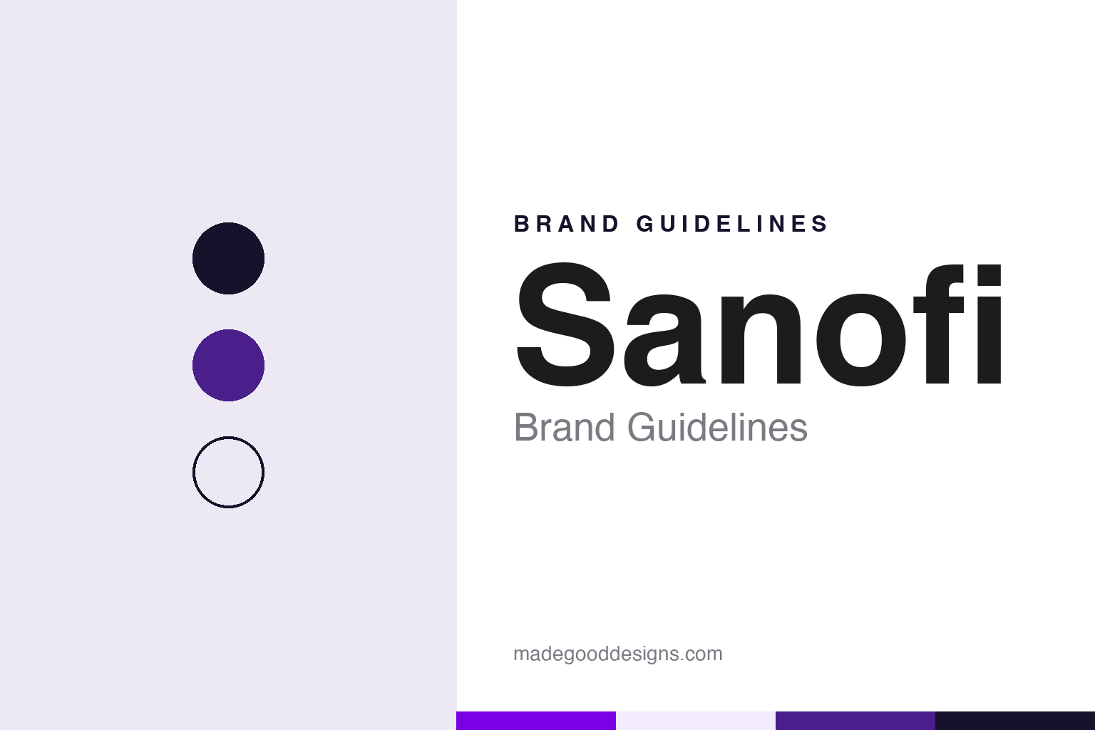
Sanofi Brand Guidelines
One lowercase name, held between two purple dots.
Aa
Two constants: a Sanofi purple, violet and night palette and a Lowercase sans register. Abstract homage — not a Sanofi asset or mark; no logo, dot or wordmark is reproduced.
An oil company’s subsidiary
Elf Aquitaine, Labaz and a new name in 1973.
Sanofi began inside an oil company. According to Wikipedia, it was founded on 15 February 1973 as a subsidiary of Elf Aquitaine, the French oil group later acquired by Total, when Elf Aquitaine took control of the Labaz group, a pharmaceutical business formed in 1947. Jean-François Dehecq was the general manager of Sanofi from its creation in 1973 until 2007, Wikipedia says, which gave the young company one leader through most of its name changes.
The name has been stretched and shortened several times since. The first extension came in 1999, when Sanofi merged with Synthélabo to form Sanofi-Synthélabo, based in Paris. Synthélabo had its own compound history: Wikipedia says it was founded in 1970 through the merger of two French laboratories, Laboratoires Dausse and Laboratoires Robert & Carrière, and that the cosmetics group L’Oréal acquired the majority of its share capital in 1973.
The second extension came five years later. Aventis had been formed in 1999, when the French company Rhône-Poulenc merged with the German group Hoechst Marion Roussel, itself the result of earlier mergers. In 2004, after a takeover battle of several months, Sanofi-Synthélabo acquired Aventis and the combined company took the name Sanofi-Aventis, Wikipedia says.
The hyphenated name lasted seven years. The company dropped the -Aventis suffix on 6 May 2011, after approval at its annual general meeting. The reason the company gave, according to Wikipedia, was to make its name easier to pronounce in countries such as China. The same year it acquired the American company Genzyme, whose name, like Pasteur’s, continued for some years as a division name alongside Sanofi.
From 2011 the corporate name was a single word again, the one chosen in 1973. What remained was the question of the many other names that sat beside it, and that is what the 2022 identity set out to address.
Colour
2022: one brand, two dots.
Sanofi introduced a new corporate brand and logo in the first week of February 2022. Campaign Asia, in a report by Diana Bradley published on 6 February 2022 and drawing on PRWeek, wrote that the company had rolled out a new logo and a new purpose that week. Under the change, the sub-brands Sanofi Pasteur and Sanofi Genzyme were united under the single name Sanofi. Internally, staff would continue to work in one of four global business units; the business names changed, but the reporting lines did not.
The reasoning was about names. Josep Catllà, Sanofi’s head of corporate affairs, told the publication that the company had lost its stakeholders with multiple names, and that when Sanofi had acquired companies in the past it had not changed their look and feel, leaving the group fragmented. The new identity was meant to connect all of its businesses and employees under one name.
The logo itself is a lowercase wordmark with two purple dots. In its statement, quoted by Campaign Asia, Sanofi said the design was “inspired by the simple and motion-oriented codes of the tech industry”, and that the two dots represent a journey between a starting point, the question “what if?”, and a finish line. The logo was created with the brand consultancy FutureBrand, part of the Interpublic Group, while Weber Shandwick and Jack Morton worked with Sanofi on the launch, the report said.
The launch leaned on people rather than products. To promote the rebrand, Campaign Asia wrote, Sanofi released a series of films, shown internally and externally, in which employees talk about why they work at the company. The change also followed a strategy introduced in December 2019 by Paul Hudson, who had become chief executive that year.
The result simplified the visible system to one word in one colour family. Where the earlier group had shown several division names side by side, the 2022 identity let a single lowercase name do the work, with the two dots acting as a repeatable device for the rest of the system.
Typography
Pharmaceutical names and their marks.
Pharmaceutical corporate identities are shaped as much by corporate history as by design. Many of the names in this sector were built through mergers, and the result is often a compound of two older names, a contraction of a longer one, or a set of initials that eventually replaces the full name altogether. A rename after a merger or a spin-off is usually the moment when a new logo, a new colour and a new typeface arrive together, presented as a single programme rather than a piecemeal refresh.
The marks themselves tend towards the abstract: interlocking shapes, simple geometric symbols or a plain wordmark, rather than pictures of anything specific. Palettes are often restrained, built around one signature colour with white space and a neutral supporting set, so that the same identity can sit on a corporate report, a laboratory building and a recruitment page without changing tone.
Promotion in this field is also regulated in many countries, with rules on what companies may say about medicines and to whom. That framework pushes corporate branding towards the company name, its values and its people, while product communication follows separate rules. The guides in this round look only at the corporate side: names, marks, colours and the dated changes behind them.
Aa
A lowercase sans — after a wordmark created with FutureBrand in 2022. (Specimen set in DM Sans, a sans STAND-IN; NOT the Sanofi logo or typeface.)
Sanofi
Paris addresses and a single name.
Sanofi has always been a Paris company, but its offices have moved. According to Wikipedia, in January 2012 it moved its head office to the 8th arrondissement of Paris, from a previous base in the 13th arrondissement. After the Aventis merger, staff from the former Aventis head office in Schiltigheim, Alsace, had moved to Paris. In November 2022, the same year as the new identity, Sanofi moved into a new global headquarters in the 17th arrondissement. The company trades on Euronext Paris and on Nasdaq in the United States.
The name history is the clearest part of the brand story. Sanofi began as a single word in 1973, became Sanofi-Synthélabo in 1999 and Sanofi-Aventis in 2004, and returned to Sanofi in 2011. The 2022 change then retired the division names that had grown up beside it, so that the corporate name now covers the whole group, from vaccines to consumer health, in the same lowercase form.
That sequence also shows how a pharmaceutical identity tends to be built: through dated decisions about names, made at annual meetings and announced with new logos, rather than through product advertising. Each step reduced the number of words on the sign.
For a design guide, Sanofi shows how a company assembled through mergers can return to its original one-word name, retire its division names, and give the result a lowercase wordmark with a simple repeatable device. Compare GSK, which shortened a merged name to initials in 2022, and Novartis, another European company formed by merger. For this guide we use dot purple, deep violet, night and lilac mist with a sans, an unofficial interpretation; no product or logo is reproduced.
Explore & save
Keep Sanofi’s identity on hand — save it to a board in the Made Good inspiration library.
Sanofi identity set
Pin the Sanofi purple, violet and night palette and the Lowercase sans register to your own board.