Novartis Brand Guidelines
Two Basel chemical houses and a Latin name.
Aa
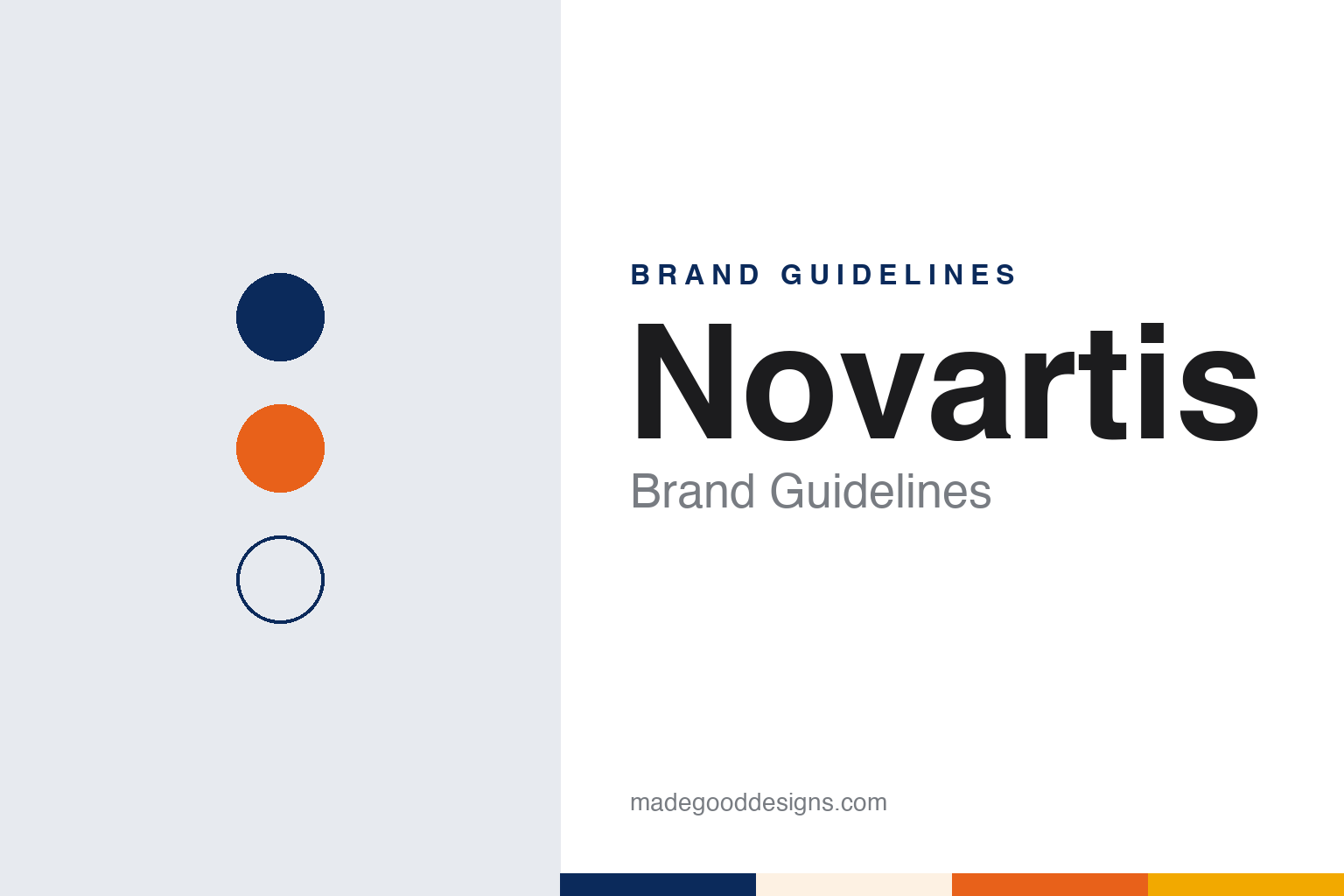
Two constants: a navy, orange and amber palette and a Rounded grotesk register. Abstract homage — not a Novartis asset or mark; no logo or wordmark is reproduced.
Dyes on the Rhine
Ciba, Geigy and Sandoz.
Novartis is a young name for an old set of businesses. It was formed in 1996, Wikipedia says, by the merger of two Basel companies, Ciba-Geigy and Sandoz, whose pharmaceutical and agrochemical divisions were brought together as a new independent company. Other parts of the two groups were sold or spun off, among them Ciba Specialty Chemicals.
Both halves began in the Basel dye trade. Ciba traces back to 1859, when, according to Wikipedia, Alexander Clavel began making the dye fuchsine at his silk-dyeing works in the city. He sold the dye factory in 1873 to Bindschedler and Busch, which in 1884 became a joint-stock company called the Gesellschaft für Chemische Industrie Basel, or Company for Chemical Industry Basel. Its initials gave the name CIBA. In 1970 CIBA merged with J. R. Geigy, another Basel firm, to form Ciba-Geigy.
Sandoz began as a partnership. In 1886, Wikipedia says, Alfred Kern and Edouard Sandoz founded the Chemiefirma Kern und Sandoz, whose early products included the dyes alizarin blue and auramine. After Kern’s death the firm was turned into a corporation in 1895 under the name Chemische Fabrik vormals Sandoz.
So when the two groups merged, neither inherited name was kept for the whole. Wikipedia says the new name, Novartis, was based on the Latin novae artes, meaning “new skills”. It is a coined word, not a surname and not a place, and it replaced the names of both predecessors at group level.
Colour
A logo kept, a system rebuilt.
The Sandoz name did not stay retired. Wikipedia says it disappeared for a few years after the merger and was revived in 2003, when Novartis gathered its generic-medicines businesses into a single subsidiary and called it Sandoz. Twenty years later the two names separated again: on 4 October 2023, Wikipedia records, Novartis completed the spin-off of Sandoz as a stand-alone company.
That separation set up the latest change to the Novartis identity, which came two months later. On 5 December 2023 Fierce Pharma, in a report by Ben Adams, described a new look for the company after the spin-off. Unlike several of its peers, it said, the refresh did not include a new logo; it updated the design around it. Novartis told the publication that the system drew on its Swiss design heritage and used biomorphic shapes, a fluid design, colour transitions and warmer imagery.
The colours were the clearest change. Fierce Pharma reported that the new shapes and warmer colours on the company’s websites and social media took up the original colours of the logo, red, blue and yellow, and then moved beyond them. Sreejit Mohan, the company’s global head of corporate brand strategy, told the publication that Novartis built its scheme out from the logo to primary colours including navy, orange and amber, with secondary colours for other settings. He said the shapes came from the concept of the circle, which he linked to the idea of partners around a table.
The tagline changed as well, from “Reimagining medicine”, used since 2016, to “Reimagining medicine together”. An agency worked on the refresh, Fierce Pharma said, though the company did not name it. Mohan said the starting point was a shift in positioning, towards showing partnerships and work beyond the science alone, and then asking how to show that visually. He explained the decision to keep the logo in terms of recognition: there was, he said, a strong internal conviction that the existing name and mark carried a lot of equity, in European markets and also in China and Japan.
Typography
Corporate marks in pharma.
Pharmaceutical corporate identities are shaped as much by corporate history as by design. Many of the names in this sector were built through mergers, and the result is often a compound of two older names, a contraction of a longer one, or a set of initials that eventually replaces the full name altogether. A rename after a merger or a spin-off is usually the moment when a new logo, a new colour and a new typeface arrive together, presented as a single programme rather than a piecemeal refresh.
The marks themselves tend towards the abstract: interlocking shapes, simple geometric symbols or a plain wordmark, rather than pictures of anything specific. Palettes are often restrained, built around one signature colour with white space and a neutral supporting set, so that the same identity can sit on a corporate report, a laboratory building and a recruitment page without changing tone.
Promotion in this field is also regulated in many countries, with rules on what companies may say about medicines and to whom. That framework pushes corporate branding towards the company name, its values and its people, while product communication follows separate rules. The guides in this round look only at the corporate side: names, marks, colours and the dated changes behind them.
Aa
A rounded grotesk — after the circular shapes of the 2023 Novartis design system. (Specimen set in Manrope, a sans STAND-IN; NOT the Novartis logo or typeface.)
Novartis
Circles on the campus.
The circle that Mohan described in 2023 also turned up in a building. The Novartis Pavilion, on the company’s campus beside the Rhine in Basel, is a round structure designed by AMDL Circle, the studio led by the architect and designer Michele De Lucchi. Dezeen reported on 24 November 2023 that it is wrapped in a media facade created by the Switzerland-based studio Iart, made from photovoltaic modules with embedded LEDs, and that AMDL Circle worked with the local architects Blaser Butscher on the planning and delivery.
The facade carries digital works by the artists Daniel Canogar, Esther Hunziker and the duo Semiconductor, made in collaboration with Novartis scientists. Iart founder Valentin Spiess told Dezeen that the artworks drew on the shapes and colours of cells and molecules. De Lucchi said the floor plan was inspired by the symbolism of the circle. Inside, according to the same report, the materials are whitened laminated wood, a light grey terrazzo floor, natural oak and dark green curtains.
Novartis also had a long financial tie to its Basel neighbour. Novartis had been a shareholder of Roche since May 2001, the news agency AFP reported on 4 November 2021, when the two companies announced that Roche would buy back the voting shares Novartis held. Novartis chief executive Vas Narasimhan said that after more than twenty years as a shareholder, the company had decided it was the right time to sell.
Read together, the threads of the identity are consistent. A merged company chose a coined Latin name instead of any of its founders’ names; it revived Sandoz as a separate brand and then let it go; and when it refreshed its look it kept the logo and changed the shapes, colours and tone around it.
For a design guide, Novartis shows how a merged company can build a lasting brand on an invented name. Compare Roche, its Basel neighbour, and Sanofi, another European company formed by mergers. For this guide we use navy, orange, amber and a warm cream with a sans, an unofficial interpretation; no product or logo is reproduced.
Explore & save
Keep Novartis’s identity on hand — save it to a board in the Made Good inspiration library.
Novartis identity set
Pin the Novartis navy, orange and amber palette and the Rounded grotesk register to your own board.