MetLife Brand Guidelines
A New York life insurer that swapped a beagle for a letter.
Aa
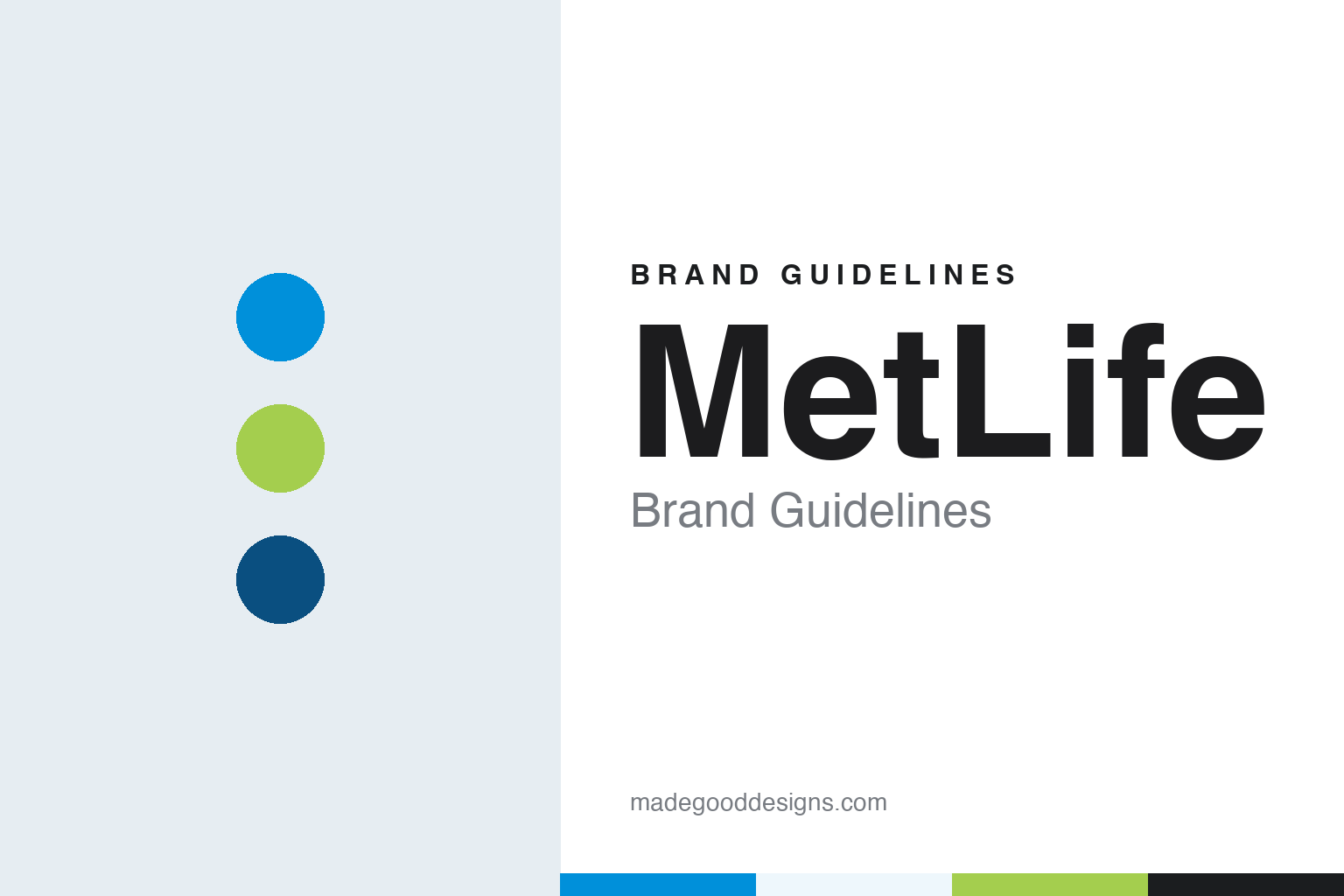
Two constants: a sky blue, leaf green and deep blue palette and a Geometric sans register. Abstract homage — not a MetLife asset or mark; no logo, symbol, character or wordmark is reproduced.
The Metropolitan
Lower Broadway, 1863–1868.
MetLife’s story begins with a different name. In 1863, during the American Civil War, a group of New York City business leaders founded the National Union Life and Limb Insurance Company, with its headquarters on lower Broadway, to insure soldiers and sailors against disability from wounds, accidents and sickness, according to Wikipedia. On 24 March 1868 it became the Metropolitan Life Insurance Company and shifted its focus to life insurance, Wikipedia says; the company treats that date as its founding.
The new name tied the business to the city it served. Metropolitan Life grew through what were called “industrial” or workingmen’s policies, sold in small amounts with premiums collected weekly or monthly at the policyholder’s home, a model that Wikipedia says its president Joseph F. Knapp brought to the United States after observing the British insurance industry in 1879. The long name was shortened in everyday use to Met Life, and later written as one word, MetLife.
An early piece of MetLife branding was a building. In 1890 it commissioned the Metropolitan Life Insurance Company Building on 23rd Street in Manhattan as its home office, completed in stages through 1905, Wikipedia says. A clock tower was commissioned beside it in 1907 and completed two years later. The home office complex, which came to include the art deco Metropolitan Life North Building, remained the company’s headquarters until 2005.
The tower went straight into the advertising. For many years, Wikipedia says, an illustration of the Metropolitan Life Tower, with light shining from the tip of its spire, appeared prominently in MetLife’s advertisements under the slogan “The Light That Never Fails.” A building, a beam of light and a promise of reliability carried the brand for decades before any cartoon character did.
The company’s ownership also changed shape over the twentieth century. On 6 January 1915 MetLife completed its conversion from a stock company owned by individuals into a mutual company run for the benefit of its policyholders, and after 85 years as a mutual it demutualised and became a publicly traded company with an initial public offering in 2000, Wikipedia says.
Colour
Snoopy, blimps and a building.
In 1985 MetLife turned to the comic strip Peanuts. It began using Snoopy, Charlie Brown, Linus and Lucy in life insurance advertisements, on business cards and even on blimps, The Christian Science Monitor reported in October 2016. Wikipedia says the Peanuts-based campaign was developed by the advertising agency Young & Rubicam, and that MetLife also used Foote, Cone & Belding for Peanuts-related promotions. The characters were licensed from the holders of the rights to Charles M. Schulz’s work.
The blimps carried the characters into the sky. The MetLife blimp programme began in 1987 with an airship named “Snoopy 1” and added “Snoopy 2” in 1994, Wikipedia says, providing overhead television coverage of golf, American football, basketball and horse racing. When MetLife ended its Peanuts branding, it closed the blimp programme as well.
Alongside the beagle, the company kept a corporate mark of its own. LogoLounge reported in October 2016 that MetLife’s earlier logo, a four-M mark, had been designed by Don Ervin in 1964. The company’s name also went up on a Manhattan building: in 1981, Wikipedia says, MetLife bought the Pan Am Building in Manhattan, the building was later renamed, and the Pan Am logo at the top was replaced with MetLife’s.
Sport put the name on a stadium. On 23 August 2011, the Associated Press reported, published on NFL.com, MetLife signed an agreement with the New York Jets and New York Giants for the naming rights to their one-year-old stadium in East Rutherford, New Jersey, which had been known as New Meadowlands Stadium, to call it MetLife Stadium for the next 25 years. As part of the deal, the area of the Meadowlands complex that includes the stadium, the racetrack and the Giants’ headquarters was to be known as the MetLife sports complex, the AP reported. At the news conference, the chief executive, Steven A. Kandarian, sat behind a white helmet bearing the words MetLife Stadium, a New York City skyline and a blimp. In January 2017, Wikipedia says, MetLife also agreed to rename the Seibu Dome in Tokorozawa, Japan, as the MetLife Dome.
Typography
Insurance names, symbols and colours.
Insurance identities have an unusual job: they sell a promise that may not be called on for decades, so the visual language tends to signal permanence rather than novelty. Many of the long-established houses reach for heraldry — eagles, lions, shields and robed allegorical figures — borrowing the vocabulary of civic seals and coats of arms to suggest that the company will still be standing when a policy matures. Over time, many of those emblems have been simplified, flattened and redrawn for screens, often keeping a single recognisable silhouette while losing the fine engraving of the originals.
A second family of marks reduces the name to a single letter or a short set of initials, which travels across languages and reads at small sizes on an app icon. Blue recurs across the sector because it is widely read as calm and dependable, though reds and deep greens also appear. Sponsorship adds another layer: stadium and arena naming rights, shirt deals and long-running mascot or character campaigns have put insurance names in front of audiences who never read a policy document, and the end of such a deal can be as visible as its start.
Aa
A geometric sans — after a blue and green letter “M”. (Specimen set in Manrope, a sans STAND-IN; NOT the MetLife logo or any MetLife typeface.)
MetLife
Goodbye, Snoopy; hello, “M”.
The Peanuts era ended in October 2016. MetLife announced on 20 October 2016 that Snoopy would no longer be its mascot, ending a 31-year relationship with the characters as it prepared a new logo and tagline starting in 2017, The Christian Science Monitor reported. The change came as the company was parting with most of its consumer life insurance business in the United States. Wikipedia says MetLife had announced in January 2016 that it would spin off its US retail business as a separate company, Brighthouse Financial, which launched in March 2017; the continuing MetLife kept the stadium naming rights.
The new identity was designed by Prophet. Graphic Design USA reported in November 2016 that MetLife had launched a global brand platform under the tagline “MetLife. Navigating life together.”, with an updated visual identity, logo and tagline. According to the agency, as quoted by the publication, the new brandmark brings blue and green together in a symbol of partnership to form an M, with the company name in black; the familiar MetLife blue was brightened and now sits alongside a green meant to represent “life, renewal and energy,” and a broader palette adds secondary colours. LogoLounge described the new mark in October 2016 as a highly simplified, organic, green and blue M shape, and said the typography was more relaxed though very similar to the previous version.
The company explained the move in terms of its customers. Its global chief marketing officer, Esther Lee, told Graphic Design USA that the Snoopy characters had been added to make the company “friendly and approachable,” but that thirty years later customers were looking for a partner to help them navigate important times in their lives. The publication reported that the design went live across mobile, social and web properties, with newspaper advertising first and broadcast to follow in December 2016.
The beagle did not disappear for good. Wikipedia says MetLife brought Snoopy back in 2023 as a mascot for its new MetLife Pet Insurance business, a narrower role than the one the character had played across the whole brand.
For a design guide, MetLife shows a brand that has borrowed its personality in turn from a building, a cartoon character and finally a letter, and how a licensed character can become so closely tied to a company that retiring it becomes news. Compare Prudential, another life insurer whose name is a word rather than a place, and Allianz, which also put its name on stadiums. For this guide we use a sky blue, a leaf green and a deep blue with a sans, an unofficial interpretation; no product or logo is reproduced.
Explore & save
Keep MetLife’s identity on hand — save it to a board in the Made Good inspiration library.
MetLife identity set
Pin the MetLife sky blue, leaf green and deep blue palette and the Geometric sans register to your own board.