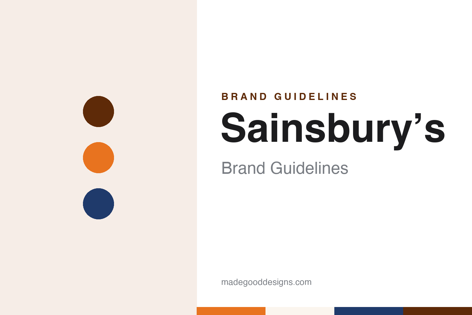
Sainsbury’s Brand Guidelines
A dairy on Drury Lane and a packaging studio in the 1960s.
Aa
Two constants: a shop orange, Greenwich navy and dairy white palette and an own-label sans register. Abstract homage — not a Sainsbury’s product or mark; no logo, label or packaging is reproduced.
Drury Lane
Eggs, milk and butter on a London street, and a sign with a motto.
Sainsbury’s began as a dairy. English Wikipedia says the business was established as a partnership in 1869, when John James Sainsbury and his wife Mary Ann Sainsbury opened a shop at 173 Drury Lane in Covent Garden, London. The Sainsbury Archivist, Allison Foster, writing on the London Museum blog in 2021, said the opening shop sold only three items, eggs, milk and butter, before the range expanded to other groceries. According to Wikipedia, the trading philosophy was painted on a sign outside: “Quality perfect, prices lower”.
The early identity lived in paper and string rather than in a logo. Foster wrote that when groceries were introduced in 1903, tea was sold in paper packets lined with foil and closed with different coloured seals to mark different blends, while sugar went into thick blue paper bags, flour into reusable cotton bags, and butter, cheese and sausages into greaseproof and brown paper tied with string. An order of York ham, she wrote, came in a white box with green edging and green ribbon, and hand-raised pork pies in boxes decorated with poppies and corn.
The company had a pun for a mark. Foster described the “Sains-berry” design, an S with a pattern of holly berries, which appeared on earthenware jars for bloater paste, potted meats and jams, and said it was the company’s registered trademark between 1909 and 1951. In the 1930s and 1940s, she wrote, several product names were used for Sainsbury’s goods: Selsa for a wide range of groceries, Crelos for margarine and Basket Brand for tinned fruit. Those names were dropped during the Second World War, and new products were branded with the Sainsbury name.
The archive that holds this record is now kept by the London Museum. Foster wrote that the Sainsbury Archive charts the company from its foundation in Drury Lane to the present, and that it is particularly strong in product packaging, spanning the company’s 150-year history.
Colour
A consultant, a studio and an orange relaunch.
Self-service changed the packaging. Foster wrote that the move from counter service, where goods were weighed and wrapped for each customer, to self-service, where shoppers took items from shelves, prompted a revolution in packaging design: a pack had to protect its contents, survive handling, stack easily and be identifiable from any angle. Sainsbury’s appointed Leonard Beaumont as its design consultant in 1950, and he used only one typeface, Albertus, with stylised graphics and muted colours to create a clean image that echoed the design of the self-service shops.
The company then brought the work in-house. Foster wrote that Sainsbury’s set up its own Design Studio in 1962, led by Peter Dixon, whose small team of five designers was charged with designing packaging for every item of the Sainsbury’s own-label range. Dixon used bold colours and patterns in a style Foster called influential “pop art”, and restrained, geometric illustrations elsewhere. Dixon recalled that the company logo had to be prominent and was later set in Venus Bold Extended, and that otherwise designers had three colours of their choice and as many typefaces as they wanted. Design magazine, Foster wrote, described the results as “austere and even Bauhaus”, and the director John Davan Sainsbury personally approved every design at a weekly Monday morning meeting. The standard was later extended to building design, shopfront lettering, store layout and advertising.
The studio was wound down during the 1990s, according to Foster, and packaging design was outsourced. In June 1999, Wikipedia says, Sainsbury’s unveiled a new corporate identity developed by 20/20 Design and Strategy, including the current company logo and new corporate colours of “living orange” and blue. Wikipedia also records a flagship store at Greenwich that trialled the new interior look, giving rise to the term “Greenwich Blue”, and a strapline, “Try something new today”, introduced in September 2005 and created by Abbott Mead Vickers BBDO.
The older designs have since returned to the shop floor. Foster wrote that for the company’s 150th birthday in 2019, studio-era packaging designs were used on a series of carrier bags, a complete set of which is held in the archive.
Typography
Design and documentation.
A retail identity is read in passing, often from across a street, so it tends to lean on a few repeated signals rather than a single mark. A founder’s name above the door is a common one: a surname turned into a wordmark carries a sense of a particular person and place long after the business has changed hands. The shopfront works at the scale of architecture, where fascia lettering, window frames, awnings and the material of the building itself become part of how a name is remembered.
The carrier bag moves that identity out of the shop and along the pavement, so bag colour can matter as much as the logo itself. A consistent house colour lets a fleet of vans, a loyalty card, a till receipt and a website feel like one voice. Inside, signage and wayfinding do quieter work: department names, aisle markers and shelf labels need a typeface that stays legible at a distance and under strip lighting. Reading these pieces together, rather than the logo alone, gives a fuller picture of how a shop presents itself.
Aa
An own-label sans — the register of a 1960s tin label and a supermarket fascia. (Specimen set in Archivo, a sans-serif STAND-IN; NOT the Sainsbury’s logo.)
Sainsbury’s
A grocer that designed its own packs for three decades.
Much of Sainsbury’s visual history survives as packaging. The Sainsbury Archive, held by the London Museum, runs from coloured tea seals and blue sugar bags through the Sains-berry trademark to Beaumont’s Albertus labels and Dixon’s studio work, so the identity can be followed pack by pack rather than through a single logo.
The thread that runs through Foster’s account is control. Beaumont limited himself to one typeface; Dixon’s studio worked to a fixed logo setting and a three-colour allowance; a director signed off every design each week; and the same standard was rolled out to shopfront lettering and store layout. The 1999 identity by 20/20 Design and Strategy moved the brand on to orange and blue, but it inherited a company used to treating its own label as its main canvas.
The 2019 carrier bags close the loop. By reprinting studio-era designs for the 150th birthday, the company used its archive as a source for new brand material, as Foster recorded.
For a design guide, Sainsbury’s shows how an own-label grocer can build an identity out of thousands of individual packs, governed by a small set of rules, and how an archive can feed back into the present. Compare it with its long-standing rival Tesco and with Marks & Spencer, whose own St Michael label ran across the same decades. For this guide we use shop orange, Greenwich navy and dairy white with a sans, an unofficial interpretation; no product or logo is reproduced.
Explore & save
Keep Sainsbury’s’s identity on hand — save it to a board in the Made Good inspiration library.
Sainsbury’s identity set
Pin the Sainsbury’s shop orange, Greenwich navy and dairy white palette and the own-label sans register to your own board.