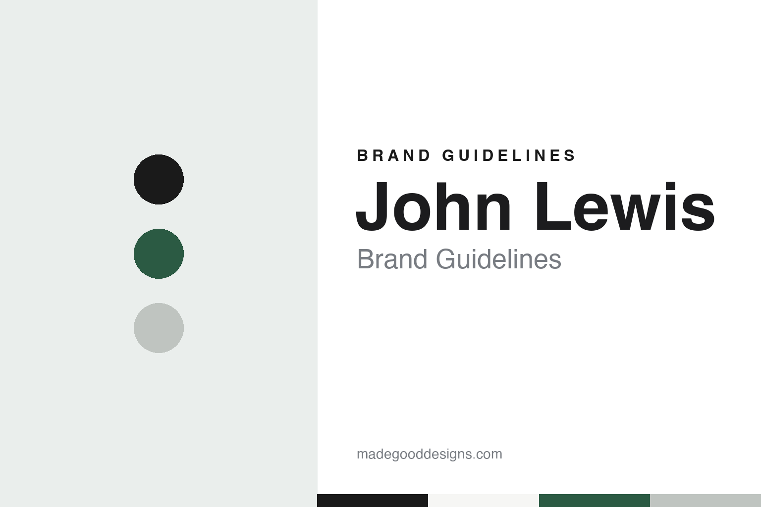
John Lewis Brand Guidelines
A draper on Oxford Street, a partnership and a pattern of diamonds.
Aa
Two constants: a store black, partner green and gift-box white palette and a humanist sans register. Abstract homage — not a John Lewis product or mark; no logo, pattern or packaging is reproduced.
Oxford Street
A draper’s shop, a son’s experiment and a business owned by its staff.
John Lewis began as a drapery shop on Oxford Street. English Wikipedia says the founder, John Lewis, opened the shop in 1864, on the site that is still the company’s flagship store, and that in 1905 he acquired a second store, Peter Jones in Sloane Square. The same source says the Oxford Street building was rebuilt in 1953 after bomb damage in the Second World War. Dezeen, reporting on the company’s identity on 6 September 2018, described the founder’s beginnings as a haberdasher, and the design studio Pentagram referred back to that trade in its later work on the brand.
The business took its present shape under the founder’s son. Wikipedia says John Spedan Lewis developed the idea of a partnership during his time in charge of Peter Jones, began the John Lewis Partnership in the 1920s, and started an in-house magazine, the Gazette, in 1918. Dezeen dated the partnership to 1929 and said each employee is a partner with partial ownership of the company. That structure is what the 2018 rebrand set out to highlight, according to Retail Gazette.
The partnership grew by buying other shops and, for many years, keeping their names. Wikipedia lists department stores such as Jessop & Son in Nottingham, Cole Brothers in Sheffield, Bainbridge’s in Newcastle and Tyrrell & Green in Southampton, and says they kept their own names until the early 2000s, when they were renamed John Lewis. Peter Jones still trades under its own name. The partnership also took over the grocer Waitrose in 1937, according to Wikipedia, which today operates as its supermarket arm.
The company also built up its own product names. Wikipedia says the partnership launched Jonelle as its own-brand name in 1937, and that from 2001 this was gradually replaced by the John Lewis name. A price promise, “Never Knowingly Undersold”, was used from 1925; Wikipedia says the company ended it in 2022 and announced on 5 September 2024 that it was bringing it back.
Colour
A 1960s pattern, a 2018 rename and a Christmas film each year.
One documented piece of John Lewis graphic design is a pattern. Dezeen reported that in the 1960s the graphic designer Peter Hatch created a “diamond pattern” for the business, and that Pentagram used Hatch’s work as a direct guide when it drew new line patterns for the brand in 2018, as a nod to John Lewis’s beginnings as a haberdasher.
That 2018 work renamed the shops. Retail Gazette reported on 4 September 2018 that John Lewis and Waitrose had added “& Partners” to their names, becoming John Lewis & Partners and Waitrose & Partners, to highlight the partnership business model. The new names were unveiled that morning on the façades of the Oxford Street flagship and the shop at Westfield London, and on the two retailers’ websites, carrier bags, uniforms, trolleys, internal signs and selected lorries and vans, with the change to every shop front phased over several years alongside refurbishments. The managing director, Paula Nickolds, told the paper the change to the visual identity put partners “back at the heart of everything we do”.
Dezeen said the identity was designed by Harry Pearce, a partner at Pentagram, and described it as a rebrand of the business. Pearce used Gill Sans in the wordmarks, chose a monochrome palette for John Lewis and greens for Waitrose, and created a bespoke colour, Partner Green, for internal communication, referring to the green ink John Spedan Lewis used to sign his correspondence.
The Christmas advert is the company’s other recurring piece of brand work. FashionUnited reported on 13 November 2017 that John Lewis began its Christmas television adverts in 2007, working with the agency Lowe London for two years before moving to adam&eveDDB. The same report listed The Long Wait in 2011; Man on the Moon in 2015, set to a version of Oasis’s “Half the World Away” sung by the Norwegian singer Aurora; Buster the Boxer in 2016, ending with the tagline “Gifts that everyone will love”; and Moz the Monster in 2017, directed by Michel Gondry and set to Elbow’s cover of “Golden Slumbers”.
Typography
Design and documentation.
A retail identity is read in passing, often from across a street, so it tends to lean on a few repeated signals rather than a single mark. A founder’s name above the door is a common one: a surname turned into a wordmark carries a sense of a particular person and place long after the business has changed hands. The shopfront works at the scale of architecture, where fascia lettering, window frames, awnings and the material of the building itself become part of how a name is remembered.
The carrier bag moves that identity out of the shop and along the pavement, so bag colour can matter as much as the logo itself. A consistent house colour lets a fleet of vans, a loyalty card, a till receipt and a website feel like one voice. Inside, signage and wayfinding do quieter work: department names, aisle markers and shelf labels need a typeface that stays legible at a distance and under strip lighting. Reading these pieces together, rather than the logo alone, gives a fuller picture of how a shop presents itself.
Aa
A humanist sans — the register of a store directory and a carrier bag. (Specimen set in Hanken Grotesk, a sans-serif STAND-IN; NOT the John Lewis logo or Gill Sans.)
John Lewis
A founder’s name, a pattern from a draper’s counter and the word “Partners”.
John Lewis’s identity is built on a name, a pattern and a structure. The name is the founder’s, carried from one Oxford Street shop to department stores that once traded under other family names. The pattern is Peter Hatch’s diamond design of the 1960s, which Pentagram treated as a reference when it drew new line patterns in 2018. The structure is the partnership, which the 2018 rebrand wrote into the name itself.
The 2018 change put the company’s ownership model on the fascia. According to Retail Gazette and Dezeen, “& Partners” went onto shop fronts, carrier bags, uniforms and vans, while Partner Green, a colour taken from the founder’s son’s signing ink, was kept for internal use. Gill Sans and a monochrome palette kept the department-store mark plain, leaving colour to Waitrose.
The Christmas films do a different job. Rather than redesigning the mark, they return each November with a new story and a cover version of a familiar song, a pattern that FashionUnited traced from 2007 through the adam&eveDDB years.
For a design guide, John Lewis shows how a retailer can turn its ownership structure into identity, take a 1960s pattern as a design reference, and use a seasonal film as a repeated brand moment. Compare it with Marks & Spencer and with the London department store Selfridges. For this guide we use store black, partner green and gift-box white with a sans, an unofficial interpretation; no product or logo is reproduced.
Explore & save
Keep John Lewis’s identity on hand — save it to a board in the Made Good inspiration library.
John Lewis identity set
Pin the John Lewis store black, partner green and gift-box white palette and the humanist sans register to your own board.