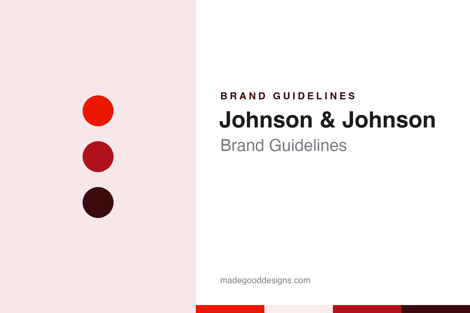
Johnson & Johnson Brand Guidelines
A brother’s signature, a red script and a single pen stroke.
Aa
Two constants: a signal red, crimson and oxblood palette and a Neo-grotesque sans register. Abstract homage — not a Johnson & Johnson asset or mark; no logo, icon or wordmark is reproduced.
Three brothers
New Brunswick, 1886.
Johnson & Johnson is a family name said twice, and the family in question was three brothers. Wikipedia says Robert Wood Johnson joined his brothers James Wood Johnson and Edward Mead Johnson to create a line of ready-to-use sterile surgical dressings, and that they founded Johnson & Johnson in 1886. The company set up in a former factory on Neilson Street in New Brunswick, New Jersey, the city where it is still based.
Robert Wood Johnson already had a business behind him. Wikipedia says he trained as a pharmaceutical apprentice in Poughkeepsie, New York, and in 1873 co-founded Seabury & Johnson with George J. Seabury, a New York firm known for its medicated plasters. At the Centennial Exposition of 1876 in Philadelphia, Wikipedia records, he heard Joseph Lister explain antiseptic surgery, an idea that shaped the new company’s early products. He parted ways with Seabury in 1885, and the brothers’ company followed the next year.
Robert Wood Johnson became the company’s president, Wikipedia says, but the name on the products came from another brother’s hand. Early Johnson & Johnson products, according to Wikipedia, carried a logo that resembled the signature of James Wood Johnson. That handwritten form became the basis of the red script that stood for the company for well over a century: a corporate name written as if signed by one of its founders, with a looping ampersand between the two Johnsons.
The script was joined early by a second symbol. Wikipedia says the company has used a red cross design since 1887 and registered it as a United States trademark for medicinal and surgical plasters in 1905. Between them, the signature and the cross gave Johnson & Johnson a visual voice that leaned on handwriting and colour rather than on a picture or an abstract symbol. Red ran through both, and red is the one element of the identity that has survived every later change.
The company grew into many businesses with names of their own, and in 1943, Wikipedia says, Robert Wood Johnson II wrote “Our Credo”, a statement of the company’s responsibilities that it has used to guide decisions since. The company became a public company in 1944. Through all of this the corporate signature on letters, reports and packaging stayed essentially the same script.
Colour
From a signature to a single stroke.
The script lasted until September 2023. FOX Business, in a report republished by FOX television stations on 15 September 2023, said Johnson & Johnson had announced on the Thursday that it was updating its logo as part of a brand realignment that would unite its medical technology and pharmaceutical segments under the company name. The report said the company was dropping the cursive script it had used for 130 years, which was based on the signature of co-founder James Wood Johnson.
The replacement keeps the idea of handwriting but changes its character. According to the same report, in the new logo each letter of the company’s name is drawn in a single pen stroke, which Johnson & Johnson said creates “a contrast that delivers both a sense of unexpectedness and humanity.” Where the old script joined letters into a flowing signature, the new lettering is upright and separated, closer to a modern sans than to copperplate, but with strokes that still suggest a pen.
The new logo was designed to work at two lengths. FOX Business reported that it would be used both for the long form of the company’s name and for the short form, J&J, which the company uses particularly in digital interfaces. The company also said, in the report, that the brand would show up in motion and respond to different environments. A script built for a letterhead had been replaced by lettering meant to sit in an app icon or move on a screen.
Colour stayed. The report said the company would continue to use red, “leaning into a refreshed, bright, and contemporary color.” The ampersand remained too, but redrawn; the company described the new ampersand as a more globally recognised symbol that represents the openness of the brand. The report added that the new logo, colours and font would be rolled out across company materials, product packaging and branding assets over time.
Typography
Signature, cross and stroke.
A corporate group’s identity has a different job from a single product’s. It has to sit above many businesses at once, often in places the public never sees: an annual report, a shipyard gate, a share certificate, a letterhead, a hard hat. That tends to push group marks towards restraint. Many began with a founder’s name or a place name, and some compressed it into a monogram or a set of initials that could be stamped, embroidered or painted at any size.
Over time the mark usually becomes a parent signature rather than a face. Operating units keep their own names and colours, while the group mark appears in a fixed position as an endorsement, a small line of type or a symbol in a corner. Designers working at this level spend much of their effort on rules for how parent and child marks sit together.
Renames are part of the story too. When a group spins off a division, merges two lines or shifts what it does, the name and mark are often rewritten to match, and older letterforms linger on buildings and archives for years. For designers, the useful lessons are about durability, hierarchy and how a single sign can carry a long and changing history.
Aa
A neo-grotesque sans — after a script that became single strokes. (Specimen set in Inter, a sans STAND-IN; NOT the Johnson & Johnson logo or any J&J typeface.)
Johnson & Johnson
A company and a consumer spin-off.
The 2023 rebrand came in the same year as a structural change that explains part of it. Wikipedia says Kenvue, the consumer products division of Johnson & Johnson, became a public company through an initial public offering in May 2023, and that in July 2023 Johnson & Johnson launched an exchange offer to split off Kenvue. Kenvue took with it consumer brands such as Band-Aid, Listerine and Johnson’s, Wikipedia says, while Johnson & Johnson kept its pharmaceutical and medical technology businesses.
Seen together, the two events separate two kinds of identity: the consumer brands now belong to a different company with its own name, while the Johnson & Johnson name stays with the pharmaceutical and medical technology businesses. The FOX Business report of 15 September 2023 framed the new logo as part of a realignment bringing the medical technology and pharmaceutical segments under the Johnson & Johnson brand name.
The 2023 lettering keeps two links to the script it replaced. The FOX Business report said the company would keep red and keep an ampersand, both redrawn for the new identity. Everything else about the corporate signature, from the slant of the letters to the joins between them, was set aside in favour of upright strokes.
The story of the identity starts with a brother’s handwriting, gains a red cross within a year of the founding, holds the same script for well over a century, and then trades it, in 2023, for lettering drawn in single strokes. Each version is still a kind of handwriting, from a signature to a set of pen marks.
For a design guide, Johnson & Johnson shows how a founder’s signature can serve as a corporate mark for generations and how a rebrand can keep its colour and its ampersand while changing everything else. Compare Procter & Gamble, another founders’ name joined by an ampersand, and 3M, a corporate mark built from letters. For this guide we use signal red, crimson and oxblood with a sans, an unofficial interpretation; no product or logo is reproduced.
Explore & save
Keep Johnson & Johnson’s identity on hand — save it to a board in the Made Good inspiration library.
Johnson & Johnson identity set
Pin the Johnson & Johnson signal red, crimson and oxblood palette and the Neo-grotesque sans register to your own board.


