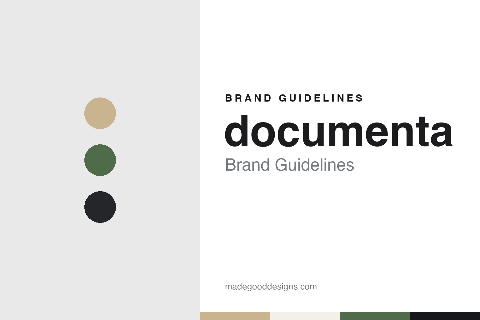
documenta Brand Guidelines
A coined word, written in lowercase, renewed every five years.
Aa
Two constants: an ink, sandstone, park green and grey palette and a lowercase grotesque register. Abstract homage — not a documenta asset or mark; no logo, poster or wordmark is reproduced.
A coined word in Kassel
Arnold Bode, 1955, and a museum of 100 days.
The exhibition known as documenta began in Kassel, in the German state of Hesse, in 1955. English Wikipedia says it was founded by the artist, teacher and curator Arnold Bode as part of the Bundesgartenschau, the federal horticultural show held in the city that year. Wikipedia says Bode wanted to show the public work that had been branded “degenerate” in Germany under the Nazi regime, so the first edition concentrated on abstract painting and on movements such as Fauvism, Expressionism, Cubism and the Blauer Reiter.
The identity starts with the name. English Wikipedia describes it as a coined word, chosen to signal that the exhibition would document modern art that the German public had not been able to see during the Nazi era. German Wikipedia says the word came from the circle around Bode, that the organisers still write it in lowercase, and that individual editions are often shortened to a “d” followed by a number. It sets the word beside other coinages of the 1950s, such as the Constructa building fair in Hanover, held from 1951.
The calendar is built into the brand as well. English Wikipedia says each documenta runs for 100 days, which is why it is often called the “museum of 100 days”, and that it is not a selling exhibition. German Wikipedia says the exhibition was at first held every four years before settling into its five-year cycle. The Art Newspaper, reporting from Athens on 6 April 2017, said documenta had been held in Kassel every five years since 1955.
Leadership changed early on. English Wikipedia says Bode organised the first four editions, and that from the fifth, in 1972, a new artistic director has been chosen by a committee for each edition. Among the directors it names are Catherine David for documenta X in 1997 and Okwui Enwezor for Documenta11 in 2002. ARTnews reported on 6 October 2014 that the artistic director of the 2017 edition was Adam Szymczyk, and The Art Newspaper said in 2017 that he had been appointed in 2013.
The organiser is a public body. German Wikipedia says documenta is run by documenta und Museum Fridericianum gGmbH, a non-profit company whose shareholders are the City of Kassel and the State of Hesse, with support from the German Federal Cultural Foundation, and that the mayor of Kassel chairs its supervisory board.
Colour
The Fridericianum, a park, and a turn to Athens.
The exhibition has a fixed home. English Wikipedia says the Fridericianum on Friedrichsplatz has been documenta’s fixed venue since 1955. Other buildings come and go with each edition. Wikipedia names the documenta-Halle, built in 1992 for documenta IX, as well as the Karlsaue park, Schloss Wilhelmshöhe, the Neue Galerie, the Ottoneum and the Kulturzentrum Schlachthof among the venues used over the years.
Temporary architecture has been part of the picture too. Wikipedia says that for documenta IX five connected temporary pavilions in glass and corrugated metal were built in the Karlsaue, and that for documenta (13) in 2012 the French architects Anne Lacaton and Jean-Philippe Vassal built a temporary pavilion in the park. Wikipedia also says that edition presented part of its work in other places, including Kabul in Afghanistan and Banff in Canada.
Some works stayed in the city after the exhibitions closed, so documenta also lives in Kassel’s streets between editions. Wikipedia lists among them Joseph Beuys’s 7000 Eichen, the oak-planting project, Walter De Maria’s Vertikaler Erdkilometer, Claes Oldenburg’s Spitzhacke of 1982 and Jonathan Borofsky’s Man walking to the sky of 1992. Wikipedia says Bode set up the documenta archive in 1961 to hold the files and materials the organisation produced.
The 2017 edition moved part of the event abroad. ARTnews reported on 6 October 2014 that Szymczyk would divide documenta 14 between Kassel and Athens, under the working title “Learning from Athens”. The Art Newspaper reported on 6 April 2017, as the Athens exhibition opened, that the Kassel part would open on 10 June and run until 17 September, that Szymczyk saw the two cities as standing on equal footing, and that in Athens the team was working with around 40 local institutions, among them the Benaki Museum, the Archaeological Museum of Piraeus and the Numismatic Museum.
The cycle continues. The Art Newspaper reported on 18 December 2024 that Naomi Beckwith, deputy director and chief curator of the Solomon R. Guggenheim Museum, had been appointed to curate the sixteenth edition, due in Kassel from 12 June to 19 September 2027; the same report said the 2022 edition, curated by the Jakarta-based collective ruangrupa, had been marked by a controversy over antisemitic imagery in one work, which was removed.
Typography
Dates, signage and catalogues.
Design and art events carry their identity in places a consumer brand rarely reaches. A recurring exhibition or festival often puts a year, an edition number or a season into its name, so the wordmark has to work as a stable root that accepts a changing suffix. The same name then has to hold together across a catalogue, a poster series, a website and a printed guide that is replaced every edition.
Host-city signage is a second surface. Banners on lamp posts, flags on venues and wayfinding panels in streets, stations and pavilions have to be read at walking pace and at a distance, often in more than one language. Typography chosen for these jobs tends toward clear letterforms, generous spacing and strong contrast against the street.
Catalogues and posters are the third surface, and the most collected. They outlast the event itself, and many organisers commission a different designer or studio for each edition, so continuity comes from the name, a grid or a colour habit rather than from a fixed logo. For a design guide, the useful question is which elements stay fixed from edition to edition and which are allowed to change.
aa
A lowercase grotesque — after the habit of writing documenta without capitals. (Specimen set in Archivo, a grotesque STAND-IN; NOT the documenta logo or any typeface used by documenta.)
documenta
One name, a new identity each time.
documenta does not keep one fixed visual identity. English Wikipedia says each edition has commissioned its own visual identity, and that most of them have kept to the typographic habit of using only lowercase letters, a style it traces to the Bauhaus. The constant across the decades is the name itself, written small, with an edition number or year beside it, while the posters, catalogues, signs and websites are redesigned for each edition.
The 2017 edition shows how far that work can reach into a city. It’s Nice That reported on 11 September 2020 that the Paris studio Vier5 had worked twice on documenta 14: once on the wayfinding system in Kassel, and again on the exhibition identity in Athens. The article illustrated documenta 14 street signs, an exhibition poster and artist labels, the labels silkscreen-printed by the Athens workshop tind. Vier5 told the magazine it saw graphic design as a free form of art, with the possibility of taking an active social position through the work.
That brief explains why a documenta identity looks so different from a corporate one. Signs have to guide visitors across a whole city, between a museum, a park, a former factory or a station, for exactly 100 days, and then disappear. Catalogues and posters outlast the exhibition and become the record of each edition, which is part of why Bode’s 1961 archive matters to the brand. The lowercase name, the Fridericianum and the five-year rhythm hold the pieces together.
For a design guide, documenta shows how a short coined word, kept in lowercase for decades, can carry an event whose look is rebuilt by a different team every five years. Compare La Biennale di Venezia, another recurring art exhibition tied to its host city, and the London Design Festival. For this guide we use ink, sandstone, park green and grey with a sans, an unofficial interpretation; no product or logo is reproduced.
Explore & save
Keep documenta’s identity on hand — save it to a board in the Made Good inspiration library.
documenta identity set
Pin the documenta ink, sandstone, park green and grey palette and the lowercase grotesque register to your own board.