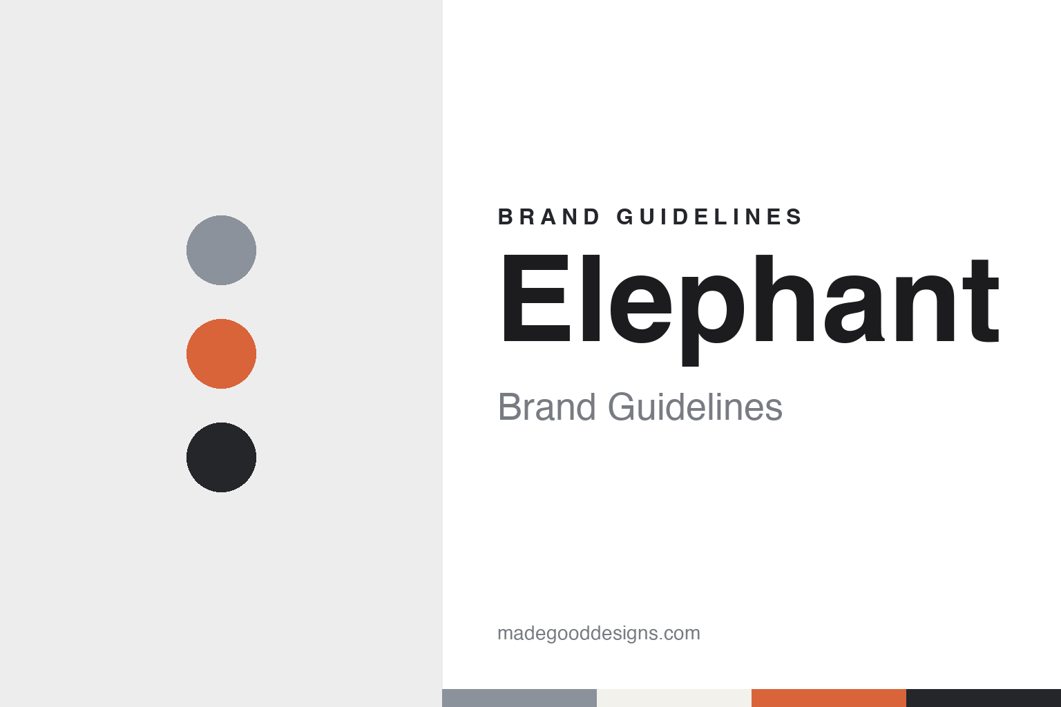
Elephant Brand Guidelines
Three partners, one parable, one Pune studio.
Aa
Two constants: a grey, slate and clay palette and a soft display serif register. Abstract homage — not an Elephant Design asset or mark; no logo, icon or wordmark is reproduced.
Three graduates, one name
From an Ahmedabad campus to Pune, 1989.
Elephant — formally Elephant Design — is a design studio in Pune. The Indian marketing title afaqs! reported on 12 July 2018 that it was established in May 1989 by Ashwini Deshpande, Ashish Deshpande and Partho Guha, who started it right after graduating that year from the National Institute of Design (NID) in Ahmedabad. The magazine described the three as the studio’s co-founders and directors, and called it independent.
The idea came out of their course. In an interview with The Better India published on 1 May 2021, Ashwini Deshpande said the plan may have formed in early 1988, during a module on design management and professional practice, when the group prepared a project report on starting a design practice, complete with costs, licences and registration fees. She said the three chose their graduation projects knowing they would combine their experience once they came together after graduating in 1989.
The name took longer than the business plan. Deshpande told The Better India that the group spent more time on the name than on wondering where work would come from, talking it through on top of the campus water tank. They were sure design was a team game, and the parable of the blind men and the elephant — each feeling one part of the animal and none seeing the whole — matched three graduates each holding a different piece of the puzzle.
The legal form came from a warning. The Better India says that when the three visited a chartered accountant in 1989 to ask about registering Elephant Design, he advised a partnership rather than a private limited company, because the latter was very difficult to dissolve — a sign, the article says, that he expected the venture to close quickly. The article also recounts that a bank manager initially offered only a joint savings account, since he did not expect many transactions.
Colour
A spare room in Pune and an opening commission.
Pune was not the plan. Deshpande told The Better India in 2021 that the three expected to do one project and then move somewhere like Bangalore or Delhi, but stayed because the city was unpretentious, close to Mumbai and had good weather. The article says the studio’s opening commission came, after their convocation in mid-April 1989, from the German chemicals group BASF, and that its original office was a spare room in her family’s ancestral property, with a neighbouring business lending its telephone because a landline took years to arrive.
The early studio worked without computers. afaqs! reported in 2018 that there were none when Elephant Design was launched, and that the studio later saw the arrival of the desktop computer as a design tool in the mid-1990s and of large-format printing as turning points. Deshpande told The Better India that desktop computers were a year away when the practice began, so setting up did not take much money, and that print, structural and desktop-publishing suppliers helped teach the young team the realities of deadlines and payments.
The studio also built its own route to clients. In the afaqs! interview, Ashwini Deshpande said that because the studio was based in Pune, its entry into companies never came through an advertising agency, and Ashish Deshpande said they spent their early years explaining to prospective clients what a designer was. Both described the mid-1990s, after economic liberalisation, as the time when Indian businesses began asking for design to meet the standards of competitive markets.
The studio describes its range broadly. afaqs! listed product design, packaging design, retail design and brand strategy among its services in 2018, and The Better India quoted the company in 2021 describing itself as a “design-led strategic consultancy that collaborates with organisations to develop meaningful and sustainable brands”. The same article said the company had expanded its base from its Pune headquarters to Singapore.
Typography
How a studio’s identity is built.
Studio identities in Latin America, South Asia and Eastern Europe tend to be built from a small set of moves. Many studios carry the name of a founder or of two partners, so the wordmark doubles as a signature and the studio’s reputation travels with a person. Others choose a coined word or an abbreviation that reads the same in the local language and in English, which keeps the name usable on a proposal written for a domestic client in the morning and an international one in the afternoon.
Bilingual working is a design problem in its own right. A studio may set its name in Latin script while its case studies switch between Portuguese, Spanish, Hindi, Romanian or Greek, and the type choices have to hold up across accents, diacritics and sometimes a second script. References to local craft, such as textiles, ceramics, signage or print traditions, often appear in the way a studio describes its own approach.
The most visible brand surface is usually the case-study website. Project pages, ordered by client and year, show the studio’s method more directly than its logo, and the layout, photography and writing of those pages become the identity that prospective clients actually meet.
Aa
A soft display serif — after a studio named for an animal no one person can see whole. (Specimen set in Fraunces, a serif STAND-IN; NOT the Elephant Design logo or any studio typeface.)
Elephant
Client work, dated.
One long-running client is an air-cooler maker. afaqs! reported in 2018 that Elephant began working for Symphony, the Ahmedabad air-cooler brand, around 1991–92, designing its products and packaging and contributing to strategy, everything except advertising. Ashish Deshpande told the magazine he had recently been appointed to Symphony’s board as an independent director; Ashwini Deshpande told The Better India in 2021 that the studio had designed every Symphony product for over thirty years.
Product design shows up early. afaqs! recounts work in the early 1990s for Nirlep, the cookware brand, where the studio split the knob on a pan lid into two parts to give the cooking spoon a place to rest, a detail the brand had not asked for. Ashish Deshpande said the studio presented it to the client as a matter of looks rather than as a product feature.
Event and wayfinding work followed. afaqs! says the studio began work in 2005 on the 2008 Commonwealth Youth Games about a thousand days before the event, designing for the precinct, the stadium and the city. Partho Guha recalled that the brief amounted to a request for good, international-looking signage.
Consumer brands make up much of the published list. afaqs! named Axis Bank, Britannia, PepsiCo, P&G, the Tata Group, Godrej, Unilever, Paper Boat, BharatBenz and ICICI Bank among the brands the studio had worked on by 2018. The Better India named Britannia Marie Gold, Tata Salt, Gillette Guard, Kurkure, Viacom18, Uber and the Indian Super League in 2021.
For a design guide, Elephant shows a studio whose name explains its method: three partners from one design school, each holding a different part of a problem, kept together under a single animal for more than three decades. Compare it with the Indian studio in our Codesign brand guidelines and with one of the client brands in our Paper Boat brand guidelines. For this guide we use grey, slate and clay with a serif, an unofficial interpretation; no product or logo is reproduced.
Explore & save
Keep Elephant’s identity on hand — save it to a board in the Made Good inspiration library.
Elephant identity set
Pin the Elephant grey, slate and clay palette and the soft display serif register to your own board.