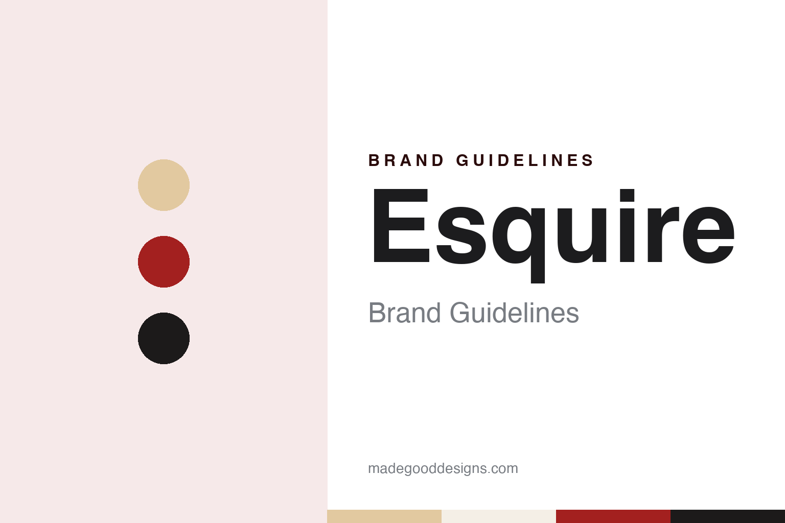
Esquire Brand Guidelines
A men’s monthly with a mustachioed mascot.
Aa
Two constants: a cream, red and black palette and a high-contrast serif register. Abstract homage — not an Esquire asset or mark; no logo, cover or masthead is reproduced.
A magazine for men, from Chicago
Three founders, a trade-paper parent and a quarterly plan.
Esquire started as a spin-off. English Wikipedia says the magazine was first issued in October 1933 as an offshoot of the trade magazine Apparel Arts, the title that later became Gentleman’s Quarterly, and that Esquire and GQ shared an owner for almost 45 years. The magazine was headquartered first in Chicago and later in New York City.
Three men founded and edited it. English Wikipedia names David A. Smart, Henry L. Jackson and Arnold Gingrich, and divides their roles: Gingrich specialised in the editorial side, Smart ran the business, and Jackson led and edited the fashion section, which made up most of the magazine in its opening fifteen years. Smart left Esquire in 1936 to found a different magazine for the company, Coronet, according to the same article.
The original plan was modest. English Wikipedia says Esquire was meant to appear as a quarterly, but that by its second issue, dated January 1934, it had changed into a more refined periodical with an emphasis on men’s fashion and with contributions from writers including Ernest Hemingway and F. Scott Fitzgerald. Fashion, fiction and essays sat side by side in the same pages.
The 1960s gave the magazine a new editor and a new look on the newsstand. English Wikipedia says Harold Hayes ran Esquire from 1961 to 1973, when its pages were oversized, and that it published writers such as Gay Talese, Tom Wolfe, Norman Mailer and Terry Southern. From 1969 to 1976 Gordon Lish was its fiction editor, and the same article credits him with publishing the short stories of Raymond Carver and Richard Ford in the magazine. In the mid-1960s Esquire also worked with Verve Records on a series of “Sound Tour” LPs with music and advice for travelling abroad.
Ownership then changed several times in a decade. English Wikipedia says the original owners sold the magazine to Clay Felker in 1977, that Felker relaunched it in 1978 as a fortnightly titled Esquire Fortnightly, and that he sold it in 1979 to the 13-30 Corporation, a Tennessee publisher, which returned it to monthly publication with the July issue. The 13-30 Corporation was renamed the Esquire Magazine Group, and at the end of 1986 Esquire was sold to Hearst. Hearst has owned Esquire since 1986.
Colour
A pop-eyed mascot, a script logo and a run of art-directed covers.
An early visual signature was a character. English Wikipedia says that from the second number a blond, pop-eyed, mustachioed figure named Esky, created by the cartoonists E. Simms Campbell and Sam Berman, appeared on almost every Esquire cover for over a quarter of a century. He was usually shown as a small figurine; in the 1950s a stylised drawing of his face replaced the figurines.
Esky then moved into the masthead. According to English Wikipedia, from 1962 the stylised Esky face served as the dot on the “i” of the Esquire logo, and it stayed there until 1978. The same article says the magazine had used a script logo, with minor tweaks, since 1933, and that Clay Felker dropped it when he relaunched the title as Esquire Fortnightly in 1978. The character has come back from time to time since, English Wikipedia says, including in the 1980s and 1990s and during Jay Fielden’s tenure as editor in the 2010s.
The covers of the Hayes years are tied to one art director. English Wikipedia’s article on George Lois dates his Esquire covers to 1962 to 1973 and says the Museum of Modern Art in New York exhibited a selection of them in 2008. It’s Nice That, in a piece by Liz Gorny published on 21 November 2022, described Lois’s years of Esquire covers and named two of them: one showing Andy Warhol drowning in a can of Campbell’s soup, and one showing the boxer Sonny Liston dressed as Santa Claus.
The physical magazine changed too. English Wikipedia says that, like many magazines of the era, Esquire shrank in 1971 from the traditional large-magazine format of about 260 by 340 millimetres to the standard letter size of about 220 by 280 millimetres.
Under Hearst the editors changed the magazine’s tone more than once. English Wikipedia says David Granger, who came from GQ, became editor-in-chief in June 1997; that he stepped down in 2016 and was replaced by Jay Fielden, who took the magazine toward a more classical, up-market style; and that Michael Sebastian became editor in mid-2019.
Typography
A Chicago spin-off, a pop-eyed mascot and art-directed covers.
A magazine can keep its name for decades and still change the way that name is set. InPublishing reported on 5 November 2015 that the London design magazine Icon, launched in 2003, marked its 150th issue with a new logo, new typefaces and a faster-paced layout, together with three new sections and a new strapline, “Design worth knowing”. English Wikipedia says the same title moved from monthly to quarterly publication in 2020, so the masthead now appears four times a year.
A name can also travel between titles. English Wikipedia says the Paris weekly Elle was founded in 1945 and that its publisher launched Elle Decoration in France in 1987; Business of Home reported that the American Elle Decor marked its 35th anniversary in 2024. Covers carry the other half of the change. Business of Home wrote on 11 September 2024 that the first Elle Decor issue under a new editor in 2020 used an illustration by Rachelle Baker that reimagined Nancy Lancaster’s Yellow Room. When reading a magazine’s identity, look at when the logo and typefaces were last redrawn, how often the issues appear, which parent title lends the name, and whether the cover shows a room, a photograph or an argument.
Aa
A high-contrast serif — the register of a men’s monthly founded in 1933. (Specimen set in Playfair Display, a serif STAND-IN; NOT the Esquire logo or any Esquire typeface.)
Esquire
A name, a mascot and a cover as a single idea.
The name has held since 1933. Esquire has kept one word across a move from Chicago to New York, a fortnightly experiment in 1978, four changes of owner between 1977 and 1986, and the shift from oversized pages to letter size in 1971.
The mascot carried the brand before the covers did. English Wikipedia describes Esky as a near-constant cover presence from the second issue onward, first as a figurine and from the 1950s as a drawn face, and from 1962 to 1978 as the dot on the “i” of the logo.
The Lois years turned the cover into a single image. The two covers named by It’s Nice That on 21 November 2022, Warhol in the soup can and Liston as Santa Claus, came from that period. English Wikipedia places Lois’s Esquire work between 1962 and 1973, the same years in which Harold Hayes edited the magazine.
Special issues have extended the name. English Wikipedia says that in September 2006 the magazine launched a style-focused issue called The Big Black Book, published twice a year from 2009 until its final Spring/Summer issue in 2018, and that in 2018 Esquire moved to eight issues a year. In 2009 it ran a blog called the Daily Endorsement Blog, discontinued in April 2011, which recommended one idea, product or website each morning.
For a design guide, Esquire shows how a magazine can put a character into its masthead, then let an art director make each cover a single picture. Compare GQ, the title that grew out of the same Apparel Arts, or The New Yorker, another American magazine. For this guide we use cream, red and black with a high-contrast serif, an unofficial interpretation; no product or logo is reproduced.
Explore & save
Keep Esquire’s identity on hand — save it to a board in the Made Good inspiration library.
Esquire identity set
Pin the Esquire cream, red and black palette and the high-contrast serif register to your own board.


