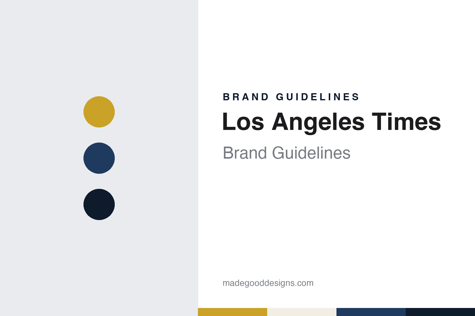
Los Angeles Times Brand Guidelines
A Los Angeles daily with a long family line and a large nameplate.
Aa
Two constants: a gold, ink-blue and night palette and a classic text serif register. Abstract homage — not a Los Angeles Times asset or mark; no logo, front page or nameplate is reproduced.
A daily from the Mirror plant
Two founders, a print shop and the family that stayed.
The paper began as a print job. English Wikipedia says the Los Angeles Times was first published on 4 December 1881 as the Los Angeles Daily Times, under the direction of Nathan Cole Jr. and Thomas Gardiner. It was printed at the Mirror printing plant, then owned by Jesse Yarnell and T. J. Caystile, and when the two founders could not pay the printing bill they turned the paper over to the Mirror Company. The same article says that S. J. Mathes, who had joined the firm, insisted that the paper keep publishing. That early link between the newspaper and the Mirror press survives in the name of the company that later owned it, Times Mirror.
The family line starts the following year. English Wikipedia says Harrison Gray Otis moved from Santa Barbara in July 1882 to become the paper’s editor and bought a stake in it at the same time. Otis built the paper around the growth of the city, and he put his own mark on its buildings: the same article describes a bronze eagle fixed on top of a high frieze of a later Times headquarters designed by Gordon Kaufmann, with a credo written by his wife, Eliza, “Stand Fast, Stand Firm, Stand Sure, Stand True”.
Control passed inside the family. English Wikipedia says that in 1917 Otis’s son-in-law and the paper’s business manager, Harry Chandler, took control as publisher. Norman Chandler, his son, followed in 1944 and ran the paper through the years of rapid growth in Los Angeles after the Second World War. Otis Chandler, the fourth generation of family publishers, held the post from 1960 to 1980. The same article says he expanded national and international reporting and modelled the paper on titles such as The New York Times and The Washington Post.
The building became part of the brand. English Wikipedia says that in 1935 the newspaper moved into the Los Angeles Times Building, an Art Deco landmark, and kept adding facilities until it filled a city block between Spring, Broadway, First and Second streets. That block came to be known as Times Mirror Square, and it housed the paper until 2018.
Colour
From Times Mirror to Tribune to a Los Angeles owner.
The paper also tried other formats under its own roof. English Wikipedia says the Times launched the Los Angeles Mirror, an afternoon tabloid, in 1948; it absorbed the Daily News in 1954, and the combined Mirror-News stopped publishing in 1962. The same year the Times joined The Washington Post to form the Los Angeles Times–Washington Post News Service, which syndicated articles from both papers to other news organisations. Much later the paper produced free weeklies in tabloid form: Metromix Los Angeles from February 2008, and Brand X, which launched in March 2009 and stopped printing in June 2011, according to the same article.
The Chandler family company changed hands in 2000. English Wikipedia says the Times Mirror Company, publisher of the Los Angeles Times, was bought that year by the Tribune Company of Chicago, which also owned the Chicago Tribune and the Los Angeles television station KTLA. On 2 April 2007 Tribune announced that it had accepted an offer from the real estate investor Sam Zell to buy the company, including the Times. The newspaper business was later run by Tribune Publishing, which renamed itself Tronc for a period.
A local owner arrived in 2018. MediaPost reported on 7 February 2018 that the Los Angeles Times had been sold by Tronc to Patrick Soon-Shiong, the founder of the Culver City company NantHealth, and that the deal also gave him control of The San Diego Union-Tribune. The same report said that in 2016, when Tronc was still called Tribune Publishing, Soon-Shiong had invested in the company through his private firm Nant Capital. English Wikipedia says the purchase, through Nant Capital, closed on 16 June 2018. Soon-Shiong has owned the Times since 2018.
The move out of downtown followed within weeks. English Wikipedia says the paper left Times Mirror Square in July 2018 for a new headquarters building in El Segundo, near Los Angeles International Airport, leaving the 1935 building behind. The same article now describes the paper as based in El Segundo.
Typography
A long name, a large nameplate and a classic front page.
A newspaper can change its typefaces without touching its name. English Wikipedia says the South China Morning Post, a Hong Kong broadsheet founded in 1903, was given new fonts in a facelift on 26 March 2007, and that a redesign in 2011 set its headlines in Farnham and Amplitude, its body text in Utopia and its section headers in Freight. The title on the front page stayed the same through both changes.
The name itself can also change. English Wikipedia says The Straits Times, founded in Singapore on 15 July 1845 as The Straits Times and Singapore Journal of Commerce, was renamed The Shonan Times on 20 February 1942, and then appeared as The Syonan Times, the Syonan Sinbun from 8 December 1942 and the Syonan Shimbun from 8 December 1943, before the earlier title returned. When reading a newspaper’s identity, look at how long its title has stayed fixed, which typefaces set its headlines and text, and when those faces were last changed.
Aa
A classic text serif — the register of a broadsheet front page. (Specimen set in Libre Caslon Text, a serif STAND-IN; NOT the Los Angeles Times nameplate or any Times typeface.)
Los Angeles Times
A city name on the masthead, and a nameplate that grew.
The name has barely moved. Apart from the word “Daily” in the opening title of 1881, the paper has kept the city and the word Times at the top of page one through family ownership, the Times Mirror years, Tribune and Soon-Shiong. The parent company’s own name, Times Mirror, joined the newspaper to the print shop that produced its first issues, and the downtown block that housed it until 2018 carried the same pairing.
The front page changed visibly in 2008. Writing on 23 October 2008, the newspaper designer Mario R. García described a redesign unveiled on 21 October. He wrote that the Times had always stayed close to the classic look of The Washington Post and The New York Times, and that page one stayed classic after the redesign, with more of a sense of verticality and a larger nameplate as the visual lead at the top of the page. The new element was colour: García pointed to section headers with colour backgrounds as the main departure from the paper’s classic look, and noted that the opening page of the Calendar arts section changed very little apart from its coloured header.
García also placed the larger nameplate in a longer tradition. He noted that books by the newspaper designer Edmund Arnold from the 1950s and 1960s showed large nameplates, and contrasted the Times with other papers of 2008 that had pushed their nameplates to one side or reduced them to an initial letter. In his account, the 2008 Times went the other way and made its recognisable name bigger, which gave page one a retro feel.
The colours of the redesign sat mostly inside the paper. The section headers took the colour while the nameplate and the front page kept to black type on newsprint, which is how García read the balance between a contemporary inside and a classic cover.
For a design guide, the Los Angeles Times shows how a newspaper can let colour into its section headers while keeping a classic front page, and how enlarging a familiar nameplate can be a redesign in its own right. Compare The Washington Post, its partner in the 1962 news service, or The Boston Globe, another American daily with a long family line. For this guide we use gold, ink blue and night with a serif, an unofficial interpretation; no product or logo is reproduced.
Explore & save
Keep Los Angeles Times’s identity on hand — save it to a board in the Made Good inspiration library.
Los Angeles Times identity set
Pin the Los Angeles Times gold, ink blue and night palette and the classic text serif register to your own board.


