The Boston Globe Brand Guidelines
A Boston daily whose type travels from paper to screen.
Aa
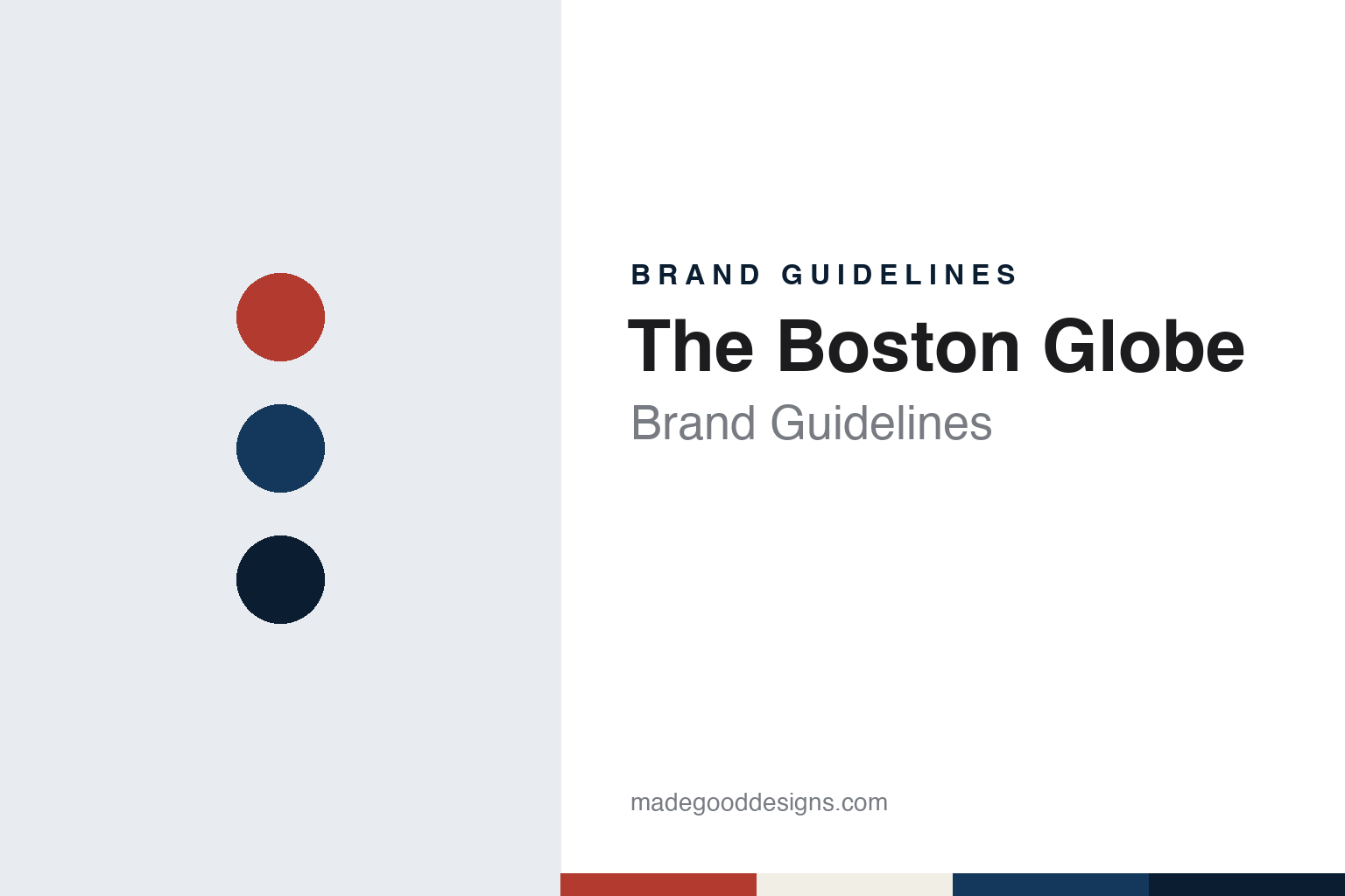
Two constants: a brick, navy and night palette and a Scotch Roman serif register. Abstract homage — not a Boston Globe asset or mark; no logo, front page or nameplate is reproduced.
A Boston daily and the Taylor family
Six founders in 1872 and a manager hired the next year.
The Globe began with a group of merchants. English Wikipedia says The Boston Globe was founded in 1872 by six Boston businessmen, among them Eben Dyer Jordan of the Jordan Marsh department store and Cyrus Wakefield of the Wakefield Rattan Company, the namesake of the town of Wakefield, Massachusetts. Its first issue was published on 4 March 1872, as a morning daily.
The family that shaped it came in a year later. English Wikipedia says Jordan hired Charles H. Taylor in August 1873 as temporary business manager, and that in December 1873 Taylor signed a contract to run the paper as general manager for two years. He went on to serve as publisher, and four of his descendants followed him in that post until 1999, according to the same article.
The paper grew into a set of editions. English Wikipedia says a Sunday edition began in 1877; a weekly called The Boston Weekly Globe, for mail subscribers outside the city, ran from 1873 until the Sunday edition absorbed it in 1892; and an afternoon paper, The Boston Evening Globe, appeared in 1878 and stopped in 1979. The morning paper itself was titled The Boston Daily Globe until the word “Daily” was dropped from the nameplate in 1960, which gave the title its present short form.
The editor’s chair separated from the publisher’s in the 1950s. English Wikipedia says Laurence L. Winship was named editor in 1955, ending a long period in which the role had been held by the paper’s publishers, and that his son Thomas Winship succeeded him in 1965 and served until 1984. In 1958 the Globe moved from its original home on Washington Street in downtown Boston to Morrissey Boulevard in the Dorchester neighbourhood. For many years the lead editorial carried a house signature, “Uncle Dudley”, a practice the same article dates from the Sunday edition of 1891 to 1966.
Colour
A public company, The New York Times Company, then John W. Henry.
The Taylor family kept running the Globe after it went public. English Wikipedia says the paper was a private company until 1973, when it went public under the name Affiliated Publications, still managed by Charles Taylor’s descendants. In 1993 The New York Times Company bought Affiliated Publications, making the Globe a wholly owned subsidiary of the parent of The New York Times. The same article says the last Taylor family members had left management by 1999.
The online editions came in two stages. English Wikipedia says Boston.com, the Globe’s original website, went online in 1995, and that a separate subscription site, bostonglobe.com, launched in September 2011. The two sites were kept apart, with Boston.com as a regional news and information site and the newer site built around the newspaper itself.
The New York Times Company put the paper up for sale twenty years after buying it. WBUR, the Boston public radio station, published an Associated Press report on 24 October 2013 saying that the sale of the Globe to John W. Henry, the businessman and principal owner of the Boston Red Sox, had been finalised that day. The report said the purchase covered the New England Media Group, which included the Globe, the Telegram & Gazette of Worcester, the websites of both papers and the Globe’s direct mail marketing company, and that The New York Times Company had put the Globe up for sale in February 2013 before the deal with Henry was announced in August.
Henry gave the business a new name and moved it. English Wikipedia says he renamed the venture Boston Globe Media and named himself publisher on 30 January 2014. In June 2017 the Globe moved its printing to the Myles Standish Industrial Park in Taunton, Massachusetts, and its headquarters to Exchange Place in Boston’s Financial District, leaving the Dorchester site. In November 2022 the Globe announced that Nancy Barnes, then the head of news at NPR, would become editor in place of Brian McGrory, according to the same article. John W. Henry has owned the Globe since 2013.
Typography
A short title, a Scotch Roman headline face and a gothic for labels.
A newspaper can change its typefaces without touching its name. English Wikipedia says the South China Morning Post, a Hong Kong broadsheet founded in 1903, was given new fonts in a facelift on 26 March 2007, and that a redesign in 2011 set its headlines in Farnham and Amplitude, its body text in Utopia and its section headers in Freight. The title on the front page stayed the same through both changes.
The name itself can also change. English Wikipedia says The Straits Times, founded in Singapore on 15 July 1845 as The Straits Times and Singapore Journal of Commerce, was renamed The Shonan Times on 20 February 1942, and then appeared as The Syonan Times, the Syonan Sinbun from 8 December 1942 and the Syonan Shimbun from 8 December 1943, before the earlier title returned. When reading a newspaper’s identity, look at how long its title has stayed fixed, which typefaces set its headlines and text, and when those faces were last changed.
Aa
A Scotch Roman serif — the register of a Boston front page. (Specimen set in Libre Baskerville, a serif STAND-IN; NOT the Boston Globe nameplate, Miller Headline or any Globe typeface.)
The Boston Globe
Miller for headlines, Benton for labels, on paper and on screen.
The Globe’s typography is well documented. Writing for Fonts In Use on 2 December 2011, the type writer Stephen Coles described Miller Headline as the heart of the paper’s typographic personality. He called it a slightly condensed addition to the Miller family by Matthew Carter, drawn for newspapers like the Globe, and said it had served as the paper’s main headline face since 2001. Coles traced how Miller grew from a sturdy Scotch Roman for general text into a set of newspaper cuts: Daily for text, Banner for large display and Headline for space-saving display.
A sans carries the labels. Coles wrote that supplemental headlines and section titles in the Globe are set in Benton Sans, the type designer Cyrus Highsmith’s interpretation of News Gothic, and that it had been introduced to the print edition four or five years before his article. Pairing a Scotch Roman headline face with a gothic for section names gives the paper two clear voices: one for the news and one for the signposts.
The same faces went online. Coles reported that BostonGlobe.com, launched in September 2011, used screen versions of the fonts supplied through Webtype. He quoted Miranda Mulligan, the Globe’s creative director for digital products, who said the site used the print typography from the start, with Miller and Benton driving the early visual prototypes before any outside vendors were involved. The Boston studio Upstatement, led by Mike Swartz, helped build the site, and Coles described sidebar teasers that set Miller Headline against Benton Sans in the same way as the paper. He also noted that the site was not a copy of the printed page: font sizes, column widths and navigation followed digital practice and resized with the window.
The title itself was shortened once. The Boston Daily Globe became The Boston Globe in 1960, when “Daily” left the nameplate, and that short form has carried through the Affiliated Publications years, The New York Times Company and Boston Globe Media.
For a design guide, The Boston Globe shows how two type families, a condensed Scotch Roman for headlines and a gothic for section titles, can hold a newspaper together across paper and screen. Compare The New York Times, whose parent company owned the Globe from 1993 to 2013, or the Los Angeles Times, another American daily with a long family line. For this guide we use brick, navy and night with a serif, an unofficial interpretation; no product or logo is reproduced.
Explore & save
Keep The Boston Globe’s identity on hand — save it to a board in the Made Good inspiration library.
Boston Globe identity set
Pin the Boston Globe brick, navy and night palette and the Scotch Roman serif register to your own board.