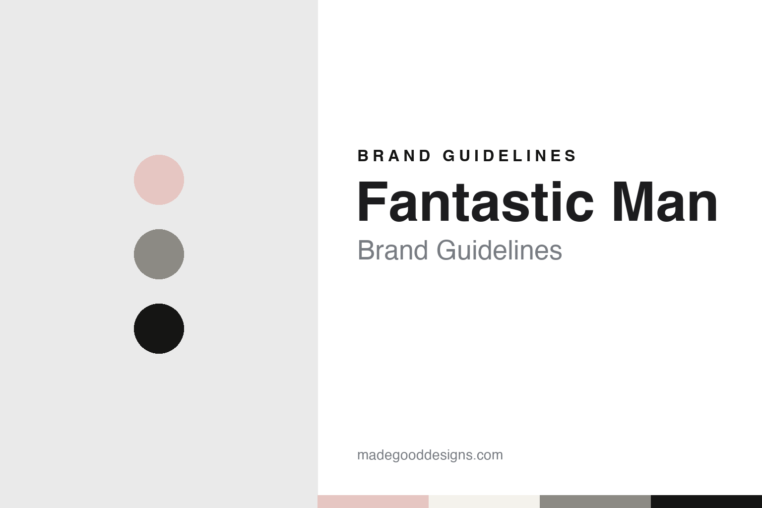
Fantastic Man Brand Guidelines
A men’s magazine meant to be read.
Aa
Two constants: a rule black, newsprint grey and pale pink palette and a roman serif register. Abstract homage — not a Fantastic Man asset or mark; no logo, cover or masthead is reproduced.
Two Dutch editors and a magazine to read
From Re-Magazine and Butt to a men’s fashion title in 2005.
Fantastic Man is a men’s fashion magazine made by two Dutch editors. English Wikipedia describes it as a semi-annual title launched in 2005, published in Amsterdam by Top Publishers, the company that also publishes Butt, and edited by its editor-in-chief, Gert Jonkers. Its co-founder is Jop van Bennekom, whom magCulture named as the magazine’s creative director in September 2015.
The partnership is older than the magazine. In a feature by Alexander Hawkins published by It’s Nice That on 7 October 2015, the two editors explained that they met when Jonkers, then writing for a Dutch newspaper, interviewed Van Bennekom about Re-Magazine, a title Van Bennekom had launched as a graphic design graduate in 1997. The site says Re-Magazine began as a one-man project and kept changing its design from issue to issue.
After finding that they saw publishing the same way, the pair worked together at the Dutch lifestyle magazine Blvd., and a couple of years later launched Butt in 2001, a gay culture magazine that It’s Nice That describes as pale pink. Fantastic Man followed in 2005. Jonkers told the site that the two of them felt they had come out of nowhere from the Netherlands with a men’s magazine, and Van Bennekom said they wanted to show things in a way other people were not showing them.
The magazine set out to be read. It’s Nice That described Fantastic Man as mostly black and white, with rule lines, a two-column layout, a pared-back design and long passages of text. Van Bennekom told the site that he did not find a picture book an interesting proposition for a magazine, and that both editors liked books and newspapers perhaps even more than magazines. In the same interview the editors said that almost the whole of the first issue had been written by the two of them, and that their team had since grown.
Its subjects are men interviewed at length. English Wikipedia says the magazine presents men’s fashion through detailed interviews with men from many different backgrounds. It’s Nice That named cover subjects including the artists Jeremy Deller and Ai Weiwei, the designer Raf Simons and the writer Bret Easton Ellis. Jonkers told the site that people are more interesting to talk to when they have nothing to sell, and recalled a cover of the designer Helmut Lang holding a black cockerel, made at a time when Lang had withdrawn from the fashion scene.
Colour
Times Roman, a stacked logo and a new sans.
The masthead is set in a serif. In a post dated 29 September 2015, Jeremy Leslie of magCulture wrote that the Fantastic Man logo is set in Times Roman, and that the earlier covers carried a stacked, centred version of it. Leslie described the pages as structured and simple, relying on strict typographic rules with little decoration beyond carefully chosen fonts. He also wrote that the typography changes from issue to issue more than a reader might notice, because the look rests on an approach rather than on a fixed set of fonts and devices.
The logo moved in the tenth-anniversary year. Leslie reported that issue No. 21 changed the logo: it kept the Times Roman but broke away from the stacked, centred arrangement, a change he said divided readers. For No. 22, published in September 2015 with the actor Kyle MacLachlan on the cover, the centred logo returned. Van Bennekom told magCulture that the first anniversary issue had looked to the future while No. 22 looked back at earlier inspiration, people and ideas, and that playing with the logo did not suit a retrospective issue. Asked whether it might change again, he said maybe, and that he wanted the magazine to change with every issue, sometimes a little and sometimes more.
Headlines changed in the same issue. Leslie noted that No. 22 introduced a new headline sans serif, Founders Grotesk, drawn by the type designer Kris Sowersby, so that a roman serif logo now sat above a grotesque in the headlines. It’s Nice That reported a month later that No. 22 came with two covers, both featuring MacLachlan, and Van Bennekom told the site that having old heroes on the cover was one of the high points of making the magazine.
The editors describe the core of the design as stable. In the It’s Nice That interview of October 2015, Jonkers said that when they compared the first issue with the newest one while making a book, they realised the magazine had not changed very much, and that there had never been a need for a complete overhaul. The site added that the design had nonetheless gone through constant small adjustments over ten years, and that some features had been dropped as the team grew.
Fashion stories follow the editors rather than the season. It’s Nice That wrote that the magazine built its fashion stories on whims and steered clear of seasonal trends. Jonkers told the site that a story on shaving off a beard caused more reaction than almost anything else the magazine had done, and that it largely stopped featuring bearded men after No. 17.
Typography
Mastheads, type and cover photographs.
A magazine’s masthead can stay in one plain serif and still change in small steps. Jeremy Leslie of magCulture wrote in September 2015 that the Fantastic Man logo is set in Times Roman, that the earlier covers carried a stacked, centred version of it, and that issue No. 21 broke away from that arrangement before No. 22 returned to it. In No. 22 the magazine also introduced Founders Grotesk, by Kris Sowersby, as a new headline sans. Leslie described pages built on strict typographic rules, with little decoration beyond the fonts, and a look based on an approach rather than a fixed set of devices. It’s Nice That described the same magazine in October 2015 as mostly black and white, with rule lines, two columns and long passages of text.
Other titles put more of the identity into the cover image itself. AnOther says the first cover of AnOther Magazine, in 2001, was a photograph by Nick Knight of two young lovers cast as Adam and Eve, and that Jefferson Hack’s foreword framed it as the magazine’s statement for that season. For its fifteenth anniversary in 2016, It’s Nice That reported, AnOther made a limited edition with a 3D hologram cover of Karl Lagerfeld, made by the holographer Rob Munday, alongside covers of other subjects in the same issue. When reading a magazine’s identity, look at how the masthead is set and how often it moves, which typefaces carry the headlines, and whether the cover photograph or the cover object carries the brand.
Aa
A roman serif — the register of a magazine set in Times Roman with long columns of text. (Specimen set in Tinos, a serif STAND-IN; NOT the Fantastic Man logo or any Fantastic Man typeface.)
Fantastic Man
A men’s magazine with a sister title, a book and a serif logo.
Fantastic Man sits inside a small family of titles. English Wikipedia says the magazine launched a website with daily content in 2009 and a sister publication for women, The Gentlewoman, in March 2010. It’s Nice That listed, alongside The Gentlewoman, a regular magazine the pair made for the Swedish fashion brand Cos, and The Happy Reader, a quarterly publishing partnership with Penguin. Both editors also continued with Butt, the title they launched in 2001.
The magazine has also become a book. It’s Nice That reported in October 2015 that Phaidon would publish Fantastic Man: Men of Great Style and Substance on 26 October 2015, collecting interviews from the magazine’s first decade with photographs by Juergen Teller, Wolfgang Tillmans and Inez and Vinoodh. The site said the book included the architect Rem Koolhaas on his dreams of being a fashion designer. Van Bennekom told the site he wanted a book that could be held in one hand.
The tone of the magazine is part of its identity. Leslie wrote in September 2015 that Fantastic Man had a very specific visual identity that matched its mannered verbal tone of voice, and It’s Nice That described the publication as a mix of wry humour, clean editorial design and relaxed style. Van Bennekom told the site that the magazine’s title implies that the editors must be fans of the people they feature, or at least be intrigued by them.
For a design guide, Fantastic Man shows how a men’s fashion magazine can build an identity from a Times Roman masthead, rule lines, two columns and long text, and how a logo or a headline face can be adjusted issue by issue while the core stays the same. Compare The Gentlewoman, its sister title for women, or AnOther Magazine, a fashion biannual published in London. For this guide we use rule black, newsprint grey and pale pink with a serif, an unofficial interpretation; no product or logo is reproduced.
Explore & save
Keep Fantastic Man’s identity on hand — save it to a board in the Made Good inspiration library.
Fantastic Man identity set
Pin the Fantastic Man rule black, newsprint grey and pale pink palette and the roman serif register to your own board.