GIMP Brand Guidelines
Two students, a toolkit and a mascot with a paintbrush.
Aa
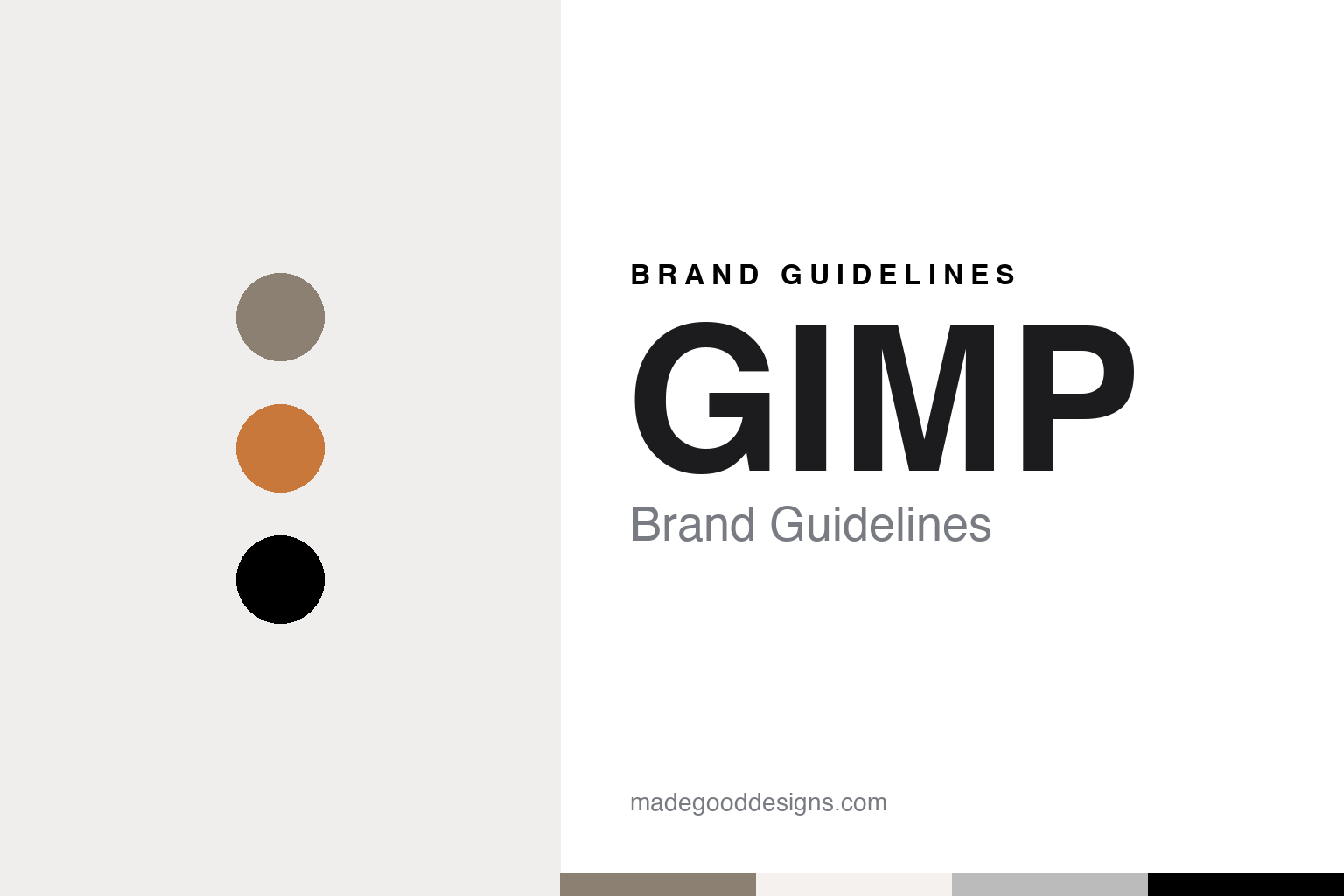
Two constants: a Wilber taupe, ferrule grey and bristle black palette and a friendly rounded sans register. Abstract homage — not a GIMP asset or mark; no logo, icon or wordmark is reproduced.
A student project at Berkeley
From a class assignment to a GNU program.
GIMP began as coursework. Wikipedia says Spencer Kimball and Peter Mattis started developing the program in 1995 as a semester-long student project in the eXperimental Computing Facility at the University of California, Berkeley. A history of the project written by contributor Seth Burgess and kept on gimp.org says the two students decided they would rather write an image manipulation program than a compiler for a computer science class, although neither had a background in the graphic arts.
The original name was descriptive. Burgess wrote that the pair called their program the General Image Manipulation Program, shortened to GIMP. Its public release, version 0.54, came in January 1996, he wrote, with a plug-in system that let developers add separate programs without breaking the main distribution, basic drawing tools, channel operations and an undo feature, all released under the GNU General Public License. The location left a mark on the file format too: Wikipedia says GIMP’s native XCF format takes its name from the letters of the eXperimental Computing Facility.
The early program relied on the Motif toolkit for its interface, and that dependency made it hard to distribute. Burgess wrote that Mattis grew fed up with Motif and decided to write his own toolkit, naming its parts gtk and gdk, for the Gimp Tool Kit and the Gimp Drawing Kit. Mattis later said, according to that history, that they never meant it to become a general-purpose toolkit and only wanted something to use with GIMP. Version 0.99 followed on 26 February 1997 with a reworked toolkit called GTK+, which Burgess noted was already being used beyond GIMP, including by the new GNOME desktop project.
The name changed during that period. Burgess recorded that the General Image Manipulation Program became the GNU Image Manipulation Program, and Wikipedia says the change to GNU followed a 1997 meeting at Berkeley between the two students and Richard Stallman of the GNU Project. Kimball and Mattis released GIMP 0.99.10 on 9 June 1997, which Burgess described as their last release before graduating; other volunteers carried the work on, and GIMP 1.0 was released on 5 June 1998.
Colour
Wilber and his redesigns.
The project’s face is a creature called Wilber. Burgess’s history on gimp.org says Wilber was created on 25 September 1997 by Tuomas Kuosmanen, and Wikipedia adds that Kuosmanen, known online as tigert, drew him using GIMP itself. Burgess described Wilber as having taken on a life of his own, appearing in many poses at the top of the old gimp.org website. The site itself dates from the same autumn: Burgess wrote that contributor Shawn Amundson secured the gimp.org domain and that the site started on 7 October 1997.
Wilber was dressed up over the years. The GIMP team’s logo history, kept in the project’s gimp-data repository, says that between 2000 and 2005 team members added accessories to the original drawing, collected as the Wilber Construction Kit, including a hard hat by Simon Budig and a wizard hat by Raphaël Quinet. Wikipedia notes the kit still ships in GIMP’s source code. The same history lists the logos used in the software: designer Jakub Steiner drew the logo for GIMP 2.4 and then the detailed Wilber used from GIMP 2.6 in 2008 through the 2.8 and 2.10 series.
That Wilber was replaced for version 3.0. Announcing the release candidate GIMP 3.0 RC1 on 6 November 2024, the GIMP team wrote that design trends had changed in the sixteen years since Steiner’s logo and that its detailed look stood out on modern desktops, so Aryeom, working with other contributors, developed a new logo. The logo history credits Aryeom with the GIMP 3.0 logo and a matching developer logo in 2024, both under a Creative Commons Attribution-ShareAlike licence, and records a special macOS version showing Wilber over an easel, used from 3.0.0 to 3.0.6.
The finished release made the change public. OMG! Ubuntu reported on 17 March 2025, in an article by Joey Sneddon, that a stable GIMP 3.0 was available after seven years of development, with a GTK 3 interface, native Wayland and high-resolution screen support, non-destructive editing of filters and text, and a redesigned logo showing Wilber in a flatter, simplified style. Wikipedia dates GIMP 3.0 to 16 March 2025 and lists GIMP 3.2 on 14 March 2026.
Typography
Wordmarks, symbols and screens.
Design software carries its identity in places a printed product never has to. The app icon does the heaviest work: it sits in a dock or on a taskbar at a few dozen pixels, beside dozens of rivals, so it tends toward a single shape, one or two colours and a letterform or emblem that still reads when it is shrunk to the size of a fingernail.
The splash screen is the second stage: the image that fills the wait while a program loads. Some studios use it for artwork made with the software itself, changing it with each release, so the splash becomes a kind of dated record of the product’s look. Mascots appear more often in community-built and open-source projects, where a character can stand in for a volunteer team that has no corporate logo to lean on.
Version naming is part of the system too, whether it uses plain numbers, years or code names. Commercial vendors usually fold a product into a parent brand’s typeface and colour rules; open-source projects tend to keep looser, community-maintained marks. The palettes shown here are our interpretation, not official colours.
Aa
A friendly rounded sans — after a mascot meant to look welcoming. (Specimen set in Nunito, a sans STAND-IN; NOT the GIMP logo, wordmark or any GIMP typeface.)
GIMP
A logo guide that invites remixes.
GIMP documents its logo in a short guide in the gimp-data repository, and the guide opens by explaining what it is not. The team writes that other projects would call such a document branding guidelines, but that the GIMP community is not interested in enforcing strong branding rules on others; the guide is mostly for the team itself. It welcomes anyone to make their own version of Wilber or to modify the logo, which is released under a Creative Commons Attribution-ShareAlike 4.0 licence, and asks only that people do not pretend to be the GIMP team.
The guide also explains the thinking behind the 2024 redesign. The new logo is flat and simple in its base form and, unlike its predecessor, does not simulate depth. The team says an important part of the work was keeping Wilber recognisable, along with his smile and friendliness, so that the mark shows professionalism through current minimalist trends while keeping the welcoming side of GIMP as a community project rather than presenting a corporate image. A version with a slight shadow is used inside GIMP itself, such as in the About dialog, because the application’s background colour can be anything a theme sets.
The guide also lists its colours. It names five: a grey-brown, #8c8073, for Wilber’s face and the lower part of the paintbrush bristles; a warm wood tone for the brush handle; #bbbbbb for the metal ring, or ferrule; #000000 for the tip of the bristles, the iris and the nose; and #ffffff for the white of the eye and the reflections on the eye and nose. The guide points to the use of negative space between face and nose, and says the colour of the bristles is meant to be interchangeable, as though different paints had been poured on the brush, an idea that is part of the base design but not yet used in GIMP or on its websites.
For a design guide, GIMP shows how a mascot drawn in 1997 can be simplified for modern screens while keeping its smile, and how a project can publish exact colours and still invite others to remix its mark. Compare Krita, another open-source painting program with a mascot, and Adobe, maker of Photoshop and other image software. For this guide we use Wilber taupe, ferrule grey and bristle black with a sans, an interpretation built on the published logo colours; no product or logo is reproduced.
Explore & save
Keep GIMP’s identity on hand — save it to a board in the Made Good inspiration library.
GIMP identity set
Pin the GIMP Wilber taupe, ferrule grey and bristle black palette and the friendly rounded sans register to your own board.