Glyphs Brand Guidelines
A font editor whose version number became its icon.
Aa
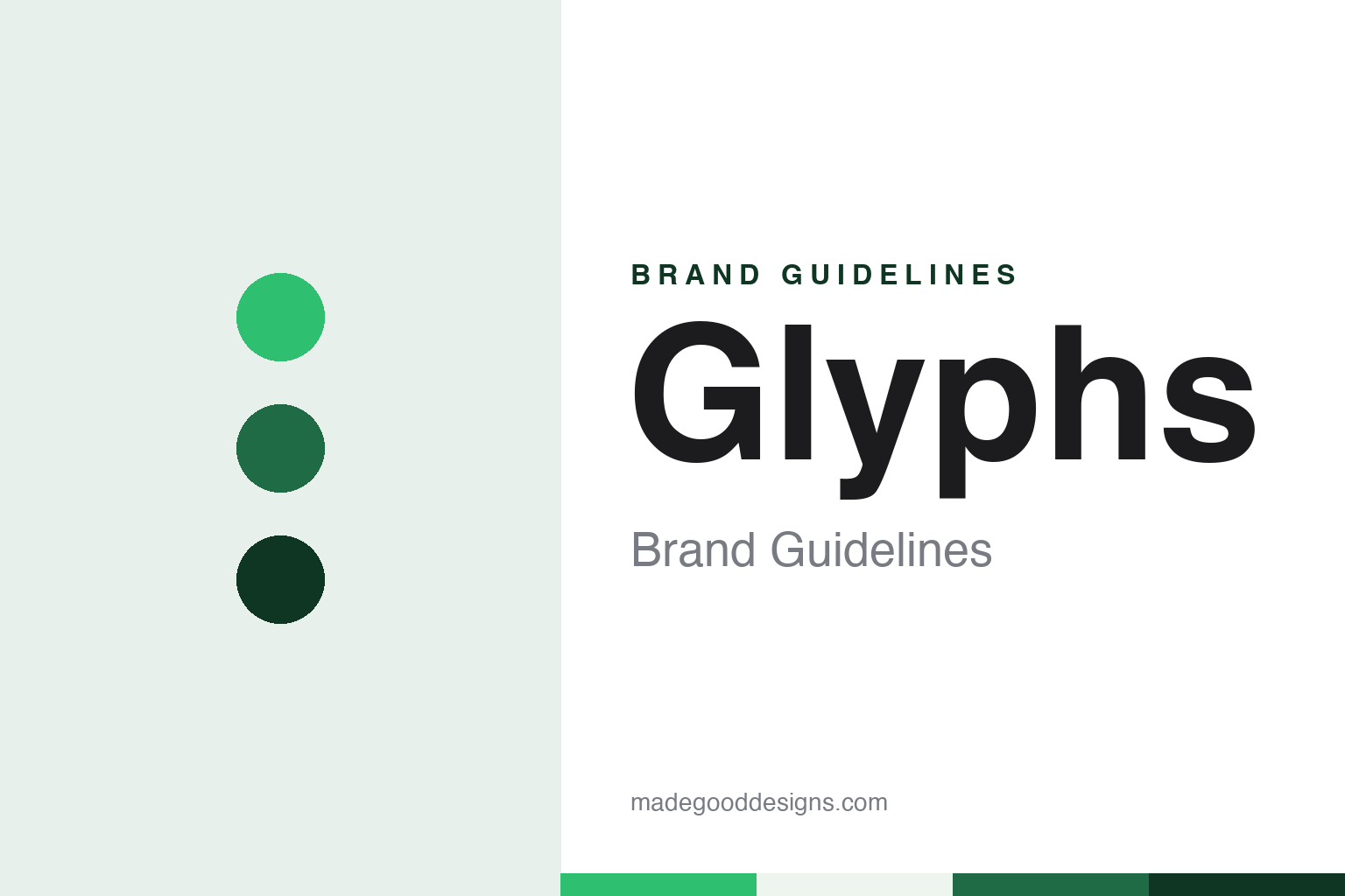
Two constants: an editor green, heritage green and mist palette and a geometric grotesque register. Abstract homage — not a Glyphs asset or mark; no logo, icon, wordmark or typeface is reproduced.
A type designer’s own editor
Berlin, Georg Seifert and a first release in 2011.
Glyphs began as the project of a type designer who also wrote software. English Wikipedia describes Glyphs as a font editor for macOS, intended for professionals and advanced amateurs who create digital fonts, and says the program was developed by the type designer Georg Seifert, with the first version released in 2011. It lists the developer as Glyphs GmbH.
The company’s press page gives the same start date in its own words. It describes Seifert as a graduate of the Bauhaus University and as both a type designer and a software developer, names his typeface families Graublau Sans and Graublau Slab, says he co-developed the typeface for the new Berlin Airport, and says he is known above all for the font editor Glyphs, first released in 2011. The same page says Seifert lives and works in Berlin.
A second name became part of the product’s public face. The press page says Rainer Erich Scheichelbauer, whom it calls chief evangelist, studied photography, philosophy and Dutch, joined the Glyphs team in 2012, and has written the tutorials, the handbook, articles and Python scripts. It says that in 2014 he started his own foundry, Schriftlabor. Pentagram’s project page describes Glyphs as a project of the type designers and software developers Georg Seifert and Rainer Erich Scheichelbauer. A third team member, Florian Pircher, has developed plug-ins and written the handbook and developer documentation since 2021, the press page says.
The program has a smaller sibling. Wikipedia describes Glyphs Mini as a related application with fewer features, aimed at beginners, alongside the full app. It says Glyphs supports fonts for the scripts covered by the OpenType standard, supports multiple masters, and can be scripted in Python.
Early independent coverage placed the app among the tools of the trade. Writing in Creative Bloq on 31 July 2014, in a piece that first appeared in Computer Arts issue 229, the type designer Béla Frank of the foundry Fontsmith compared four font editors: FontLab Studio, Fontographer, Glyphs and RoboFont. He said Glyphs and RoboFont both supported the UFO format natively, and he quoted the Glyphs website, which then called the app “the font editor for everyone”. Frank described Glyphs as bringing drawing, spacing and kerning together in one interface and said it could generate OpenType features automatically.
Colour
A heritage green and an icon in three parts.
The identity work around Glyphs is tied to its version numbers. For the launch of Glyphs 3, Pentagram says, Andrea Trabucco-Campos helped design a revamped website and brand identity to explain what Glyphs does and to bring new energy to the release. Pentagram says the logo and identity simplify and reimagine the app, so that the focus falls on the typographic work made with it, and that Trabucco-Campos designed and art directed abstractions of the app’s working environment.
Colour carried over from the earlier brand. Pentagram says the palette builds on the heritage green that had set Glyphs apart from its competitors, evolving it into a more vibrant green. It says the redesigned website was set in a single variable font by the Swiss foundry ABC Dinamo, drawn and developed entirely within Glyphs, and that the site was rebuilt around the community: tutorials, a forum and a Learn section in which readers can bookmark material.
The current site keeps that typographic link. Its colophon says the text of the website is composed in ABC Arizona, a sans-to-serif variable font from ABC Dinamo, with Cyrillic text set in Accia by the foundry Mint Type. The press page offers photographs of the team, the Glyphs 4 logo on its own and a wordmark that adds the word “Glyphs”, both as SVG files, along with two video clips.
The icon is where the version number becomes visible. The Mexican studio Enigma, based in Puebla, says in its case study that the Glyphs 3 icon, designed by Pentagram, was made up of three parts to symbolise the version number. Enigma says it was asked to evolve the brand for the fourth major update without losing its core identity, and that it followed the same logic for Glyphs 4: a modular icon system with pixel-level precision for screens, and a number 4 drawn from the same geometric pieces as the icon.
The studio also describes a play on words. Because “four” and “for” sound the same, Enigma says, the numeral could carry the message that Glyphs is meant for many kinds of designer and not only for type specialists. It says the same construction was applied to the company’s secondary apps so that the icons form one family, and that the verbal identity moved away from technical language toward short, friendly messages.
Typography
Icons, file formats and version numbers.
Design software carries its identity on surfaces that most brands never have to think about. The first is the app icon: a square of a few hundred pixels that sits in a dock, a taskbar or a launcher beside dozens of others, and that has to be recognisable at a size smaller than a fingernail. Icons for creative tools are often redrawn when an operating system changes its visual language, so a single program can accumulate several generations of icon over its life.
The second surface is the splash screen or start window, the image that appears while the program loads. For many users it is the moment they see the product name at full size, and it is frequently refreshed with each major release.
A third surface is the file format. A document extension appears in file names, in email attachments and in folder listings, and a distinct document icon lets a user spot a working file among exports. The extension often outlives the interface around it.
Finally, release names and version numbers act as a kind of sub-brand. A numbered release, a year-based name or a renamed edition tells users which generation of the tool they have, and the way a developer numbers its versions becomes part of how the product is talked about.
Aa
A clean geometric grotesque — after the simple, icon-led identity of the app. (Specimen set in Instrument Sans, a sans STAND-IN; NOT the Glyphs logo or any typeface used by Glyphs.)
Glyphs
A fourth version and a new line.
The company’s news page announced the fourth version in July 2026 under the line “Glyphs 4: Create. Love the process.”, saying the new version could be used to create fonts, letterings, icons, logos and pictograms. Enigma describes the campaign line as a variable claim built around the words “Love the process”, which it says came from interviews with users around the world about what they valued in the app.
The Enigma case study illustrates that wider range with work made in the software: the typeface Idris Sharp by Pascal Zoghbi, a set of icons for the German broadcaster ZDF by Carrois Type Design, and logos by the Austrian studio Typejockeys. Showing other designers’ output instead of the program window follows the approach Pentagram describes for Glyphs 3, where the identity put the typographic expression made with the app at the centre.
The name itself describes the material. A glyph is the drawn shape of a character in a font, and the app, its smaller sibling Glyphs Mini and the company’s secondary apps all sit under that one word, with the version number doing the work of telling releases apart. Since Pentagram’s identity, that number has also been built into the icon.
For a design guide, Glyphs shows how a software brand can turn a version number into a mark and let a heritage colour carry over from one release to the next. Compare FontLab, a font editor with a longer history of numbered releases, and the type company Monotype. For this guide we use editor green, heritage green and mist with a sans, an unofficial interpretation; no product or logo is reproduced.
Explore & save
Keep Glyphs’s identity on hand — save it to a board in the Made Good inspiration library.
Glyphs identity set
Pin the Glyphs editor green, heritage green and mist palette and the geometric grotesque register to your own board.