North Brand Guidelines
A compass point for a name.
Aa
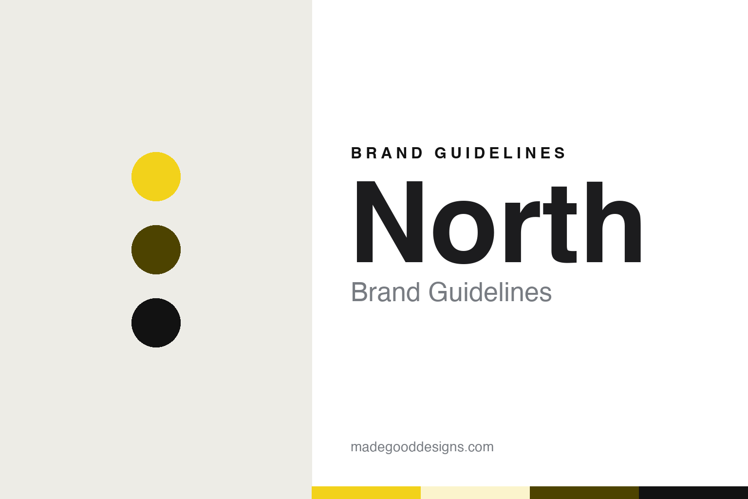
Two constants: a yellow, moss ink and carbon palette and a neo-grotesque sans register. Abstract homage — not a North asset or mark; no logo, icon or wordmark is reproduced.
From the Royal College of Art to a studio of his own
London, 1995.
North is a graphic design studio in London founded in 1995 by the designer Sean Perkins. The Thai design magazine art4d, in a review by Pakpoom Lamoonpan dated 4 April 2024, said North had been led by Perkins since it was established in 1995. The design blog Designers Journal gave the same founding year in a profile of Perkins by the designer Martin Maher, dated 7 May 2012.
That profile set out Perkins’ route into the business. It said he studied at the polytechnics in Huddersfield and Leicester and then completed an MA at the Royal College of Art in London. He went on to work at the branding consultancy Wolff Olins, the design studio Cartlidge Levene and the agency Imagination in London before setting up North on his own, Designers Journal reported.
The studio has since grown into a partnership. The publisher Unit Editions, in its description of the studio’s monograph, names Perkins alongside his partners Jeremy Coysten and Stephen Gilmore, and says the three of them chose how the book would present their work. It’s Nice That, in a news story by Yaya Azariah Clarke dated 29 January 2024, described Coysten as a partner and creative director at North, and called North a London-based design studio.
Across these accounts, the studio comes across as one that has kept a low public profile. Maher wrote in 2012 that North’s website had hardly been updated in years and that the studio gave few interviews. art4d made a similar point in 2024, noting that for a long time North’s online presence was minimal and that its work was seen mainly through features in design magazines and scattered images on the web. Unit Editions describes the studio’s website and its Instagram account as giving little away.
Colour
A compass point for a name.
North is named after a place rather than a person, though the place is personal. Unit Editions says the studio’s name is derived from Perkins’ origins in the north of England, and that it stands for plain-speaking visual directness. art4d traced the word to Perkins’ hometown in northern England as well, and observed that such a short, common word makes the studio hard to find through a web search. The studio’s own website sits at northdesign.com, the address art4d printed at the end of its review, which adds the word “design” to the name the studio uses everywhere else.
The studio has carried that geographic idea into its own publishing. Its monograph, North: Extracts from visual identities, arranges projects by geographical latitude. Unit Editions describes that ordering as a typical North strategy and says the book runs from the studio’s work for clients in the far north to those further south. art4d said the sequence moves from the highest latitude to the lowest, taking in work for Nokia in Finland, projects in Australia and work for Central Group in Thailand.
The book also leaves out the usual explanations. Unit Editions says Perkins, Coysten and Gilmore argued that graphic design has to speak for itself, so the monograph contains no descriptive or biographical texts. art4d reported that the studio’s biographical information does not extend beyond a single credit page at the back. The publisher lists the production details: a cover of yellow cloth foil-blocked in white, printing in six colours including metallic gold and silver inks, and text set in Neue Haas Unica.
The book’s dates vary with its editions. art4d listed it as a Unit Editions title from 2023. Unit Editions now describes its own version as a sold-out edition released from North’s studio archive to celebrate the launch of the studio’s website. A further companion, an appendix of unused logos designed by North, accompanied some copies, according to the publisher.
Typography
Names, websites and offices.
A smaller design studio rarely has a product on a shelf, so its identity has to live on the surfaces it controls directly. The name comes first. Many studios choose a single short word or a founder’s surname, and that choice sets the tone for everything that follows: a one-word name has to work in a sentence, on a door plate, in an email signature and as a domain, often in that order of difficulty.
Partnerships shape the story as well. Studios are often founded by two or three people, and the way founders arrive, leave or hand over the business becomes part of how the studio is described in the trade press. A name that combines surnames records that history; an abstract name lets the studio outlive any single partner.
The studio’s own website is usually its main brand surface, carrying the typeface, the grid and the way projects are presented. Some studios also publish books, monographs or small runs of printed matter about their own work, which act as an extended identity. For a design guide, the useful habit is to read these surfaces as a system: the name, the type choice, the website and any self-published material are all expressions of one point of view.
Aa
A neo-grotesque sans — after a studio whose name is a single compass point. (Specimen set in Work Sans, a sans STAND-IN; NOT the North logo or any North typeface.)
North
Client work, dated.
North’s work is mostly identities for other organisations. In his 2012 profile, Maher listed corporate identities for the motoring organisation RAC, the bank First Direct, the Barbican, HM Land Registry, the cable company Telewest, The Royal Mint and the media agency Carat. He wrote that North produced a hard-bound brand guide for the RAC, and that printed pieces for the Barbican Art Gallery, test sheets of the RAC guide and Land Registry brand books had been photographed on a design blog during a studio move. Unit Editions lists Tate, Southbank, Munch in Oslo, the Co-op and Samsung among the studio’s clients.
In Hong Kong, North designed the logo for M+, the museum of visual culture in West Kowloon. Dezeen, in a story by Alyn Griffiths dated 18 October 2022, reported that the Dutch agency Thonik had created a visual identity for M+ to be used in conjunction with a logo designed by the British design firm North. Dezeen said the museum building, by Herzog & de Meuron, was completed in 2021.
The studio’s work for Magnum Photos is documented in more detail. It’s Nice That reported in January 2024 that a North team made up of Coysten, Josef Clinch and Perkins had initially been asked only to carry out a visual audit of the Magnum brand, which Coysten called “a diagnosis”. Working with the Magnum team and some of its photographers, the studio then built a brief for an overhaul. Coysten said the existing brand had been applied inconsistently, with distorted and edited versions of the logo, typefaces used interchangeably and several sub-brand logos.
The central change was to remove the word “photos” from the logo. Coysten told It’s Nice That that the word was very small in proportion to the black frame and often illegible, particularly on screen, and that it was rarely used in speech or text. The lettering was extended to the borders of the frame, with part of both letters M made transparent, which the studio linked to the cooperative’s openness.
For a design guide, North shows how a studio can take its name from a compass point and carry the same idea of geography into the way it presents its own work. Compare Magnum Photos and M+, two clients whose marks it has shaped. For this guide we use yellow, moss ink and carbon with a sans, an unofficial interpretation; no product or logo is reproduced.
Explore & save
Keep North’s identity on hand — save it to a board in the Made Good inspiration library.
North identity set
Pin the North yellow, moss ink and carbon palette and the neo-grotesque sans register to your own board.