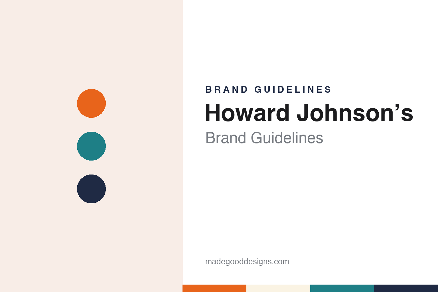
Howard Johnson’s Brand Guidelines
The Quincy name under the orange roof.
Aa
Two constants: a roof orange, aqua and ink navy palette and a roadside serif register. Abstract homage — not a Howard Johnson’s product or mark; no roof, sign or logo is reproduced.
Wollaston
A pharmacy, a soda fountain and a roof colour.
Howard Johnson’s began in 1925 in Wollaston, a neighbourhood of Quincy, Massachusetts, when Howard Deering Johnson took over a small corner pharmacy there. English Wikipedia says the shop’s soda fountain soon became the busiest part of the business, and quotes Johnson saying that the number of his ice-cream flavours “became my trademark.” Through the summers of the late 1920s he ran beachfront stands along the Massachusetts coast, and in June 1929 the original Howard Johnson’s restaurant opened in Quincy, serving New England dishes alongside the ice cream.
Growth came through franchising. Wikipedia records that in 1935 Johnson persuaded an acquaintance to open a second Howard Johnson’s restaurant in Orleans, on Cape Cod, as a franchise rather than a company-owned unit, and that franchised restaurants then spread along the highways of the East Coast. As the Pennsylvania Turnpike and later the Ohio, New Jersey and Connecticut turnpikes were built, it says, Johnson bid for and won rights to serve drivers at their service stops.
The look of those buildings became the brand. Wikipedia names three devices — orange roofs, cupolas and weather vanes — and says they helped patrons identify the chain’s restaurants and motels. NPR, reporting in April 2015, called the orange roofs fixtures of the American highway, and CNN wrote in June 2022 that the restaurants were instantly recognisable for them. NPR also noted that customers affectionately called the restaurants HoJo’s.
The restaurant’s trademark, Simple Simon and the Pieman, was created in the 1930s by the artist John Alcott, Wikipedia says, and the fibreglass signs that carried the figures were sculpted by Charles Pizzano. Alcott’s industrial-design firm also produced children’s menus, including ones printed with maps of the United States, a guide to the metric system and one that could become a mask once a string was added. Interiors had a designer too: Wikipedia, quoting Anthony Mitchell Sammarco’s A History of Howard Johnson’s (2013), says the decorator Dorothy “Sister” Parish was hired in the 1930s for a restaurant in Somerville, New Jersey, and dressed its waitresses, walls and placemats in aqua.
Colour
Motor lodges, new owners and a split between hotel and restaurant.
In 1954 the company opened a Howard Johnson’s motor lodge in Savannah, Georgia, the start of its hotel business. Wikipedia says the architects Rufus Nims and Karl Koch oversaw the design of the rooms and gate lodge, and that a lamplighter character joined Simple Simon and the Pieman in the marketing of the motels. In 1959 Johnson handed control to his son, Howard Brennan Johnson; the company went public in 1961 and that year hired the chefs Pierre Franey and Jacques Pépin to develop recipes at its commissary in Brockton, Massachusetts.
Ownership then changed hands several times. Wikipedia says Howard Brennan Johnson accepted a bid from Imperial Group of London in 1979. CNN reported that Marriott bought the company in 1985, and Wikipedia records that Marriott wanted the company-owned restaurants for their real estate, converting many sites to other brands it owned, among them Big Boy, while the motor lodges and the Howard Johnson trademark passed to Prime Motor Inns of New Jersey. In 1986 the owners of the franchised restaurants formed Franchise Associates Inc., which Marriott allowed to operate the Howard Johnson’s restaurants.
The hotel side followed its own path. After Prime Motor Inns sold its assets in 1990, Wikipedia says, operators of the lodges formed a company that became Howard Johnson International, a subsidiary of Hospitality Franchise Systems, which later merged with other companies to form Cendant. When Cendant split in 2006, its hotel group became Wyndham Worldwide. Wikipedia says all Howard Johnson hotels and company trademarks, including those of the restaurant chain, have been owned since 2006 by what is now Wyndham Hotels & Resorts, which markets the hotels as Howard Johnson by Wyndham; CNN described the hotel chain as operating under Wyndham in 2022.
The restaurants dwindled. Franchise Associates ceased operations in 2005, and in 2006 Cendant sold the restaurant rights to La Mancha Group, Wikipedia says. NPR reported on 1 April 2015 that the Lake Placid, New York, restaurant, open since April 1956, had closed, leaving Howard Johnson’s restaurants in Lake George, New York, and Bangor, Maine. CNN reported that the Bangor restaurant closed in 2016 and, on 1 June 2022, that the Lake George restaurant, the remaining one, had closed and its property was up for lease. Wikipedia notes that the Lake George restaurant had operated independently, with no official connection to Wyndham.
Typography
Design and documentation.
The restaurant names in this group grew up along American highways and suburban roads, where a chain had to be recognised from a moving car long before anyone read a menu. In that setting a brand’s identity is carried as much by buildings as by printed matter: a tall pole sign that can be seen from the road, a roof shape repeated from one site to the next, a colour that marks the building at a distance, and a name lettered large enough to read at speed.
Inside, the same identity continues in smaller pieces — the menu board and printed menu, placemats, cups and wrappers, staff uniforms and, for many chains, a character or mascot meant to make the name friendly and easy to remember. Because restaurant chains are often sold, merged, franchised or licensed, those pieces can outlast the company that first commissioned them, and a sign or roof can stay in place long after ownership has changed.
Each guide separates what independent sources record from what the company says about itself — who started the chain, who has owned and franchised it since, and how its name, signs and buildings have changed — and marks plainly what rests only on the company’s own word.
Aa
A roadside serif — the register of a painted sign and a printed menu. (Specimen set in Fraunces, a serif STAND-IN; NOT the Howard Johnson’s logo.)
Howard Johnson’s
A roof, a rooftop ornament and a storybook sign.
The Howard Johnson’s identity worked at the scale of a building. The orange roof topped with a cupola and weather vane, the fibreglass sign of Simple Simon and the Pieman, and an aqua interior are the elements Wikipedia ties to the restaurants, and the lamplighter extended the cast to the motor lodges. Wikipedia adds that cultural historians link the chain’s association with travel among American motorists partly to Johnson’s outdoor advertising displays.
The hotel brand has been reworked since the restaurants faded. Wikipedia records that in 2013 Wyndham proposed reinvigorating Howard Johnson with a new logo, a single brand in place of several tiers and a facelift for its properties; it says Wyndham went on to carry out retro-inspired guest-room renovations and that the multiple price tiers were abolished by 2015. Under Cendant and Wyndham, Wikipedia says, many properties joined as conversions of existing independent motels, so they lacked the chain’s distinctive architecture.
The roof also survives on screen. NPR noted that Don Draper dines at a Howard Johnson’s in an episode of Mad Men, and CNN wrote that the series recreated the restaurant to film the scene.
For a design guide, Howard Johnson’s shows how a roof colour, a rooftop ornament and a storybook sign can carry a name along the highway, and how that name can outlive the restaurants that made it familiar. Compare it with Friendly’s, another Massachusetts restaurant name built on ice cream, and Big Boy, the chain Marriott converted many Howard Johnson’s sites to in the 1980s. For this guide we use roof orange, aqua and ink navy with a serif, an unofficial interpretation; no product or logo is reproduced.
Explore & save
Keep Howard Johnson’s’s identity on hand — save it to a board in the Made Good inspiration library.
Howard Johnson’s identity set
Pin the Howard Johnson’s roof orange, aqua and ink navy palette and the roadside serif register to your own board.