ITV Brand Guidelines
A network of regions that learned to wear one name.
Aa
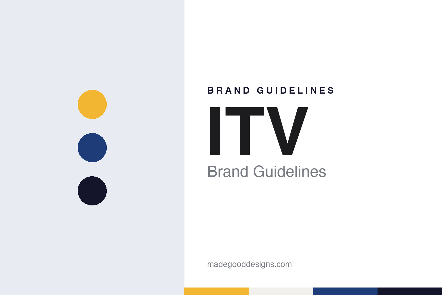
Two constants: a yellow, royal blue and night palette and a rounded sans register. Abstract homage — not an ITV asset or mark; no logo, ident or programme graphic is reproduced.
A network built from regions
Independent Television in 1955 and the franchises behind it.
ITV began as a set of companies rather than a single broadcaster. English Wikipedia says the network was launched in 1955 as Independent Television, after the Television Act 1954 created the Independent Television Authority to regulate the new service and award franchises. The opening franchises were awarded in 1954, for London, the Midlands and the North of England, and each was originally held by a different company that made programmes for its own region and shared others across the network.
That regional structure shaped how the name appeared on screen. English Wikipedia says that before 1989 there had never been an identity for ITV as a whole adopted by every broadcaster in the network. Each regional company used its own name, and “ITV” was rarely seen on air except in sub-brands such as ITV Schools or ITV Sport, or in network promotions such as “Christmas on ITV”. Viewers in one region knew the station by the company that held the local franchise.
The franchises themselves changed hands over the decades. English Wikipedia lists franchise reviews in 1963, 1967, 1974, 1980 and 1991, during which regions were redrawn and some operators were replaced. The same article says several names from the network’s past, among them Thames, ABC and ATV, have no connection with the modern network, which is why the history of ITV reads as a list of regional companies as much as a single story.
A national look arrived in stages. English Wikipedia says a national ITV corporate identity was set up in September 1989, combining regional brands with the national ITV name, though the balance between the two varied from company to company and some companies never used the ITV brand at all. It was not until October 2002 that national ITV-branded continuity was adopted across all the regions in England and Wales, and regional continuity before local programmes carried on until November 2006.
The network and the company are not quite the same thing. English Wikipedia says the ITV network is a separate entity from ITV plc, which holds the Channel 3 licences for every region except central and northern Scotland. Those two licences are held by STV Group, and there the channel is branded STV rather than ITV1. The design story of ITV is in large part the story of how many regional names were folded into one.
Colour
From Granada and Carlton to ITV plc, then one look in 2013.
Consolidation came through the 1990s. English Wikipedia says that from 1994, when ownership rules were relaxed, the companies of the network began buying one another, and that by the end of the decade three owners dominated the franchises in England and Wales. The article notes that these groups ran their licences in different ways: Carlton re-branded its stations with its own name, creating one identity across its territory, while Granada kept the licensees’ names but centralised continuity.
The two groups became one company in 2004. English Wikipedia says that in 2004 Granada purchased Carlton and renamed itself ITV plc, a single company for all the ITV franchises in England and Wales. Before the deal, the article says, the rivals had already worked together on digital channels, among them ITV2, which had launched in December 1998. The online service followed a run of names: English Wikipedia says ITV Catch Up was rebranded as the ITV Player on 5 December 2008, and the app and website became ITV Hub on 23 November 2015, before the company announced ITVX in 2022.
The current identity was announced in 2012. The Drum, in a report by John Glenday dated 16 November 2012, said ITV would group all its channels and activities under a single “unifying brand identity” for the first time, with a new logo for the business and new identities for each channel. The main channel, ITV1, would be renamed simply ITV. The report described the new look as curvaceous and colourful, intended to be less formal than the existing branding, and said it would roll out in January across all ITV channels, the ITV Network and ITV Studios, the production arm.
The work was done inside the company. The Drum said the rebrand was conducted in-house by Rufus Radcliffe, ITV’s group director of marketing, and Reemah Sakaan, director of network marketing, and that it was the first such rebrand since 2006. Radcliffe, quoted at a press briefing, said the aim was to cement the link between the shows people watch and the ITV name that makes them, and he explained that ITV1 had appeared in yellow whatever the programme, whereas the new look was meant to “flex and focus”. The report added that sub-identities would follow, with ITV News given a royal blue logo and ITV Sport a green tint.
The launch followed two months later. Creative Bloq, in a staff report dated 14 January 2013, said ITV had launched the rebrand across its broadcast channels and online that day, as a unifying identity for ITV plc, the ITV Network and the company’s content and distribution businesses. The report credited the brand work to Radcliffe, Sakaan and Phil Lind, creative director of ITV Creative, and described idents featuring a marching band, surfers, night cyclists, bus journeys and ballet dancers, each showing how the logo took its colour from the scene behind it.
Typography
A logo that takes its colour from the picture.
A broadcaster’s mark has to work on a screen for a few seconds at a time, and it is often redrawn while its core stays put. German Wikipedia says the German shared channel Das Erste took a “1” as its logo with a new corporate design on 1 October 1984, gave it a ring in 2003, and from 28 February 2015 cut it out of a white circle. Horizont reported on 27 November 2008 that a revised on-air design for the channel kept its logo, colours and typography and changed the animated backgrounds around them, with new identity spots showing people in different landscapes and regions.
The initials can also hold steady while the words behind them change. The Irish Times reported on 20 July 2009 that RTÉ’s full name was respelled Raidió Teilifís Éireann, and quoted an RTÉ spokeswoman saying that all on-air logos read simply RTÉ. Idents can change with a channel’s name: Promax Daily Brief reported on 19 September 2014 that RTÉ Two returned to the name RTÉ2 with idents built from footage of young people in Ireland. When reading a broadcaster’s identity, look at which mark has stayed fixed, how long it has lasted, and what the idents and backgrounds around it have been asked to do.
Aa
A rounded sans — the register of a soft, curving broadcast wordmark. (Specimen set in Nunito, a rounded sans STAND-IN; NOT the ITV logo or any ITV typeface.)
ITV
Three letters over many regions, and colour that follows the screen.
The colour rule is the clearest part of the 2013 system. Before it, The Drum reported, the main channel’s mark sat in the same yellow whatever was on air. After it, Creative Bloq described a logo that picked up its colour from the picture behind it, so a dance ident, a surf ident and a night ride each tinted the same three letters differently. The sub-brands kept fixed colours of their own: royal blue for ITV News and green for ITV Sport, according to The Drum.
The name itself had to be earned on screen. English Wikipedia’s account of ITV’s visual identity runs from regional company names before 1989, through a shared national identity from September 1989, to national continuity across England and Wales from October 2002. The 2013 identity, as The Drum described it, went one step further by placing the channels, the network and the studios business under the same mark, and by dropping the numeral from the main channel’s name.
The company has continued to change around the mark. The regional structure remains visible: English Wikipedia notes that the network’s licences are still held regionally, and in central and northern Scotland the channel carries the STV name.
Read across its history, ITV shows a sequence of identity decisions rather than a single moment. A network of regional companies shared programmes for decades under their own names; a national brand was layered over them in 1989; continuity was unified in 2002; and the 2013 work, made by ITV’s own marketing team and ITV Creative, gave one logo to the whole business and let colour do the work of telling programmes and channels apart.
For a design guide, ITV shows how a broadcaster assembled from regional franchises can settle on one short name and then let colour, not a fixed tint, carry the variety of its schedule. Compare the BBC, the British public broadcaster ITV was created to compete with, or Channel 4, another British channel whose identity is built around idents. For this guide we use yellow, royal blue and night with a sans, an unofficial interpretation; no product or logo is reproduced.
Explore & save
Keep ITV’s identity on hand — save it to a board in the Made Good inspiration library.
ITV identity set
Pin the ITV yellow, royal blue and night palette and the rounded sans register to your own board.