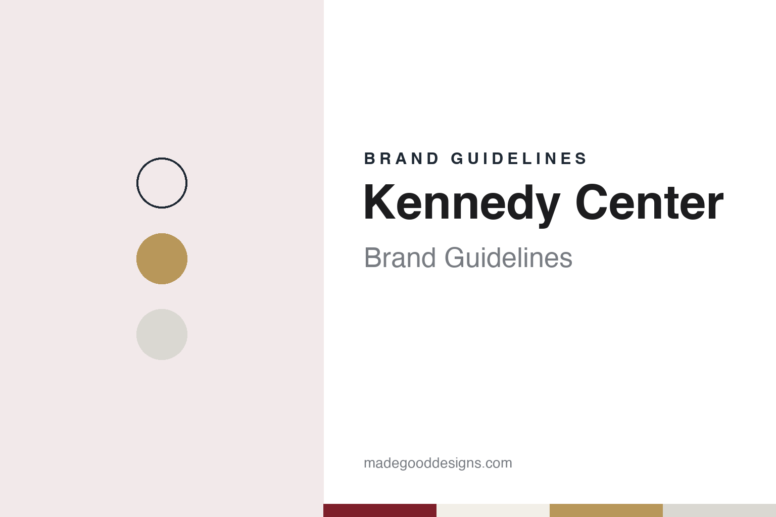
Kennedy Center Brand Guidelines
A national cultural center, a living memorial and a marble box on the Potomac.
Aa
Two constants: a Carrara white, foyer gilt, curtain red and Potomac night palette and a Classical modern serif register. Abstract homage — not a Kennedy Center asset or mark; no logo, photograph or Kennedy Center lettering is reproduced.
From a national cultural center to a living memorial
Public Law 85-874, a site by the river and an architect chosen in 1959.
The John F. Kennedy Center for the Performing Arts began life under a different name. Wikipedia traces the idea of a national cultural center in Washington to 1933 and the First Lady Eleanor Roosevelt. It came back in 1950, when the New York congressman Arthur George Klein introduced a bill to plan and build a cultural center, and in 1955 the Stanford Research Institute was commissioned to select a site and suggest designs.
The legal foundation came three years later. A Library of Congress blog post by Laura Jenemann, published on 4 January 2023, says the plan for a national cultural center was formalised with the passing of Public Law 85-874, the National Cultural Center Act, on 2 September 1958; Wikipedia says the act was signed by President Dwight D. Eisenhower. Under the act the center was set up as a bureau of the Smithsonian Institution, and Wikipedia says the original building is still administered that way, with a board of trustees that Eisenhower established on 29 January 1959. Wikipedia says the act requires programming to be sustained through private funds, making the center a public–private partnership.
The site was a stretch of the Potomac shore in the Foggy Bottom area. The Library of Congress post describes a 1959 television programme, “A National Cultural Center”, made for National Educational Television and dated 20 December 1959, built around an interview with Frank Lloyd Wright recorded on 3 October 1958 at the Lisner Auditorium in Washington. The programme describes the site as land on the Potomac then partly occupied by an old brewery, and says Wright had visited it three times; in the interview he argued that the center would need three kinds of auditorium: a concert hall, an opera house for opera and ballet, and a small chamber space.
The commission went elsewhere. Wikipedia says Edward Durell Stone was selected as architect in June 1959 and presented preliminary designs to the President’s Music Committee in October 1959. Wikipedia says Stone’s design was quickly approved by the United States Commission of Fine Arts, the National Capital Planning Commission and the National Park Service.
Colour
A new chairman in 1961, a memorial in 1964 and a Mass in 1971.
The project gained a patron in the White House. Wikipedia says President John F. Kennedy took an interest in bringing culture to the capital, and in 1961 asked the theatre producer Roger L. Stevens to chair the board of trustees; Stevens recruited Jacqueline Kennedy as honorary chairman and the former First Lady Mamie Eisenhower as co-chairman. After Kennedy’s assassination in November 1963, Wikipedia says, the board re-envisioned the project as a “living memorial” to him, and Congress renamed it the John F. Kennedy Center for the Performing Arts in 1964.
Construction followed. President Lyndon B. Johnson turned the ceremonial shovel of earth at the groundbreaking on 2 December 1964. Excavation began on 11 December 1965, and the Philadelphia contractor John McShain built the center. The marble came as a gift: Wikipedia says the Italian government donated Carrara marble from the Apuan Alps, quarried by the Bufalini family firm that Stone favoured, and the slabs were installed between 1968 and 1970 on the facade and interior walls.
The building is a long box divided into three halls. Wikipedia says the Concert Hall sits at the south end, the Opera House in the middle and the Eisenhower Theater on the north side, joined by a grand foyer and two long corridors, the Hall of States and the Hall of Nations. The acoustician Cyril M. Harris designed the auditoriums. Because aircraft using the nearby Ronald Reagan Washington National Airport fly along the river, the center was designed as a box within a box, with an extra outer shell around each auditorium.
Many of the fittings were gifts: the grand foyer’s sixteen hand-blown Orrefors chandeliers came from Sweden, and the Opera House’s red and gold silk curtain from Japan. A bronze bust of Kennedy by Robert Berks has stood in the foyer since 1971.
The center opened in stages. Wikipedia says the opening performance, a public preview on 5 September 1971, was a premiere of Leonard Bernstein’s Mass in the Opera House, and the official opening followed on 8 September 1971 with a formal gala and the premiere performance of the same work. The National Symphony Orchestra inaugurated the Concert Hall on 9 September, and the Eisenhower Theater opened on 18 October 1971 with Ibsen’s A Doll’s House.
Typography
A memorial name, a building as a mark and a collage system.
Many venues carry two names at once. One is the historic name, often long and formal, cut into stone or printed on a founding document; the other is the short form that audiences actually say, which tends to become the wordmark. Moving from the long name to the short one is a frequent identity decision for a theatre or arts centre, and it often happens quietly, when a new logo drops a word such as “centre” or “theatre” and the shorter name simply takes over in conversation, on tickets and in the press. Anniversaries test the arrangement. A twentieth, fortieth or fiftieth year usually brings a special lock-up, a commemorative season and a run of printed matter that sits beside the everyday mark for a year and then retires, and designers have to decide how far the anniversary version may bend the rules before it starts to look like a different organisation.
Much of a venue’s identity also leaves the building in a bag. Gift shops sell programmes, posters, books, tea towels and mugs, and a mark that works on a ticket has to survive embroidery, a pencil and a tote bag. The building itself often becomes the merchandise, as a drawing, a print or a model. Digital channels add another layer: recorded performances, cinema relays and streaming services frequently get a sub-brand of their own, so the house mark must lock up cleanly with a second name. Funders and partners bring their crests and credit lines too. A workable system sets out in advance where each of these marks sits, how large it is and what it may sit beside.
Aa
Classical modern serif — after the restrained, monumental register of the Stone building. (Specimen set in Cormorant Garamond, a serif STAND-IN; NOT the Kennedy Center logo or any Kennedy Center lettering.)
Kennedy Center
Three white pavilions in 2019 and an identity told through programming.
The center’s expansion is called the REACH. Wikipedia says a competition in 2013 selected Steven Holl Architects, working with the firm BNIM, that ground was broken in December 2014, and that the expansion opened on 7 September 2019 with an arts festival; it says REACH stands for Renew, Experience, Activate, Create and Honor. Dezeen reported on 11 September 2019 that almost all of the 72,000 square feet of new space sits underground, beneath a grassy slope broken by three white concrete pavilions: the Welcome pavilion above the entrance, the Skylight pavilion with a large curved wall at the centre of the site, and the River pavilion at the lowest point beside a reflecting pool.
The magazine described the pavilions as titanium-white board-formed concrete cast against Douglas fir, with swooped edges set against sharp angles, and quoted the firm describing “a language of forms, from conical sections to hyperbolic paraboloids”. Inside, feature walls are lined with what the studio calls “crinkled concrete”, grooved for acoustics. The landscape, by Edmund D Hollander, includes a grove of 35 ginkgo trees for Kennedy as the 35th president and a mahogany deck at the reflecting pool that recalls his wartime PT boat.
Two agencies describe identity work for the center. IA Collaborative says the Kennedy Center engaged it to evolve its identity, as a cultural institution and a memorial to Kennedy, starting from the center’s mission statement and building a system that could stretch across its sub-brands; it says the logo was meant to carry a sense of movement and monumental architecture, with the art living inside it. Zeus Jones says the center approached it in late 2024 to refine its brand and narrative after a 2018 rebrand, that it framed the center as “the nation’s cultural center”, and that the refreshed system uses collage as its main visual theme, with colourful accents and photography of audience reactions.
For a design guide, the Kennedy Center shows an institution whose name, building and identity all carry its double role as a national stage and a memorial: Stone’s marble box of 1971, Holl’s white pavilions of 2019 and a mark built to hold the programme inside it. Compare the Barbican Centre and Esplanade – Theatres on the Bay guides. For this guide we use Carrara white, foyer gilt, curtain red and Potomac night with a serif, an unofficial interpretation; no product or logo is reproduced.
Explore & save
Keep Kennedy Center’s identity on hand — save it to a board in the Made Good inspiration library.
Kennedy Center identity set
Pin the Kennedy Center Carrara white, foyer gilt, curtain red and Potomac night palette and the Classical modern serif register to your own board.