Keymaster Games Brand Guidelines
An Athens, Georgia studio with a golden key.
Aa
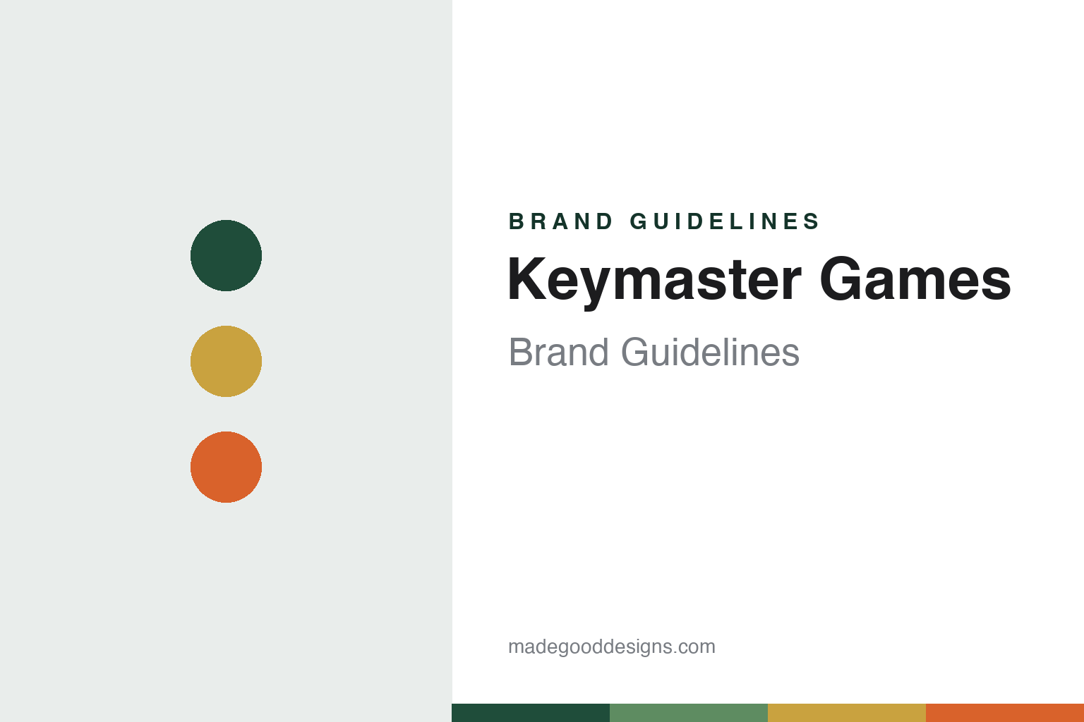
Two constants: a greens, gold and orange palette and a retro display sans register. Abstract homage — not a Keymaster Games product or mark; no box art, mascot or logo is reproduced.
Control
Game nights, a card game and a Kickstarter.
Keymaster Games is a board-game publisher in Athens, Georgia, built by Kyle Key and Mattox Shuler. In January 2019 Flagpole, the Athens weekly, profiled it as a “local company” and a board-game success story. Key told the paper that he started by writing house rules for games he already loved, and then wanted to make his own. Shuler, a game developer, met Key afterwards, and the two became friends through game nights.
“The real spark was when Mattox made Control,” Key told Flagpole. Control, a quick card game about trapped time-travellers, went to Kickstarter in 2016 and comfortably passed its goal, the paper reported. Campy Creatures, a bluffing card game with artwork by Josh Emrich, followed on Kickstarter in February 2017 and funded in under 27 hours.
By early 2019 the team had grown to four, with two people handling finance, operations and marketing, according to the same article. Its first games by outside designers, Caper and Space Park, came out in 2018. “We are small, so we can work closely and in tandem with the designers,” Shuler told the paper.
Colour
Parks and the national parks.
The game that made Keymaster’s name was Parks, designed by Henry Audubon and published in 2019. Flagpole reported in January 2019 that it would launch on Kickstarter on 29 January, describing a tile-and-card game in which players are hikers visiting the United States’ national parks, illustrated with work from Fifty-Nine Parks, a collective of artists formed to celebrate the parks. The paper said five per cent of sales would go to the National Park Service.
English Wikipedia describes Parks as a game for one to five players played over four seasons, with its art “derived from the Fifty-Nine Parks Print Series,” citing Polygon from Gen Con in August 2019. A modular expansion, Nightfall, followed, which Board Game Quest reviewed in April 2021.
Keymaster then rebuilt the game as a second edition. A trade listing by the distributor PHD Games, posted in January 2025 with an April 2025 release, described it as featuring all 63 national parks “with brand new art and expanded gameplay,” illustrated by Josh Emrich and Lisk Feng, and folding in elements of the Nightfall and Wildlife expansions. Keymaster’s product page says the team “worked alongside Parks designer Henry Audubon” on it, and lists an FSC certification and membership of 1% for the Planet. The deluxe Summit Edition described there swaps the main board for a playmat made from recycled rubber, adds screen-printed wildlife tokens, ripstop nylon bags made from recycled materials and a holofoil park card, and uses gold foil on a numbered first printing. The page also asks customers to donate unwanted games locally rather than ship them back, saying shipping is “a significant expense and a drain on the environment.” Its staff page says producer Jen Graham-Macht researched national-park history for the edition and copywriter Nathan Thornton wrote the card content for all 63 parks.
The current catalogue on the company’s website includes Hanami, Caper: Europe, Campy Creatures: Volume 1, Fuego and Chicken! alongside Parks.
Typography
Design and documentation.
The seven brands in this group are all board-game publishers: Allplay, Button Shy, Flatout Games, Keymaster Games, Mindclash Games, Red Raven Games and Grail Games. A publisher’s name sits on the box beside the names of the designers who invented the game and the artists who illustrated it, and a single title can pass from one publisher to another as rights are licensed, new editions are made and older editions go out of print.
A board-game publisher’s identity is therefore carried less by one product than by a logo on the box, a run of illustrators and a promise about the kind of games it makes, because the company behind the name may change its partners, its owners or the places where its games are printed. That makes the plain questions behind each name worth asking: who started it, who runs or owns it now, and where its games are made.
Each guide separates what independent sources record from what the company says about itself — its founding story, its owners and partners over time, where its games are manufactured and how its look has changed — and marks plainly what rests only on the company’s own word.
Aa
A retro display sans, after a wordmark drawn from 1970s paperback sci-fi type. (Specimen set in Righteous, a display STAND-IN; NOT the Keymaster logo or its Nichrome typeface.)
Keymaster Games
A golden key at 45 degrees.
Keymaster’s visual identity is unusually well documented, because its designers published a case study. The branding agency Focus Lab, whose write-up was online by July 2021 according to the Internet Archive, says it worked on Keymaster’s strategy, verbal identity and visual identity as the company prepared to move from Kickstarter to retail shelves, aiming to keep the charm fans liked while reaching new audiences.
According to Focus Lab, the original hexagon monogram became a circle, a nod to connection around the table. The mark, called “the Key,” sits at a 45-degree angle and is almost always gold. The wordmark is based on Keymaster’s Nichrome display typeface, which the agency says references 1970s and early-1980s paperback science-fiction lettering, and was customised letter by letter. The colour palette was cut back to a trio of greens, gold and orange, replacing inconsistent older colours. A mascot, Red, was developed from sketches by Kyle Key and refined by the agency; it is “always searching for the golden key,” Focus Lab says. The agency also wrote a vision statement — “to craft beautiful, immersive experiences that create joy and deep connection for years to come” — and notes that packaging and game artwork were produced by Keymaster itself. Key is quoted in the case study crediting the positioning work with helping to win a deal with Target to stock a new game.
The company’s own about page today states a mission to make games that “share wonder, break expectations, and have a lasting impact on our world.”
For a design guide, Keymaster Games shows how a small publisher can turn a single flagship into a whole identity system. Compare Stonemaier Games, another Kickstarter-grown publisher of nature-themed games, and Flatout Games. For this guide we use greens, gold and orange with a display sans, an unofficial interpretation; no product or logo is reproduced.
Explore & save
Keep Keymaster Games’s identity on hand — save it to a board in the Made Good inspiration library.
Keymaster Games identity set
Pin the Keymaster Games greens, gold and orange palette and the retro display sans register to your own board.