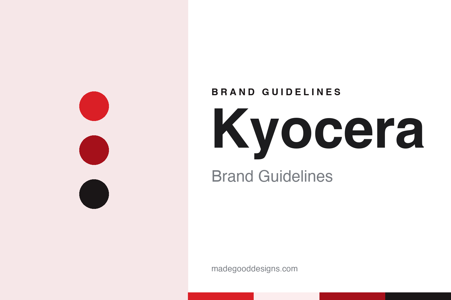
Kyocera Brand Guidelines
A Kyoto ceramics workshop, a shortened name and a K wrapped around a C.
Aa
Two constants: a red, deep red and ink palette and a Geometric grotesque sans register. Abstract homage — not a Kyocera asset or mark; no logo, icon or wordmark is reproduced.
A fine-ceramics company in Kyoto
Kyoto Ceramic, April 1959.
Kyocera’s name records where the company started and what it made. English Wikipedia says the business was founded by Kazuo Inamori in April 1959 as Kyoto Ceramic Co., Ltd., a company specialising in fine ceramics, and that it was renamed in 1982. The company’s own history page gives the same month and city: Kyoto Ceramic Co., Ltd., now Kyocera Corporation, was founded in Kyoto as a fine-ceramics company, and its facilities were a headquarters and a factory.
Inamori arrived at ceramics through insulators. The trade publication The Recycler, reporting on 31 August 2022, said he graduated from Kagoshima University in 1955 with an engineering degree and joined Shofu Industries, an insulator manufacturer in Kyoto, before establishing Kyoto Ceramic Co., Ltd. in April 1959. Wikipedia says the new company’s original product was a ceramic insulator for cathode-ray tubes, and that it soon adapted its technology to a widening range of ceramic components for electronic and structural uses, including ceramic semiconductor packages in the 1960s.
The company’s history page traces how quickly the name travelled beyond Kyoto. A Tokyo office opened in April 1960, and a plant in Shiga followed in May 1963. In 1969 Kyocera International, Inc. was set up as the North American sales company, and in January 1971 a European company was formed in Germany in cooperation with Feldmühle AG. In July 1972 the headquarters moved to Yamashina, still within Kyoto.
The company frames its beginnings in modest terms. Its corporate motto page says Kyocera “started as a small, suburban factory, with no money, credentials or reputation,” and that it grew because employees and managers built trust in one another, an idea it calls management “based on the bonds of human minds.” The same page sets out a management rationale: “To provide opportunities for the material and intellectual growth of all our employees, and through our joint efforts, contribute to the advancement of society and humankind.” These words, rather than any slogan about ceramics, are what the company places at the centre of its identity.
Colour
Do what’s right. Do what’s new.
The rename came with a reorganisation. Wikipedia says that in 1982 the company merged Kyoto Ceramic with several of its subsidiaries to create Kyocera Corporation. The new name is built from the old one: the Kyo- of Kyoto and the -cera of ceramic, joined into a single word.
The company’s “Our Brand” page explains the mark that arrived with the name. Kyocera says its brand symbol is made of a corporate mark and a corporate logotype. The mark represents the initial “K”, for Kyocera, encircling a “C”, for ceramics, and it was introduced in October 1982, when the company name was changed from “Kyoto Ceramic” to “Kyocera.” In other words, the symbol keeps the material in view even after the word “ceramic” was shortened to four letters: one letter stands for the company, and the letter inside it stands for what the company was founded to make.
The same page sets out a Brand Essence in two short sentences, “Do what’s right. Do what’s new.” Kyocera says these express the core of its management ideals, drawn from its corporate motto, management rationale and the Kyocera Philosophy. The page turns them into questions for staff, such as “Is this the right thing to do?” and whether one is taking on new challenges or “following the beaten path.” It is a verbal identity built from plain imperatives rather than a product promise.
The name also appears in more than one script. Wikipedia says that on the shirts of Kyoto Sanga F.C., the J.League club from the company’s home city, the word “Kyocera” is written in Japanese katakana, while everywhere else the Latin-letter logo is used. Wikipedia also notes that Kyocera holds the naming rights to Kyocera Dome Osaka, the indoor stadium otherwise known as Osaka Dome, which puts the wordmark on a building rather than a product.
Through the 1980s the Kyocera name sat beside others it acquired. Wikipedia says Kyocera bought the American audio name KLH in 1982 and sold it in 1989, and that it acquired Yashica in 1983, along with Yashica’s existing licensing agreement with Carl Zeiss, going on to make film and digital cameras under the Kyocera, Yashica and Contax names. In 1984, Wikipedia says, it took an equity stake in Daini-Denden Kikaku, the company now known as KDDI.
Typography
Parent names and product names.
A corporate identity has a different job from a product brand. A product name speaks to the person holding the bottle or the device; a parent name speaks to investors, employees, suppliers and regulators, and it often has to stretch across trades that look nothing alike. A group that sells spirits and beer, or a maker whose catalogue runs from printers to ceramics, needs a name that does not tie it to a single shelf.
That is why parent names tend to fall into a few patterns. Some are contractions of an older, longer name, keeping the sound of a founding place or material while dropping the literal description. Some are the joined surnames of founders or the shortened names of two merged companies. Others are coined from scratch, built from fragments of words in another language so that they carry a mood rather than a meaning, and so that they can be registered as trademarks in many countries at once.
The visual system follows the same logic. A group mark is usually quieter than the marks it owns: a wordmark, a simple symbol, a restrained colour, designed to sit on an annual report, a factory sign and a business card without competing with the product names underneath.
Aa
A geometric grotesque — after a short corporate wordmark beside a letter-within-a-letter symbol. (Specimen set in Inter, a sans STAND-IN; NOT the Kyocera logo or any Kyocera typeface.)
Kyocera
Copiers, a founder’s handover and a lasting mark.
Office equipment brought more names under the Kyocera umbrella. Wikipedia says that in January 2000 Kyocera acquired the photocopier maker Mita, creating Kyocera Mita Corporation, headquartered in Osaka, and that the company was renamed Kyocera Document Solutions in 2012. Its printers and multifunction devices, Wikipedia adds, are also marketed under the Copystar name in the Americas and under the TA Triumph-Adler and Utax names in Europe, the Middle East and Africa. Kyocera’s own name has meanwhile stayed on its ceramic kitchen knives, which Wikipedia says it sells under the name Kyocera Advanced Ceramics, a product line that keeps the founding material in plain sight.
The founder stepped back in the late 1990s. The Recycler reported that Inamori served as president and chairman of the company until 1997, when he took the title of Founder and Chairman Emeritus; Wikipedia says he retired that year to become a Zen Buddhist monk. A new headquarters building in Fushimi, Kyoto, was completed in 1998, according to Wikipedia, so the company never left the city whose name opens its own.
On 31 August 2022, The Recycler reported Kyocera’s announcement that Inamori had died at home in Kyoto on 24 August 2022. The announcement, as quoted by the publication, described him as Founder and Chairman Emeritus of Kyocera, Honorary Adviser to KDDI and Japan Airlines, and founder of the Inamori Foundation, and said a private wake and funeral had been held mainly among close family members before the news was released.
For a design guide, Kyocera shows how a contraction can carry a whole founding story: the city and the material survive in the name, and the material survives again in the letter tucked inside the mark. Compare Ricoh, another Japanese maker known for office printing, and NEC, an electronics company identified by its initials. For this guide we use red, a deep red and ink with a sans, an unofficial interpretation; no product or logo is reproduced.
Explore & save
Keep Kyocera’s identity on hand — save it to a board in the Made Good inspiration library.
Kyocera identity set
Pin the Kyocera red, deep red and ink palette and the Geometric grotesque sans register to your own board.