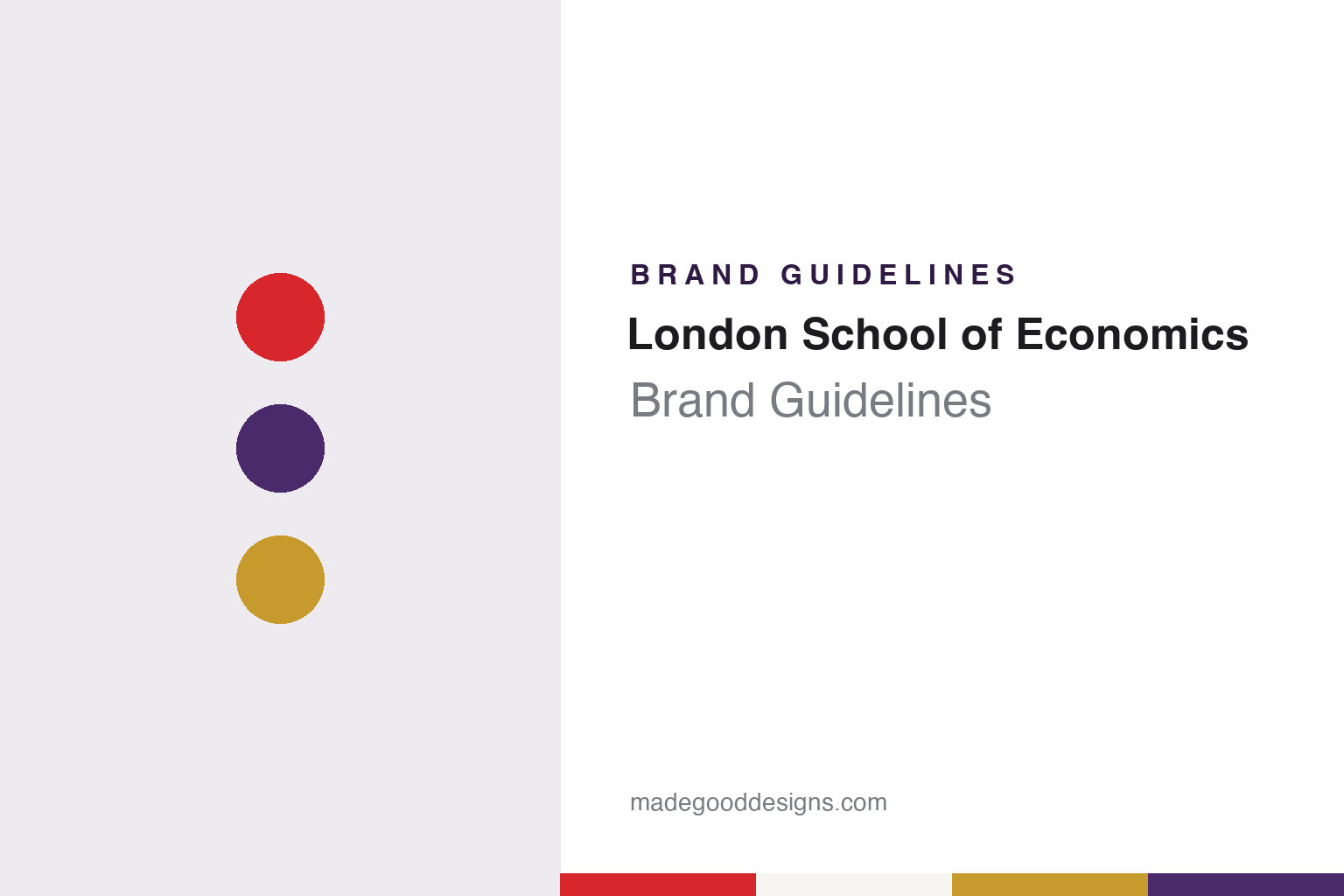
London School of Economics Brand Guidelines
A beaver on the arms, a line from Virgil and a red square at the end of the name.
Aa
Two constants: a red, purple and gold palette and a plain sans register. Abstract homage — not a London School of Economics mark; no arms, beaver, logo or wordmark is reproduced.
Founded in 1895
Four founders, a breakfast meeting and rooms in the Adelphi.
The London School of Economics and Political Science, known everywhere by its three initials, was founded in 1895 by four members of the Fabian Society: Sidney Webb, Beatrice Webb, Graham Wallas and the playwright George Bernard Shaw, English Wikipedia says. The money came from a bequest left in trust by Henry Hunt Hutchinson, a lawyer and Fabian. LSE’s own records place the idea at a breakfast meeting on 4 August 1894; the trustees accepted the proposal in February 1895, and classes began that October in rooms at 9 John Street, Adelphi, in the City of Westminster.
The school grew quickly. It joined the federal University of London in 1900 as a faculty of economics, and the University of London degrees of BSc (Econ) and DSc (Econ) followed in 1901. After a short stay at 10 Adelphi Terrace it moved to the district of Clare Market and Houghton Street, where it has been based since 1902, between the Royal Courts of Justice and Kingsway. King George V laid the foundation stone of the Old Building on Houghton Street in 1920, and it opened in 1922. LSE began awarding degrees in its own name in 2008, and in 2022 it became a university in its own right within the University of London, Wikipedia records.
Shaw left a literary trace as well as an institutional one. Wikipedia notes that the epilogue to his 1912 play Pygmalion sends Eliza Doolittle to the LSE, and the school’s fiction and general reading collection is still called the Shaw Library, housed in the Founders’ Room of the Old Building. When the students’ paper launched in 1949, Shaw sent a postcard: The Beaver recalled in March 2019 that its opening front page was headlined “Bernard Shaw Greets the Beaver”.
Colour
A committee, a beaver and a line from Virgil.
The school’s heraldry was settled the same year the Old Building opened. Wikipedia says the arms, including the motto and the beaver, were adopted in February 1922 on the recommendation of a committee of twelve set up to research the matter, eight of whom were students. The motto, Rerum cognoscere causas, is a line from Virgil’s Georgics, translated as “to know the causes of things”, and it was suggested by the economist Professor Edwin Cannan.
The beaver was chosen, Wikipedia says, for its associations with “foresight, constructiveness, and industrious behaviour”, and elsewhere describes it as standing for a hard-working and industrious yet sociable animal, qualities the founders hoped LSE students would have. The animal has spread well beyond the shield. The students’ weekly newspaper is called The Beaver, LSE sports teams are known as the Beavers, and the bar at Rosebery residence hall is the Tipsy Beaver. The Beaver, writing its own history in March 2019, traced the paper back to 1949 and described how its pages had changed from that four-page debut issue, with news on the front and reviews and sport at the back.
The historic coat of arms still has a formal role. Wikipedia says it is used on official documents, including degree certificates and transcripts, carrying both the motto and the beaver. That leaves the arms to do ceremonial work, while a separate, simpler mark handles everyday communication. The same split runs through the colours: LSE has two sets, a brand colour and academic colours, so that the shield and the gown keep one register and the signage and publications keep another.
Typography
Arms, red block, colours and type.
A university’s identity usually begins with a coat of arms, a shield granted or adopted to mark the institution in the way a family or a town would be marked. The charges on that shield often carry meaning: books stand for learning, crowns for a royal charter or patron, and heraldic animals and birds borrowed from a founder’s own arms or from the landscape of the region. Beneath the shield sits a motto, very often in Latin, compressing an institutional purpose into a handful of words that survive every later redesign.
Alongside the arms, universities often settle on one or two institutional colours. These begin in academic dress, rowing jackets and sports kit, and only later become specified tones in a style manual, with print and screen values set out for staff and suppliers.
The modern layer is the wordmark: a typeset name paired with a simplified shield, built to work at small sizes on websites, apps and signage. Many institutions now keep the full arms for ceremonial use, such as degree certificates and convocation, while the simplified mark carries day-to-day communications. Athletics programmes frequently run a separate family of marks with their own team names and mascots.
Aa
A plain sans — the register of a department sign. (Specimen set in Work Sans, a sans STAND-IN; NOT the LSE logo or its typeface.)
London School of Economics
Red for every day, purple, black and gold for ceremonies.
The everyday mark is the red block. Wikipedia says LSE’s present logo was modified as part of a rebrand in the early 2000s and is protected as a trademark, but can be produced in several forms for different needs. In its full form, the full name of the institution sits to the right of the block, followed by a further small empty red square at the end. The logo is adapted for each academic department and professional service division, so that the many parts of the school share one cohesive brand. In that full form the name written out beside the block is the school’s formal title, the London School of Economics and Political Science, rather than the three initials used in everyday speech.
Red is the brand colour, used on signage, publications and in buildings across the campus. The academic colours are different: purple, black and gold, worn for presentation ceremonies and in graduation dress. The two sets rarely meet, which lets a red-and-white sign on Houghton Street and a purple gown at graduation both read as LSE.
Red also carries into the identities of the school’s research centres. Design Week reported on 29 November 2016 that the agency Templo had rebranded what it called the LSE Climate Change Institute, with a logo meant to highlight two sides of its work, economic prosperity and reducing climate change. Templo made the institute’s full name part of the mark itself and introduced a new typeface and a red colour palette, keeping the sub-brand within the colour of the parent.
For a design guide, the London School of Economics shows how an institution can split its identity in two: a 1922 shield with a beaver and a Virgil motto for certificates and ceremonies, and a plain red block with an empty square for everything else, adapted department by department; compare University of Cambridge for arms and name kept together in one mark, and British Museum for another London institution with a long institutional history behind a modern identity. For this guide we use red, purple and gold with a sans, an unofficial interpretation; no product or logo is reproduced.
Explore & save
Keep London School of Economics’s identity on hand — save it to a board in the Made Good inspiration library.
London School of Economics identity set
Pin the block red, academic purple and gold palette and the plain sans register to your own board.