Marathon Brand Guidelines
Ohio Oil’s runner, the hexagon M and a red, white and blue forecourt.
Aa
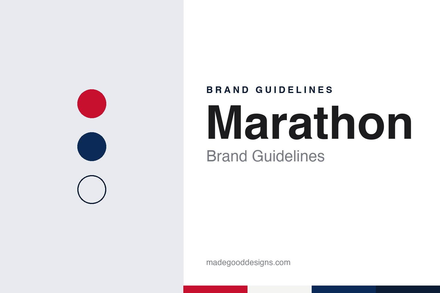
Two constants: a Marathon red, white and blue palette and a Bold road sans register. Abstract homage — not a Marathon product or mark; no sign, logo or station element is reproduced.
The Ohio
An oil company in Lima, and a name bought in 1930.
The Marathon name on fuel stations today belongs to Marathon Petroleum Corporation of Findlay, Ohio, but the business that built it started under another name. Marathon Petroleum’s own history says several small oil companies banded together in 1887 to form The Ohio Oil Company in Lima, Ohio, and that John D. Rockefeller’s Standard Oil bought the company in 1889. The company’s timeline dates the move of its headquarters to Findlay to 1889; the American Oil & Gas Historical Society (AOGHS), in its history of the company, dates the move from Lima to Findlay to 1905. Both say Ohio Oil became independent again in 1911, after the Supreme Court broke up the Standard Oil trust. Known in the trade as “The Ohio,” AOGHS says, it began as a producer and pipeline company rather than a seller of fuel.
Ohio Oil came to selling gasoline through purchases. In June 1924, AOGHS says, it bought the Lincoln Oil Refining Company of Robinson, Illinois, and sold its products as Linco; Marathon Petroleum’s timeline says the deal included the Robinson refinery and a group of Linco-branded service stations in Robinson and in Terre Haute, Indiana. By 1930, according to AOGHS, Linco products were sold in Ohio, Indiana, Illinois, Michigan and Kentucky.
The Marathon name arrived in 1930, when Ohio Oil bought Transcontinental Oil, a refiner that, AOGHS says, had marketed gasoline under the trademark “Marathon” across the Midwest and South since 1920. The company’s timeline says the purchase brought oil and gas wells, refineries, storage plants and filling stations, together with the Marathon product name, a trademark showing Pheidippides, the Greek runner of the marathon story and a slogan built around the runner. The same year, the timeline adds, Ohio Oil’s stock was traded on the New York Stock Exchange. AOGHS says the Marathon name had replaced Linco at stations across Ohio Oil’s original territory by the Second World War.
Colour
From a Greek runner to an M in a hexagon.
The runner set the tone for Marathon’s early advertising. Marathon Petroleum’s timeline says Ohio Oil began a campaign in 1945 for Marathon “Cat” gasoline, named after the catalytic cracking process then replacing thermal cracking in its refineries, and that in 1946 its Marathon service stations took on a new look, adding tires, batteries, accessories and service bays for car maintenance. In those years, the company says, the Marathon slogan became a familiar sight to drivers in the Midwest, painted on signs at the roadside.
The company name followed the brand in 1962. To mark its 75th anniversary, The Ohio Oil Company renamed itself Marathon Oil Company, and, AOGHS says, launched a new logo, an “M” inside a hexagon-shaped shield. Marathon Petroleum’s timeline says the Pheidippides trademark was retired the same year. The change moved the identity from an illustrated figure to a letter that could be repeated on signs, pumps and paperwork.
Other names joined the business along the way. The company says it bought the Aurora Gasoline Company in 1959, whose stations sold Speedway 79 fuel, and that in 1976 it set up Emro Marketing to run company-operated stations, a name formed by adding an E to Marathon Oil’s stock-exchange symbol, MRO. In 1998 Marathon and Ashland Inc. combined their refining and marketing businesses as Marathon Ashland Petroleum, and Emro and Ashland’s SuperAmerica chain were merged as Speedway SuperAmerica, according to the company. Marathon Petroleum dates Ashland’s transfer of its interest to Marathon to 2004; AOGHS dates Marathon’s full ownership to 2005. That business later took the Marathon Petroleum name.
Typography
The forecourt.
A fuel brand is met mostly at the roadside, and much of its identity is built for people moving at speed. The canopy over the pumps is a large branded surface, carrying a band of colour and a name or mark along its edge so that it reads from the road and at night under its own lights.
The tall sign at the entrance, often called a price pylon or price sign, does two jobs: it carries the brand’s mark at the top and a set of changeable figures below it. In a brand system the mark and the frame stay fixed while the figures change, so the sign is designed around the space the numbers will take.
At the pump itself the brand appears again on toppers, panels and nozzle labels, at a scale meant for someone standing beside the car. Forecourt colour ties these pieces together: the same hues on canopy, pumps, kiosk and sign let a station read as one place from a distance.
Each guide looks at how one name has carried its mark across those surfaces, who has owned it and how its signs have changed, and marks plainly what rests on the company’s own word.
Aa
A bold road sans — a name carried on canopies and pump toppers. (Specimen set in Archivo, a sans STAND-IN; NOT the Marathon logo.)
Marathon
Red, white and blue, reconfigured.
Marathon Petroleum became a separate company in mid-2011. AOGHS says that on June 30, 2011, Marathon Oil became an independent exploration-and-production company and unveiled an “energy wave” logo of its own as it separated from Marathon Petroleum; Marathon Petroleum’s timeline gives July 1, 2011 as the date it became a stand-alone refining, marketing and transportation company, headquartered in Findlay. The Marathon name on fuel stations stayed with Marathon Petroleum, while the oil producer kept the Marathon Oil name for its own business.
Part of the retail network later changed hands. Marathon Petroleum’s Speedway convenience-store chain went to 7-Eleven, Inc., which completed the acquisition on May 14, 2021, Supermarket News reported; the deal had been announced in August 2020. Marathon-branded stations, CSP Daily News reported in June 2022, are run by independent entrepreneurs who buy fuel from Marathon Petroleum, alongside direct dealers trading mainly under the ARCO name.
In June 2022 Marathon showed a new look for those stations. “Remaining true to our heritage, you will still see the familiar red, white and blue colors reconfigured into a bolder, more contemporary design,” John Rice, Marathon’s manager of brand marketing, told CSP Daily News. He described a retooled logo, channel letters and illumination meant to catch attention by day and night, and a new phrase on the stations, “Endurance Fuels.” The company said it would test the design at prototype sites in Findlay, its home town, before announcing a wider launch plan. Steve Solomon, Marathon’s director of brand strategy and innovation, called it “a brighter, more modern look,” the paper reported. The new phrase, like the old runner, draws on the name’s own meaning.
For a design guide, Marathon shows how a product name bought with another company in 1930 outlasted its illustrated runner and became the name of the business. Compare 7-Eleven, whose owner bought Marathon Petroleum’s Speedway chain, and BP, another fuel-station brand. For this guide we use a Marathon red, a deep blue and white with a sans, an unofficial interpretation; no product or logo is reproduced.
Explore & save
Keep Marathon’s identity on hand — save it to a board in the Made Good inspiration library.
Marathon identity set
Pin the Marathon red, white and blue palette and the Bold road sans register to your own board.