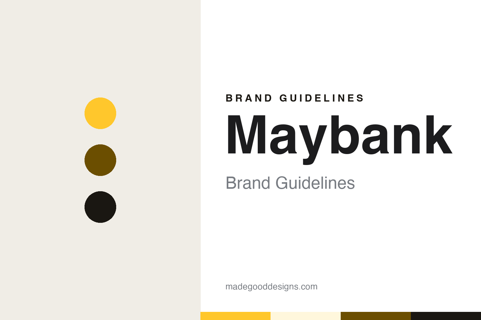
Maybank Brand Guidelines
A 1960 Kuala Lumpur bank, a yellow ground and a tiger head.
Aa
Two constants: a yellow, ochre and ink palette and a Rounded sans register. Abstract homage — not a Maybank asset or mark; no logo, tiger head or wordmark is reproduced.
Malayan Banking
Kuala Lumpur, 1960.
Maybank is the short form of a longer name. Malayan Banking Berhad was incorporated on 31 May 1960 and began operations in Kuala Lumpur on 12 September 1960, according to Wikipedia, which names its founders as the Singapore businessman Khoo Teck Puat and Oei Tjong Ie. In 2025 the bank’s head of brand described it as an institution established three years after Malaysia’s independence, Marketing-Interactive reported.
The founding grew out of a departure from another bank. Khoo had been deputy general manager of Singapore’s OCBC, and Wikipedia’s history of that bank says he resigned in 1959 after he was not appointed to its board, then set up Malayan Banking in Kuala Lumpur in 1960 with former OCBC staff.
The new bank looked outward early. Its Wikipedia timeline records a branch opening in Brunei on 28 November 1960, branches in Singapore in the same year, and the establishment of Malayan Finance Corporation, later Mayban Finance. In 1962 Malayan Banking was listed on the Kuala Lumpur Stock Exchange and opened branches in Hong Kong and London.
The contraction of Malayan Banking into Maybank, and into the prefix Mayban, ran through the names of its businesses. Wikipedia lists Mayban-Phoenix Assurance, incorporated in 1977 and renamed Mayban Assurance in 1986; Mayban Securities, formed in 1992; Maybank Ventures, which began operations in February 1993; and Mayban Takaful, which began operations in 2002.
The name also travelled with the bank. In 1994 a joint venture with PT Bank Nusa Nasional brought the Maybank name to Indonesia, and in 1997 the bank acquired a stake in PNB-Republic Bank of the Philippines and renamed it Maybank Philippines, Wikipedia says. Branches followed in Phnom Penh in 1994 and in Hanoi in 1996, and in 2012 the bank opened a branch in Laos, according to the same timeline.
Colour
Yellow and a tiger head.
Maybank’s visual identity rests on three elements that its own stakeholders asked it to keep. In September 2011, Marketing-Interactive reported on 13 September 2011, Maybank launched a revamped brand image with a new logo, intended to strengthen its regional reach and to appeal to a younger audience.
The bank’s chairman at the time, Megat Zaharuddin Megat Mohd Nor, said that in developing the refreshed corporate identity the bank had sought the views of various stakeholders, including its employees, and that they had made clear they wanted three key elements of the identity to remain: the name Maybank, the colour yellow and the tiger head symbol, the publication reported.
The design work was done outside Malaysia. Maybank engaged the Singapore-based The Bonsey Design Partnership for the rebranding, Marketing-Interactive said. Mohamed Adam Wee Abdullah, the bank’s chief marketing officer, told the publication’s sister title A+M that the new image would attract young customers, high-net-worth individuals and international customers. The chairman linked the new logo to the bank’s progress and to the coming rebranding of entities it had recently acquired, and the chief executive, Abdul Wahid Omar, said the exercise would be carried out over the following twelve months.
The group had been growing through acquisitions. Wikipedia records that in 2008 Maybank acquired stakes in An Binh Bank in Vietnam, MCB Bank in Pakistan and Bank Internasional Indonesia, and that in 2011 it acquired Kim Eng Holdings, making it a subsidiary. In 2009 its investment banking arm, Aseambankers, was renamed Maybank Investment Bank.
Not every part of the group took the Maybank name. In 2007, Wikipedia says, the bank launched Etiqa as the new brand name for its conventional and takaful insurance businesses under Mayban Fortis Holdings, and in 2008 it established its Islamic banking subsidiary, Maybank Islamic Berhad.
Through the 2011 work, the yellow and the tiger head named by the chairman stayed at the centre of the identity, alongside the name itself.
Typography
Bank names, symbols and colours.
Many bank names in Asia are the product of mergers, and the name chosen at each merger tends to tell the story in compressed form. Some institutions keep a founder’s family name or a place name; others stack the names of the banks that combined; and many settle on a set of initials. Over time those initials often stop standing for anything in particular and become the name in their own right, while the long form survives mainly in legal documents and company histories.
Colour does a great deal of the recognition work. Red and gold carry associations of prosperity and good fortune in several Asian cultures, and both appear widely in banking, often as one dominant colour applied flat across every surface so that a mark stays legible when it is very small.
The surfaces themselves have multiplied. Branch signage, illuminated fascias and cash-machine housings were once the main public face of a bank; today the payment card in a wallet and the app icon on a phone screen are seen far more often. A square icon a few millimetres wide leaves room for little more than a symbol and a colour, which is one reason bank identities are increasingly simplified to those two elements.
Aa
A rounded sans — after a bank that kept yellow and a tiger head through its 2011 refresh. (Specimen set in Plus Jakarta Sans, a sans STAND-IN; NOT the Maybank logo or any Maybank typeface.)
Maybank
An emblem on a tower.
More recently, the emblem has gone up on a skyscraper. In September 2025 Maybank began installing its emblem atop the Merdeka 118 tower in Kuala Lumpur, having been granted naming and signage rights under its tenancy agreement as the building’s anchor tenant, Marketing-Interactive reported on 23 September 2025. Photographs of the installation shared online prompted public discussion of the signage, the publication said.
The bank explained the decision in brand terms. Shazlina Mohd Suffian, Maybank’s executive vice president and group head of brand and marketing, described the emblem as a symbol of continuity, representing the bank’s journey alongside Malaysia since its establishment, Marketing-Interactive reported. She said the final design had been developed to complement rather than dominate the tower’s profile, and she connected the signage to the bank’s stated purpose, “Humanising financial services”.
The building then took the bank’s name. With effect from 28 July 2026, Maybank officially renamed the tower Menara Merdeka Maybank, reflecting the group’s presence in the building, which serves as its headquarters, Marketing-Interactive reported on 29 July 2026. At the same time the bank’s former headquarters on Jalan Tun Perak, previously known as Menara Maybank, was renamed Menara Tun Perak, and Maybank said its Kuala Lumpur main branch would continue to operate from there until further notice.
Leadership has changed hands over the bank’s history. Wikipedia records that Amirsham Abdul Aziz led the bank as president and chief executive from 1994 until March 2008, that Abdul Wahid Omar held the role from May 2008 to June 2013, and that Khairussaleh Ramli was appointed president and chief executive on 1 May 2022.
For a design guide, Maybank shows how a colour and an animal symbol can be held constant through a logo redraw, and how a contracted name can spread across a regional group. Compare OCBC, the Singapore bank its founder left in 1959, and CIMB, another Malaysian bank brand. For this guide we use yellow, a deep ochre and ink with a sans, an unofficial interpretation; no product or logo is reproduced.
Explore & save
Keep Maybank’s identity on hand — save it to a board in the Made Good inspiration library.
Maybank identity set
Pin the Maybank yellow, ochre and ink palette and the Rounded sans register to your own board.