Mr Black Brand Guidelines
The cold brew coffee liqueur from Australia’s Central Coast.
Aa
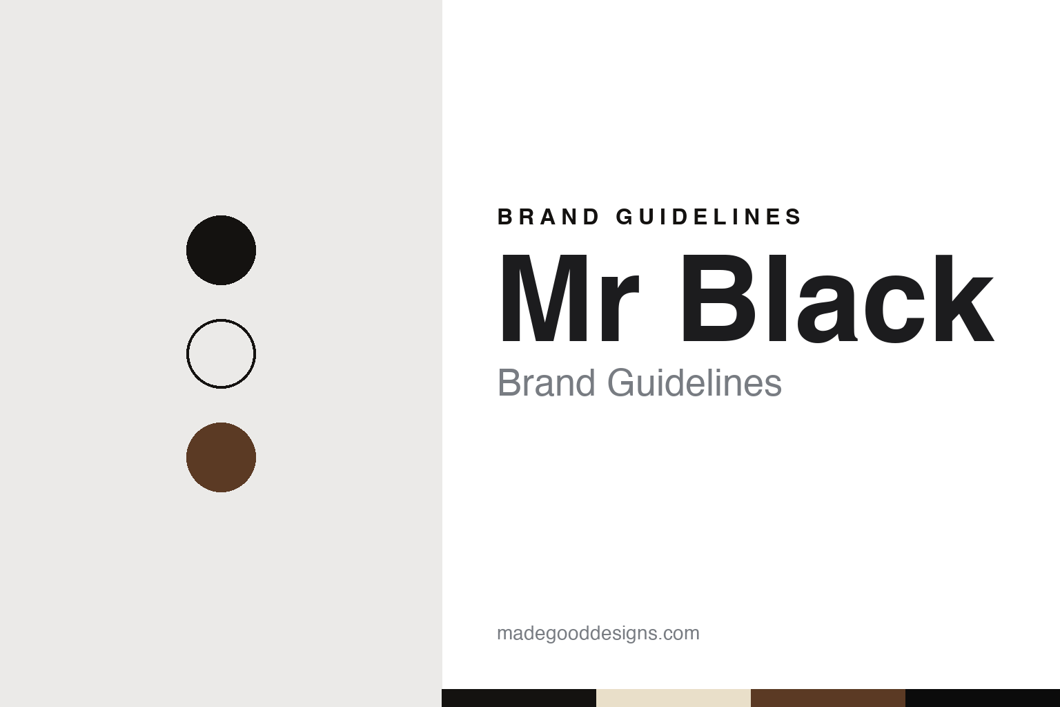
Two constants: a Mr Black black and ecru palette and a sash-label serif register. Abstract homage — not a Mr Black product or mark; no bottle, owl, label or monogram is reproduced.
A designer and a distiller
A coffee liqueur from a Central Coast still.
Mr Black is an Australian coffee liqueur built by two people with very different skills. Diageo’s announcement of September 2022 describes it as launched in 2013 by the designer Tom Baker and the distiller Philip Moore. Entrepreneur reported in January 2018 that the pair teamed up in 2012, after Baker tasted a coffee liqueur Moore was already making and, in his words, “called up the guy that was making the booze and said we should start a company.” Baker told the magazine that he could not make spirits and Moore had no background in marketing or sales, so they split the business down the middle; the product went through some 240 iterations before release.
The first home was a small still on the Central Coast of New South Wales. Broadsheet reported in August 2013 that the liqueur was made at Moore’s Distillery Botanica in Erina, with beans from the Central Coast roaster Glee Coffee taken to the distillery straight after roasting. The method was cold drip: Baker explained that ground coffee went into a bath of water and alcohol from which nitrogen had driven out the oxygen, which he called “the enemy of good coffee.”
The launch was funded by the public. Broadsheet described a campaign on the Australian crowdfunding site Pozible in 2013, and Entrepreneur reported that it reached its goal within three days. Baker told Broadsheet that the drinks industry “just doesn’t want to know about us – we’re too small and too niche,” and added: “The world needs more products made by people who care.” Entrepreneur recorded a modest early test the founders set themselves in 2013: if they could sell 200 bottles, they would start a business.
Colour
An owl that appears as the bottle empties.
Entrepreneur reported that Baker designed the original bottle himself and continued to do much of the brand’s graphic design. Its signature was on the back: Broadsheet credited the artwork to the Sydney illustrator Dale Bigeni, whose character was an owl in a top hat and monocle, and Food Republic described how the etched illustration, printed only on the back so the front stayed minimal, becomes more visible as the bottle empties.
In 2015 the pack was refreshed with the Manchester design studio United Creatives, as The Dieline and Lovely Package reported in September that year. The studio said the first pack had been “just a placeholder” made quickly. The new label took its shape from a sartorial sash, the kind worn with a dinner suit, and sat low on the bottle, printed in a simple two-colour palette on ecru paper, with icons of a coffee plant, water droplets and a stopwatch in its corners and a bespoke monogram designed to work across other branded material. The owl stayed on the back. The same refresh changed the descriptor from “cold drip” to “cold press”, a wording change the team told The Dieline it had deliberated over for nearly a year.
The bottle kept evolving. Entrepreneur reported in January 2018 that the bottle then in use had been designed by the Young Jerks, a studio in Greenpoint, Brooklyn. Today the brand’s own site presents it as a cold brew coffee liqueur under the line “Where Coffee Meets Cocktail,” and says its coffee is 100% Arabica from Colombia and Ethiopia, roasted in-house and fortified with vodka.
Typography
Design and documentation.
The seven brands in this group are all coffee or cream liqueurs: Mr Black, Carolans, Saint Brendan’s, Kamora, Caffè Borghetti, Dooley’s and Coole Swan. Some are sweetened spirits flavoured with coffee; others blend dairy cream with a spirit such as Irish whiskey. Brands like these sit at many different points in the trade, from small independent companies to labels that now belong to much larger drinks groups, and the same bottle can turn up on a supermarket shelf, in an airport shop or behind a cocktail bar.
A liqueur brand’s identity is usually carried less by the liquid than by a bottle, a label and the story it tells, because the company behind the name may have changed hands, moved its production or licensed its name to others. That makes the questions behind each name worth asking plainly: who created it, who owns it now, and where it is actually made and bottled.
Each guide separates what independent sources record from what the company says about itself — its founding story, its owners over time, where its liqueur is made and how its bottles and labels have changed — and marks plainly what rests only on the company’s own word.
Aa
A dressed-up serif — the register of a sash-shaped label. (Specimen set in Playfair Display, a serif STAND-IN; NOT the Mr Black logo or monogram.)
Mr Black
From a crowdfunding page to Diageo.
The owner arrived in two steps. Diageo says it took a minority stake in 2015 through Distill Ventures, the drinks accelerator it backs, and on 29 September 2022 it announced that it had acquired Mr Black outright; Diageo’s half-year report filed with the US Securities and Exchange Commission dates the purchase of the remaining shares to the same day. Diageo has owned the brand outright since 2022, which places it in the same group as Baileys.
The 2022 announcement described the liqueur as a blend of Arabica coffees with Australian wheat vodka, made by a cold brew process with no added flavours, at a purpose-built coffee roastery near Sydney. Claudia Schubert, Diageo’s president for US spirits and Canada, said the deal was in line with the group’s strategy of buying high-growth brands in exciting categories; Baker, who stayed involved with the brand, said that “Diageo understood our vision early on”; and Frank Lampen, chief executive and co-founder of Distill Ventures, said it had been “love at first taste.”
The name needs a little care online. The liqueur’s own site is mrblack.co, and its name has been written both “Mr Black” and “MR BLACK” in the press, as Broadsheet did in 2013.
For a design guide, Mr Black shows how a designer-founder can make the bottle do the talking — an owl that only appears as the liquid level drops, a label cut like a sash, and a two-colour palette on ecru paper. Compare Kahlúa, the Veracruz coffee liqueur of 1936, and Tia Maria, the Jamaican coffee liqueur. For this guide we use cold brew black, ecru and roast brown with a serif, an unofficial interpretation; no product or logo is reproduced.
Explore & save
Keep Mr Black’s identity on hand — save it to a board in the Made Good inspiration library.
Mr Black identity set
Pin the Mr Black black and ecru palette and the sash-label serif register to your own board.