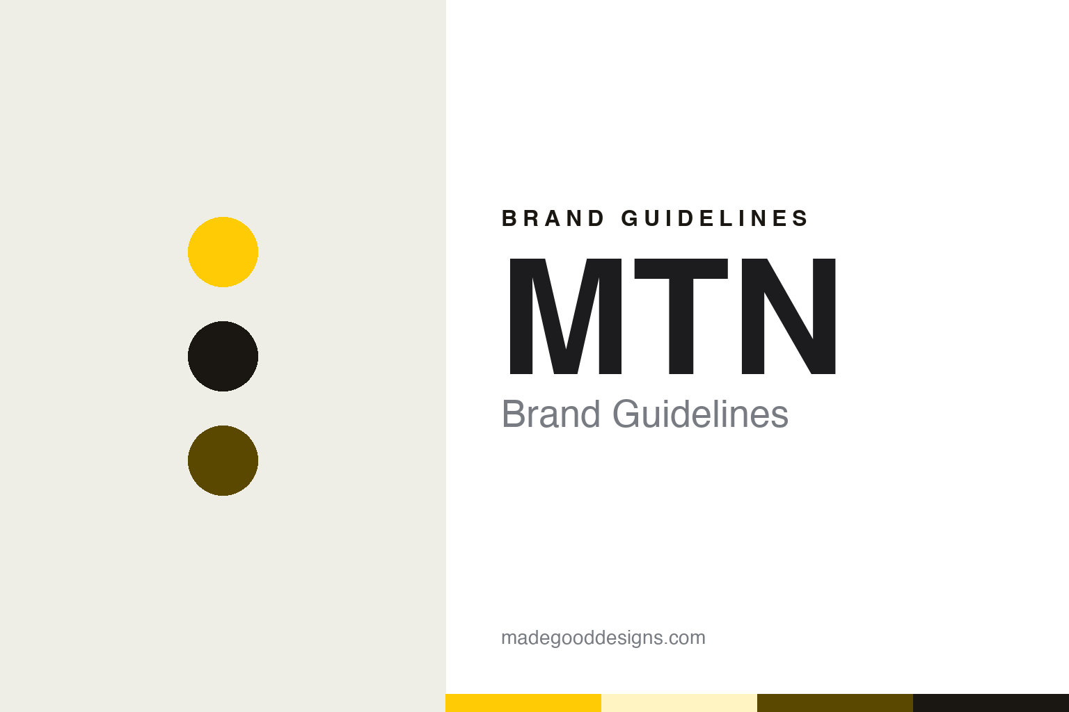
MTN Brand Guidelines
A licence in 1994, a new name in 2002 and a colour claimed in 2004.
Aa
Two constants: a sunshine, ochre and black palette and a heavy grotesque sans register. Abstract homage — not an MTN asset or mark; no logo, icon or wordmark is reproduced.
From M-Cell to MTN
Johannesburg, 1994–2002.
MTN began in South Africa under another name. The Oxford Business Group, in the company profile in its 2016 report on South Africa, says the business was incorporated in 1994 under the name M-Cell, was awarded the country’s second national licence and began commercial operations in June 1994. Wikipedia gives the same founding year and the same original name, and says the group’s head office is in Johannesburg. MTN’s own statement of February 2022 also dates the founding of the group to 1994.
The early years were spent building networks beyond South Africa as well as inside it. The Oxford Business Group says M-Cell obtained licences in Swaziland, Uganda and Rwanda in 1998, began operations in Cameroon in 2000 after acquiring Camtel, and acquired a licence in Nigeria in 2001, where it started building its radio transmission backbone in 2002. Each new country added another network to a group whose holding company was still called M-Cell.
The holding company took the network’s name in October 2002, when, according to the Oxford Business Group, it rebranded to MTN. The same profile says Phuthuma Nhleko joined in 2001 as chairman and became group president and chief executive a year later. Wikipedia records that in 2001 the company reported Johnnic Holdings as its controlling shareholder, with Irene Charnley as chairperson, and that Nhleko replaced Paul Edwards as chief executive in 2002. From that rename on, the parent company and the brand on the street carried the same three letters.
Leadership changed hands again in the following decades. Wikipedia says MTN appointed Rob Shuter as chief executive in March 2016, and that he was succeeded on 1 September 2020 by Ralph Mupita, who was group president and chief executive when the current identity was unveiled in 2022. MTN Group Limited remains headquartered in Johannesburg.
Colour
Taking ownership of yellow.
The colour came before the current logo. In a statement published on 27 February 2022, MTN Group said that changes made to the brand in 2004 resulted in MTN “taking ownership of the colour yellow”, and it counted the 2022 work as only the second brand overhaul since the group was founded. The marketing news site Bizcommunity reported on 13 October 2004 how that year had been spent putting the colour, and a single word, in front of the public.
That word was “Y’ello”. Bizcommunity said MTN ran a Y’ello Freedom campaign in 2004 to mark a decade of cellular service in South Africa. In June of that year, the site said, the company took over the top of Sandton City, replacing its usual green top with a yellow glow. The same report recorded the launch of an interactive mobile portal, MTNLoaded.
The seasonal campaign took the colour into advertising. Bizcommunity said the Y’ello Summer 2004 campaign introduced a character called Ten/Ten, drawn from the South African tradition of street hawkers and vendors who sell car chargers and phone covers at traffic lights, and that it built on a Y’ello Summer 2003 campaign the year before. Bernice Samuels, then general manager of MTN Brand, described the 2004 campaign as integrated, streetwise and youthful, and its message ended with the line “Put summer in your hands.”
Samuels was still part of the story eighteen years later. In the February 2022 statement she was quoted as MTN Group Executive for Marketing, introducing a new positioning built around the idea of “doing”. The same statement presented the new identity as an extension of the group’s strategy, which it called Ambition 2025, and set out a brand formula in three words and two symbols: Opportunity + Energy = Progress.
Typography
Surnames, coined words and one colour.
Retail and telecom names across Japan, Australia and Africa tend to come from a small set of sources. Some carry a founder’s surname, sometimes in the plural when a family of brothers or partners started the business together. Others are coined words built from Latin or English roots, chosen to sound settled and durable rather than to describe a product. A third group joins two everyday words into one, so that a service name reads as a single compound rather than a description. Acronyms also recur, especially where a company began as a network or a division with a long formal title.
For a design reader the more useful pattern is how these identities travel. A shop name has to work on a fascia board seen from across a car park, on a till receipt, on a carrier bag and on an app icon. A telecom mark has to sit on a SIM card no bigger than a thumbnail, on a scratch-off airtime voucher, on a kiosk umbrella and on a phone screen. Many of these companies settle on a single house colour and apply it everywhere, so that the colour does the work of recognition even where the wordmark is too small to read.
Aa
A heavy grotesque sans — after a telecom group’s three-letter name. (Specimen set in Archivo, a sans STAND-IN; NOT the MTN logo or any MTN typeface.)
MTN
An oval on the N1.
The 2022 logo was seen before it was announced. TechCentral reported on 16 February 2022 that changes outside MTN’s head office in Fairland, Johannesburg, had revealed a coming overhaul of the group’s brand identity. The signage on the corner of 14th Avenue and the N1 freeway had been replaced with a new corporate identity and a simpler logo. Gone, TechCentral said, was the white, yellow and red lettering; in its place was the MTN name set inside an oval, a shape the site compared to a rugby ball.
The hoarding changed the words as well. TechCentral said “Y’ello” was emphasised in white below the logo, and that it understood MTN would de-emphasise the “Everywhere you go” tagline it had used for many years. Nompilo Morafo, chief sustainability and corporate affairs officer at MTN Group, confirmed the changes to the site and said the new brand would be rolled out from 27 February together with a marketing campaign. She said the new look was aligned to the group’s evolution from a telecommunications company to a technology company.
The official unveiling came on that date. MTN Group’s statement of 27 February said it was explaining the context behind the logo “many have seen since 16 February 2022”, and it opened the new campaign with a question, “What are we doing today?” Morafo had told TechCentral that the campaign was inspired by the idea that “doing is a bridge between can and done”. The renaming habit reached other parts of the group the following year: Wikipedia says that in May 2023 MTN rebranded its subsidiary MTN GlobalConnect as Bayobab, operating as Bayobab Fibre and Bayobab Communication.
For a design guide, MTN shows how a telecom group can hold one colour for two decades while redrawing the mark that sits on it, from white, yellow and red lettering to three letters inside an oval. Compare Vodafone, whose name was built from voice, data and fone, and Safaricom, the Kenyan network whose kiosks are often painted green. For this guide we use sunshine, ochre and black with a sans, an unofficial interpretation; no product or logo is reproduced.
Explore & save
Keep MTN’s identity on hand — save it to a board in the Made Good inspiration library.
MTN identity set
Pin the MTN sunshine, ochre and black palette and the heavy grotesque sans register to your own board.


