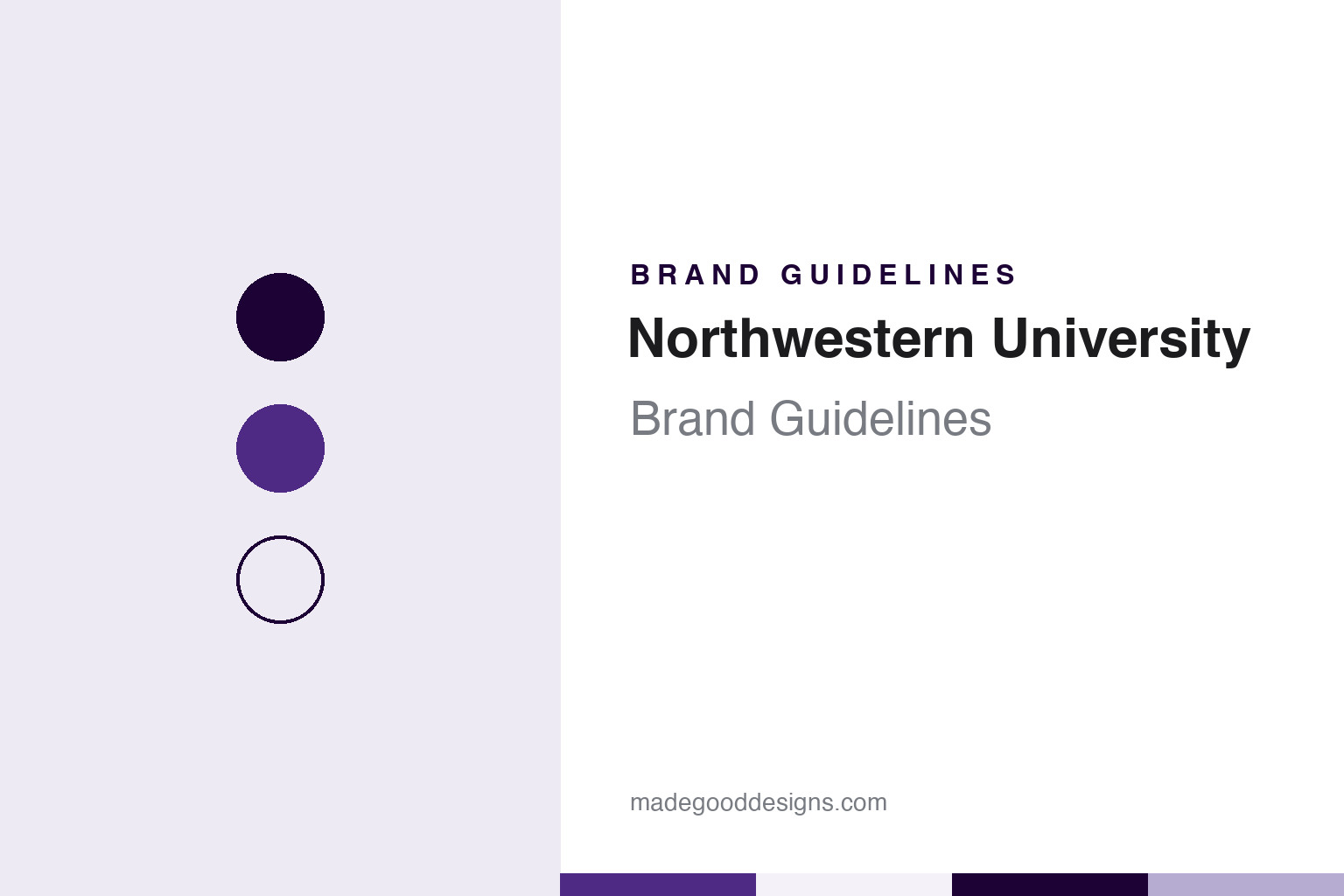
Northwestern University Brand Guidelines
A purple mixed to order, a single N and a nickname from a newspaper report.
Aa
Two constants: a purple, violet and lavender palette and a plain-spoken sans register. Abstract homage — not a Northwestern mark; no seal, N, wildcat or wordmark is reproduced.
Evanston
A university for the old Northwest.
The name is a piece of geography. In a history written for its 150th anniversary, Northwestern says that on May 31, 1850, nine men met in a law office above a hardware store in Chicago to plan a university that would serve the former Northwest Territory — the region that became Ohio, Indiana, Illinois, Michigan, Wisconsin and part of Minnesota. They were Methodists, three of them ministers, and the university names three as key leaders: John Evans, a physician; Orrington Lunt, a commodities broker credited with choosing the site; and Grant Goodrich, a lawyer who drafted the charter and steered it through the Illinois legislature, which approved it on January 28, 1851.
The town grew up with the school. Northwestern’s own timeline records that Clark T. Hinman became its first president in 1853, the year the university bought land on the shore of Lake Michigan, and that the university officially opened on November 5, 1855, in its first building, Old College. Wikipedia notes that the surrounding town, Evanston, takes its name from John Evans, and that Philo Judson drew up the plans for it.
The Methodist roots are still written into the formal emblems. Wikipedia gives the university’s motto as Quaecumque sunt vera — “whatsoever things are true,” from the Epistle to the Philippians — and records that the seal also carries a Greek phrase from the Gospel of John, translated as “the Word full of grace and truth.”
That seal became the subject of an identity review at the turn of the century. The Daily Northwestern reported on February 19, 2001 that university officials were creating a new logo to replace the seal — described by the paper as a purple-and-white circle containing the motto — on most university documents. A branding and institutional identity study carried out in the spring of 2000 had found what Alan Cubbage, vice president for university relations, called a “cluttered visual identity.” The seal, he said, had been designed as an official mark for diplomas and transcripts but had become overused, and it did not work well at small sizes. The paper reported that the university was working with the consulting firm Cagney + McDowell on the options, and that the athletic “N” logo would stay.
Colour
Purple, then purple alone.
Northwestern’s colour settled in two steps. The university’s historical timeline records that purple and gold were adopted as the school colours in 1879, and that in 1892 purple was adopted as the official — and sole — school colour. White has long kept it company: Wikipedia notes that the university’s hymn, Alma Mater, written in Latin in 1907 by Peter Christian Lutkin, dean of the School of Music, is sung in English with the line “Hail to purple, hail to white.”
The modern brand treats that purple as a manufactured material rather than a swatch-book reference. Northwestern’s brand site describes a proprietary Northwestern Purple, numbered Purple 100, and a family of tints and shades running from Purple 160, the darkest, to Purple 10, the lightest; anything darker or lighter, the guidelines say, loses its connection to the colour. The university says the new purple is a custom ink and can no longer be referenced by a Pantone number, so designers and vendors are sent approved swatches on coated and uncoated paper, fabric and plastic to match against. For screens, it lists hex #4E2A84.
The guidelines are as specific about what surrounds the colour. They say the brand relies almost exclusively on Northwestern Purple and its tints, but that the predominant colour in most layouts should be white, with plenty of white space; they describe that space as a pause rather than a gap to be filled, and as a discipline that keeps copy short. Rich black is used in place of process black, except in body text and small sizes, and a set of warm greys sits alongside.
The type system is published with the same care. The university names Campton and Akkurat Pro as its sans-serif typefaces and Periodico, in display and text cuts, as its serif, with specified Google Fonts used on the web when the desktop fonts are not available. The logo system, it says, takes in the Northwestern N, an official university wordmark and lockups for each school.
Typography
Design and documentation.
University identities are usually built from a small set of inherited parts. The earliest is often a coat of arms or seal: a shield with charges such as books, lamps, crosses, trees or animals, sometimes granted by a heraldic authority and sometimes adopted locally, and frequently redrawn over the decades as printing methods and tastes change. Around the shield sits a motto, often in Latin, which tends to survive every redesign because it is written into charters, diplomas and gates.
Next come the school colours. Many institutions name a single shade and attach it to the place, so that a colour word becomes shorthand for the whole community; style guides later pin that shade down with print and screen values. A wordmark, usually set in a serif or a custom typeface, then carries the name on letterheads, signs and websites, while the seal is kept for formal occasions.
Finally there are the athletic marks: nicknames, mascots and lettering that often grew up separately from the academic identity, through student newspapers, coaches and costume characters, and were only later folded into one licensing and brand system.
Aa
A plain-spoken sans for a purple-led identity. (Specimen set in Libre Franklin, a sans-serif STAND-IN; NOT a Northwestern typeface or logo.)
Northwestern University
From a bear cub to Willie.
The athletic identity has a newspaper origin. Northwestern, the university’s alumni magazine, wrote in its Fall 2014 issue that before the Wildcats there was Furpaw, a bear cub from the Lincoln Park Zoo that attended the 1923 home football games at Northwestern Field and was banished from campus as bad luck after a losing season. The nickname arrived in 1924, when the Chicago Tribune reporter Wallace Abbey, a 1923 graduate, described the team as “wildcats” after a hard loss to the University of Chicago. The university’s trademark office quotes his line as “The Northwestern team fought like wildcats yesterday,” and says the name was then officially adopted as the athletic nickname.
The cat took longer to take shape. The magazine says the athletic department released the first image of Willie in 1933, and that in 1947 four Alpha Delta Phi fraternity brothers — Frank Willard, John Balch, Rog Johnson and Bill Henning — brought him to life in a hand-sewn costume for the Homecoming parade. According to the trademark office, the four designed the head while their mothers sewed the rear section, and the first costume needed two people, one for the front and one for the back. In 1948, the same account says, two women students wearing the costume were stopped at the gates of the stadium in South Bend because Notre Dame did not allow women on the field, until officials gave them special permission.
Willie has changed shape several times since. The magazine describes a once-fierce wildcat with sharp fangs and a snarl, and an early costume made of chicken wire and faded purple velvet over a football helmet; it also records a Wilhelmina Wildcat in the early 1960s and a Winnie the Wildcat in the late 1970s and early 1980s. Throughout, the costume has stayed purple, the colour that ties the athletic marks to the academic ones.
For a design guide, Northwestern University shows how an institution can turn a colour into a controlled material — a custom ink, matched by swatch, used against generous white. Compare University of Chicago and Stanford. For this guide we use purple, violet and lavender with a sans, an unofficial interpretation; no product or logo is reproduced.
Explore & save
Keep Northwestern University’s identity on hand — save it to a board in the Made Good inspiration library.
Northwestern University identity set
Pin the Northwestern purple, violet and lavender palette and the plain-spoken sans register to your own board.