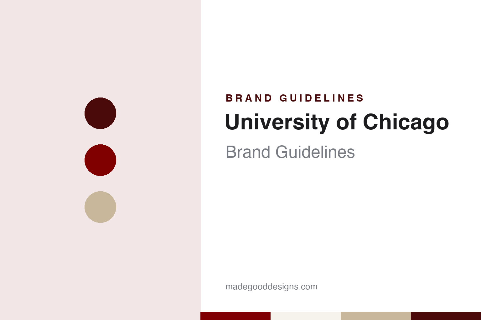
University of Chicago Brand Guidelines
A university reborn under a phoenix, with a book of Latin above the flames.
Aa
Two constants: a maroon, limestone and white palette and an old-style serif register. Abstract homage — not a University of Chicago mark; no phoenix, shield, seal or logo is reproduced.
Two Universities of Chicago
An old university closes and a new one takes the name.
The name was used once before. An earlier University of Chicago, founded by a group of Baptist educators, was incorporated in 1857 and closed in 1886 after years of financial trouble, English Wikipedia says. In 1890 its trustees agreed to rename it the “Old University of Chicago” so that a new institution could carry the city’s name, and that same year the American Baptist Education Society incorporated the present university as a coeducational institution, backed by a gift from the Standard Oil co-founder John D. Rockefeller and land donated by the retailer Marshall Field.
William Rainey Harper became the first president on 1 July 1891, and classes began on 1 October 1892 on a campus in Hyde Park, on the South Side near Lake Michigan. A 2013 history for incoming students in the student newspaper The Chicago Maroon describes the new university as having risen from the ashes of the old one, with Rockefeller recruited to fund it and Harper at the helm, and notes that Hyde Park had only been incorporated into Chicago in 1889.
That idea of a second start sits at the centre of the identity. The Maroon piece opens by pointing to the phoenix printed on the scarves and T-shirts handed to first-year students, and reads it as an emblem of the university’s rocky beginning. The university’s own account of its emblems, published by the Office of the Secretary, is more careful: it says no surviving documents explain why the phoenix was chosen, and offers two readings. One is the rebirth of the institution itself, closed in 1886 and incorporated again in 1890. The other is the city, badly damaged by the Great Chicago Fire of 1871 and rebuilt within a few years. The Secretary’s page calls the first reading the more probable one.
Colour
A coat of arms, a seal and a motto, all from the library years.
The heraldry arrived about two decades after the founding. The board of trustees assumed the coat of arms by resolution in August 1910; English Wikipedia gives 15 August and the Secretary’s page gives 16 August. The blazon was devised by Pierre de Chaignon la Rose, a heraldic specialist based in Boston, working under the direction of the university architect Charles Coolidge. It describes a silver field with a red phoenix displayed in flames, and above it a red chief carrying an open book with gold edges and binding.
Wikipedia records a small piece of design reasoning from those drafts. An early version showed the book without the separate chief, which would have made it look as though the book itself were burning, so the final arms lifted the book into the band at the top of the shield. The motto followed: the trustees adopted Crescat scientia; vita excolatur on 17 January 1911, and it was inscribed on the two pages of the book. Wikipedia translates it as “Let knowledge grow from more and more; and so be human life enriched.”
The seal came next. According to the Secretary’s page, the university archives record that it was designed in 1912 by the Boston firm John Evans & Co., architectural sculptors working for Shepley, Rutan & Coolidge, then the university’s architects. It reworks the arms into a circular device with the phoenix and book surrounded by bands of Latin text, made to be used with an embossing tool on diplomas and proclamations. The page links the whole burst of activity to the building of Harper Memorial Library between 1910 and 1912, whose decoration was planned around the arms of other universities.
The colour is older than the shield. In 1894 the university adopted maroon as its official colour after first choosing goldenrod, and the athletic teams became known as the Maroons the same year, Wikipedia says. The student newspaper is called The Chicago Maroon.
Typography
Seals, arms, colours and wordmarks.
University identities are usually built from a small set of inherited parts. The earliest is often a coat of arms or seal: a shield with charges such as books, lamps, crosses, trees or animals, sometimes granted by a heraldic authority and sometimes adopted locally, and frequently redrawn over the decades as printing methods and tastes change. Around the shield sits a motto, often in Latin, which tends to survive every redesign because it is written into charters, diplomas and gates.
Next come the school colours. Many institutions name a single shade and attach it to the place, so that a colour word becomes shorthand for the whole community; style guides later pin that shade down with print and screen values. A wordmark, usually set in a serif or a custom typeface, then carries the name on letterheads, signs and websites, while the seal is kept for formal occasions.
Finally there are the athletic marks: nicknames, mascots and lettering that often grew up separately from the academic identity, through student newspapers, coaches and costume characters, and were only later folded into one licensing and brand system.
Aa
Old-style serif capitals — the register of a diploma and a library lintel. (Specimen set in EB Garamond, a serif STAND-IN; NOT the University of Chicago logo.)
University of Chicago
A two-colour shield, a Garamond wordmark and a phoenix mascot.
The everyday logo pairs a simplified shield with a wordmark. Since 2012, Wikipedia says, the university has used a modified version of its arms that drops the chief, so the book appears to float directly above the phoenix, and reduces the colours to two: red and white. The university’s communications office described the logo, on a page marked as updated in fall 2012, as the shield together with the words “The University of Chicago” set in Adobe Garamond capitals, with “The University of” justified above “Chicago”. The same page allowed the shield to be used on its own as a graphic element but ruled that the wordmark should never appear without the shield, and asked departments to use approved artwork rather than redraw or crop it.
Athletics carries the same bird in a looser form. The varsity teams are the Maroons, and their mascot is Phil the Phoenix, Wikipedia says. The teams’ history left a mark on the city as well: the 2013 Maroon history notes that the football teams coached by Amos Alonzo Stagg, whom Harper recruited in 1892, were known as the “Monsters of the Midway” before the Chicago Bears took up that nickname. The university was a founding member of the Big Ten Conference, dropped football in 1939, withdrew from the conference in 1946 and brought football back in 1969 as an NCAA Division III programme, now playing at the new Stagg Field.
Each piece has its own job in the university’s account. The seal was made for embossing diplomas and proclamations; the shield and Garamond wordmark were meant, the communications office said in 2012, for all print and digital communications and signage; and the phoenix turns up on the scarves and T-shirts that the Maroon described new students receiving in 2013.
For a design guide, the University of Chicago shows how one heraldic animal, chosen for reasons nobody wrote down, can carry an institution’s founding story across a coat of arms, a seal, a logo and a mascot; compare Columbia University and Northwestern University for other university systems built on arms and a single colour. For this guide we use maroon, limestone and white with a serif, an unofficial interpretation; no product or logo is reproduced.
Explore & save
Keep University of Chicago’s identity on hand — save it to a board in the Made Good inspiration library.
University of Chicago identity set
Pin the University of Chicago maroon, limestone and white palette and the old-style serif register to your own board.