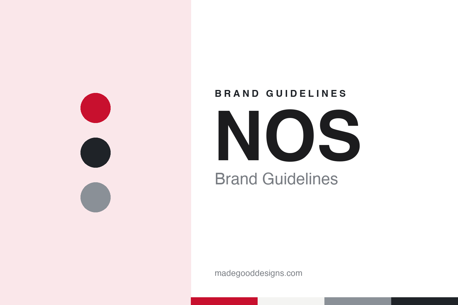
NOS Brand Guidelines
Three letters, and the middle one in red.
Aa
Two constants: a red, grey and charcoal palette and a geometric sans register. Abstract homage — not an NOS asset or mark; no logo, wordmark or ident is reproduced.
A foundation formed from two older bodies
The Nederlandse Omroep Stichting, its predecessors and the news it makes.
NOS stands for Nederlandse Omroep Stichting, the Dutch Broadcasting Foundation. It is one of the organisations that make up the Dutch public broadcasting system, and English Wikipedia says it has a particular task: making news and sports programmes for the public television channels and the public radio services. Its main programme is the NOS Journaal, the daily news bulletin on radio and television.
The foundation grew out of two older bodies. English Wikipedia says the Nederlandse Radio Unie (NRU) was set up in 1947 as a union of broadcasting associations that ran shared studios, orchestras and outside broadcast facilities, and that it became the Dutch founding member of the European Broadcasting Union in 1950. The Nederlandse Televisie Stichting (NTS) followed in 1951, playing a similar role for television. In 1956 the NTS made its own first programme, a news bulletin called the NTS Journaal, the direct ancestor of the NOS Journaal.
A media law passed in 1967 merged the two. English Wikipedia says the Nederlandse Omroep Stichting was created on 29 May 1969, taking over the coordinating role of the NRU and NTS, their technical and production facilities, and the job of supplying news and sports bulletins. Dutch Wikipedia gives the same date and names the two bodies it replaced.
The decades that followed added services and then trimmed the remit. English Wikipedia says NOS launched its teletext service on 1 April 1980, after trials from 1977, and aired the first Jeugdjournaal, a news bulletin for children, in 1981. A media law of 1988 moved the technical and transmission facilities into a separate production company based at the Media Park in Hilversum. In 1995 a new law created the Nederlandse Programma Stichting, which took over programmes about culture, art, children and education, while NOS concentrated on news, sport and live events.
English Wikipedia says that from 2002 programme makers worked under the name RTV NOS, while a separate umbrella body handled coordination of the public system, and that in 2009 NOS gained its own board of directors. Today its output runs from the Journaal and Jeugdjournaal to NOS Studio Sport, and reaches the public through television, radio, teletext pages and its website.
Colour
A rounded logo for 36 years, then a red O, then new sets around it.
For most of its history NOS used a single mark. Dutch Wikipedia says the familiar logo with rounded and blunt corners, which served as the emblem until 2005, was designed by Johan Volkerijk. English Wikipedia describes it as the organisation’s initials in lowercase, with round and obtuse angles, and says it was in use for 36 years.
The change was announced in the trade press before it appeared on screen. Villamedia, the Dutch journalism trade site, reported on 27 September 2005, citing Radio.nl, that NOS would soon have a new house style and that the English design firm Lambie-Nairn was making the new logo. On that basis, the report said, new sets for the Journaal, the Jeugdjournaal, the sports programmes and NOS Actueel were being finished in Britain. The so-called signature sound, the music for the title sequences, was being made by eStation, the company of composer Stephan Emmer. The exact launch date was still open, Villamedia said, because the broadcaster was in the middle of a large move.
The new identity arrived on 17 December 2005, according to both English and Dutch Wikipedia. Dutch Wikipedia notes that Lambie-Nairn had also designed the house style of the BBC. English Wikipedia says the new logo painted the O red, standing for “the hub of 360-degree reportage”, that it came with new idents for the programmes, and that the typeface was Gotham.
Seven years later the setting changed and the letter stayed. Villamedia reported on 22 May 2012 that a new look for the NOS Journaal would be seen from Sunday 27 May, that the well-known red O had been kept, and that the previous design had been in service for seven years. On 24 May 2012 Villamedia reported that NOS had unveiled the new sets and title sequences in Hilversum, to be used in the NOS Journaal, Studio Sport and other NOS programmes. The red O from the logo, the report said, was central to the new design.
The same 24 May report described two further changes. The Journaal’s title sequence brought back the familiar gong, and the eight o’clock set was roomier, with the presenter moving around more. English Wikipedia also notes the switch to a standing presentation for that bulletin from 2012.
Typography
Initials kept, one letter turned into a colour.
A broadcaster’s identity often lives as much in its channel names as in its mark. M+AD Daily reported on 30 September 2016 that TVNZ would rename TV ONE as TVNZ 1 and TV2 as TVNZ 2 from 2 October that year, in a rebrand produced by its in-house Blacksand creative team, with new channel idents carrying original music and a special TVNZ font. TVNZ’s marketing head, Sarah Finnie, told the site the aim was for the channels to “look and feel like one family of content brands”.
Initials can also carry a long lineage of older names. The Honolulu Advertiser reported on 4 March 2007 that the station behind KBS made its first broadcast as JODK in Seoul on 16 February 1927, took the call sign HL in 1947 and was renamed in 1973. When reading a broadcaster’s identity, look at which letters lead each channel name, which earlier names they replaced, and what the idents between programmes are asked to carry.
Aa
A geometric sans — the register of short initials set on screen. (Specimen set in Montserrat, a sans STAND-IN; NOT the NOS logo or Gotham.)
NOS
One red letter carried from the logo into the studio and the sound.
The NOS identity works by isolating one letter. In the 2005 logo the O carries the colour while the N and the S stay neutral, and English Wikipedia ties that red O to the idea of “the hub of 360-degree reportage”. When the programmes were redesigned in 2012, Villamedia reported, the red O was kept and placed at the centre of the new design for the sets and title sequences.
The organisation that carries the mark makes programmes rather than running a channel of its own. English Wikipedia describes NOS as one member of the Dutch public system with a statutory duty to make news and sports programmes for the public networks. The NOS name appears inside other schedules, on the Journaal, the Jeugdjournaal and Studio Sport, which is where a short, consistent mark has to do its work.
Sound belongs to the identity too. Villamedia reported in September 2005 that eStation was making the signature music that went with the Lambie-Nairn look, and in May 2012 that the Journaal title sequence had brought back the gong. The design history runs from the rounded lowercase initials by Johan Volkerijk, used from 1969, to a red O that has now outlasted one full redesign.
The 2005 change also came at a moment of reorganisation. English Wikipedia says the news departments for radio, television and the internet were merged at about the same time and grouped into sections for news and sport, with events added in 2009. A single mark for all of that work suits a body whose output reaches people through several channels at once.
For a design guide, NOS shows how a broadcaster can turn one letter of its initials into the whole visual signal, then carry it from the logo into the studio furniture and the title sequences without redrawing it. Compare the BBC, whose house style came from the same design firm, or NRK, another public broadcaster in northern Europe. For this guide we use red, grey and charcoal with a sans, an unofficial interpretation; no product or logo is reproduced.
Explore & save
Keep NOS’s identity on hand — save it to a board in the Made Good inspiration library.
NOS identity set
Pin the NOS red, grey and charcoal palette and the geometric sans register to your own board.