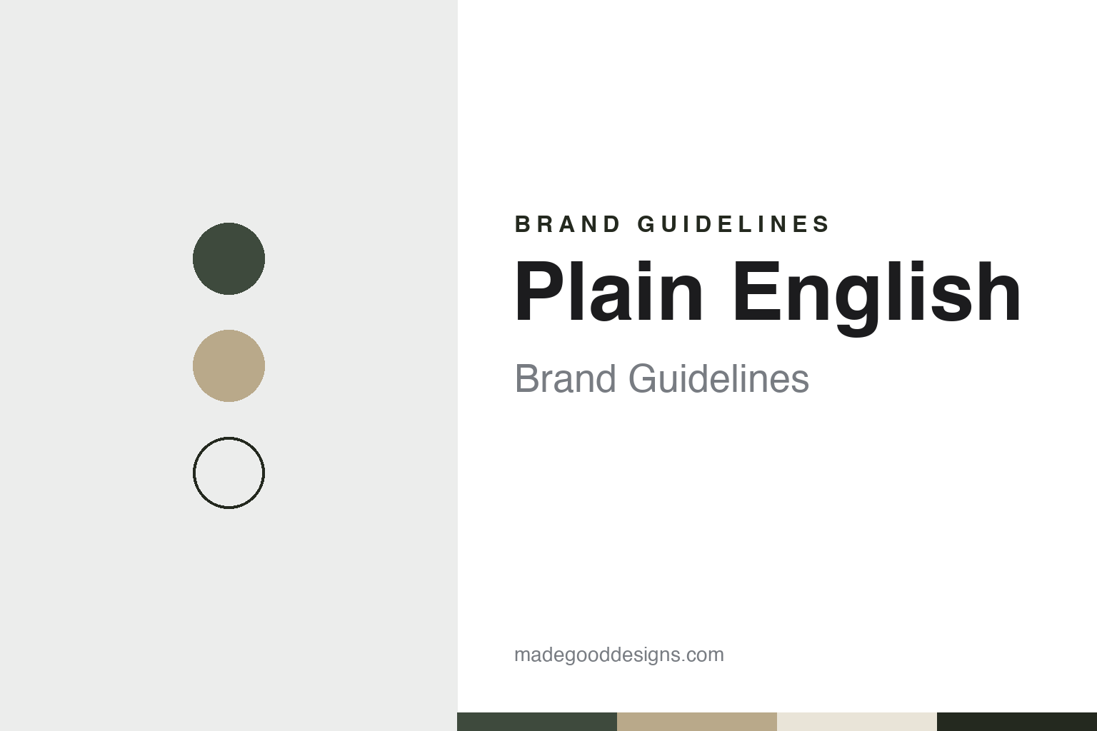
Plain English Brand Guidelines
A painted kitchen for a Suffolk longhouse, a Georgian farmhouse workshop and below-stairs joinery.
Aa
Two constants: a larder green, scrubbed oak and limewash palette and a Georgian bookish serif register. Abstract homage — not a Plain English product or mark; no cupboard, colour or logo is reproduced.
From a Suffolk longhouse
A kitchen built for the founders’ own house, and the enquiries that followed it.
Plain English was founded in 1992 by Tony Niblock and Katie Fontana. The company’s own About page tells the story. The couple were building a longhouse in Suffolk and wanted a traditional, painted kitchen for it. Rather than go to a conventional kitchen showroom, they asked a local Suffolk joiner to make a kitchen to their own design and specification, and then painted it themselves. When that kitchen appeared in House & Garden, the company says, they were inundated with enquiries and saw a gap in the market.
The page explains the gap in terms of taste. In the early 1990s, it says, kitchens tended to fall into two camps: shiny modern laminates or humble natural woods. Fontana was looking for something closer to the Georgian values of her parents’ home, which had traditionally crafted joinery and a large butler’s pantry. That reference point has stayed with the business. Its kitchens page opens with the line that since 1992 the company has studied “the below stairs joinery of the great houses of England,” and it describes a focus on the Georgian sense of form and function across all its designs.
The early premises were modest. In a statement on the About page signed by Fontana as creative director and Niblock as managing director, the founders say that after about a year of welcoming clients into their own home they set up shop in an old tannery, and later moved to a Georgian farmhouse deep in the Suffolk countryside. As the business grew, they write, the farm’s outbuildings, barns and stables were converted into workshops and design studios, and that is where they still make all of their cupboards and kitchens. The same statement says that imagining life in the old house in its heyday frames much of the inspiration for the work, along with plain Georgian architecture, simple domesticity and an English fascination with nature, weather and the seasons.
Colour
A farmhouse workshop in Suffolk, a flagship on Pimlico Road and two American showrooms.
The farmhouse is Stowupland Hall, in the village of Stowupland near Stowmarket. The company’s showrooms page lists it as its head office and describes it as an active workshop rather than a showroom, open only to existing clients by appointment with their designer, occasionally so that they can see their own cupboards being made. Its Suffolk page says the head office opened in the farmhouse more than twenty years ago and that the surrounding barns, stables and outbuildings were converted as the business grew.
Where the kitchens are made is part of how the company describes its process. Its How We Work page says that after a design is signed off it goes to the company’s workshops, where craftspeople build the cupboards from start to finish, and that Plain English’s own fitters and painters then install and hand-finish the joinery on site. The same page says designs draw on the company’s own paint colours, freestanding furniture, tiles and ironmongery.
In London the brand now centres on Pimlico Road. Its flagship occupies Newson’s Yard, a nineteenth-century former timber yard restored for the estate owner Grosvenor. The architects Stiff + Trevillion announced on 1 November 2023 that Newson’s Yard had formally opened that day, and named Plain English among the design brands based there. Plain English says the space shows kitchens, dressing rooms, larders, sculleries and pantries in a series of interlinked rooms. The company also lists a second Pimlico Road address, Plain English at HOWE.
The North American business runs from a separate website. It lists a showroom in New York’s Greenwich Village, where a lower Garden Floor opened in spring 2023 beneath the original upstairs showroom, and a showroom in West Hollywood, Los Angeles, which it says opened in May 2024. The US site says its design teams work on projects across North America from those two bases.
Typography
Design and documentation.
Kitchen cabinet and kitchen-system brands sit at many different points in the trade, from workshops that build a single kitchen to order to factories that make modular systems sold through showrooms in many countries, and from firms that make the whole room to companies that make only the doors and fronts that fit another maker’s cabinet frames.
A kitchen brand’s identity is usually carried less by one product than by a way of planning a room: a grid, a handle, a finish, a run of named colours, a showroom and the designers whose names are attached to it. Because the company behind a name may have changed hands, moved its workshop or begun buying in parts, the plain questions are worth asking: who started it, who owns it now, and where its cabinets are actually built.
Each guide separates what independent sources record from what the company says about itself — its founding story, its owners over time, where its kitchens are made and how its look has changed — and marks plainly what rests only on the company’s own word.
Pe
A refined, bookish serif in the spirit of a Georgian joinery catalogue. (Specimen set in Cormorant Garamond, a serif STAND-IN; NOT the Plain English logo.)
Plain English
Below-stairs joinery, its own paint colours and a design archive.
Plain English presents its kitchens less as a product line than as an archive of cupboard designs, each drawn from historic domestic rooms. A journal post dated 1 February 2024 shows how a new design enters that archive. Introduced to coincide with the opening of the Pimlico Road showroom, Kew was inspired by the kitchens at Kew Palace, which the company notes were locked away in 1818 and left largely untouched for nearly two centuries. The post says Kew was designed by Katie Fontana, whom it calls creative director and owner. Its double cupboards have arched doors based on the arches of the palace’s original charcoal burners, and the design comes with a large Kew Table made from slabs of English sycamore and an arched Dutch larder that can conceal a tall fridge.
The kitchens page gives a sense of how the brand names its work. Rather than numbered ranges, it lists completed projects under the names of houses and places, from a Norfolk flint house and a Dorset farmhouse to London townhouses and a loft in New York. The company describes its aim as a combination of proportion, patina and fine detail that gives each design a sense of always having been there.
Colour is handled as a product in its own right. The website groups the company’s paint shades into numbered Colour Collections, from No.1 onward, and its enquiry form asks clients to choose between moods such as chalky and gentle, deep and crisp, or warm and soft. Because the kitchens are hand-painted after installation, the colour is applied by the company’s own painters in the client’s house. Its press page lists a conversation with Fontana in The World of Interiors in June 2017 and a Financial Times piece of June 2016 on the co-founder’s taste.
For a design guide, Plain English shows how a cupboard maker can turn a founding house, a farmhouse workshop and a vocabulary of Georgian service rooms into a consistent look. Compare deVOL, the Leicestershire kitchen maker, and Farrow & Ball, the Dorset paint maker. For this guide we use larder green, scrubbed oak, limewash and range black with a serif, an unofficial interpretation; no product or logo is reproduced.
Explore & save
Keep Plain English’s identity on hand — save it to a board in the Made Good inspiration library.
Plain English identity set
Pin the Plain English larder green, oak and limewash palette and the Georgian bookish serif register to your own board.