Porthos Brand Guidelines
The musketeer sardines of a cannery that moved from Sesimbra to Matosinhos.
Aa
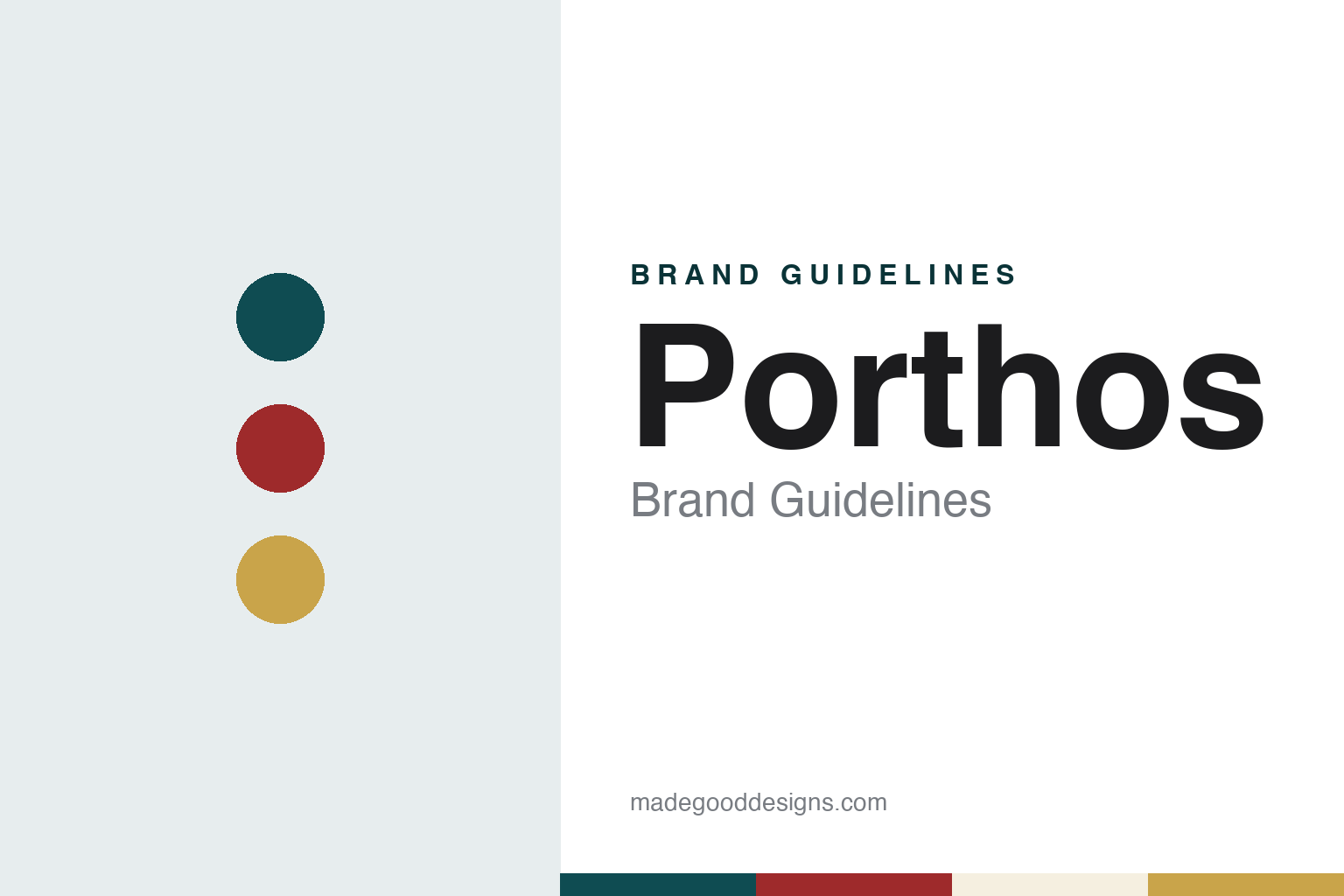
Two constants: a harbour teal, cannery red and olive gold palette and a sturdy slab serif register. Abstract homage — not a Porthos product or mark; no label, logo or can is reproduced.
A cannery that moved north
From the fishing village of Sesimbra to a factory beside Leixões.
Porthos is a brand of tinned sardines, tuna and mackerel made by Conservas Portugal Norte, Lda., a cannery in Matosinhos, just north of Porto. The company says Porthos is the earliest of its brands, and it traces both the brand and the business to 1912. The beginning was not in Matosinhos at all. According to the company’s published history, the cannery started work that year in the fishing village of Sesimbra, on the coast south of Lisbon, and Porthos was first produced there.
The company dates its move north to 1944. It says the factory relocated to Matosinhos, where Portuguese canning was concentrated because of the supply of fish and the ease of exporting through the Port of Leixões. In 1958 it opened the factory on Rua Sousa Aroso in Matosinhos where it still works today, a short walk from the fishing harbour.
Ownership changed at the end of the 1980s. The company says it was sold to António Faustino in that period, and that in 1990 its corporate name was changed to Conservas Portugal Norte to mark the new administration. Encouraged by the business, the company says, Faustino opened a second factory in 1991 at the fishing port of Figueira da Foz, Briosa Conservas de Pescado, which still works alongside the Matosinhos plant. Retailers of the brand describe the business as part of the Faustino family’s Conserveira group. The latest chapter came in February 2025: the company says it then became part of a business group with strong ties to the fishing and canning industries, a change of management it presents as continuing its mission; its website does not name the group.
Colour
A diagonal signature, then a musketeer.
The brand’s look has a short, documented history, told by the company itself. In a June 2026 article on the brand’s origins, Conservas Portugal Norte said that in the early years the cans carried only the word “Porthos” written diagonally, as a signature. The figure of a musketeer joined the packaging only in the 1950s, the company says, and has since become the brand’s face.
The name itself belongs to one of the three musketeers of Alexandre Dumas’s novel The Three Musketeers. The company gives its own reason for the choice: in the early twentieth century, it says, tinned fish was an everyday food bought above all by working people, and the musketeer was picked to stand for their strength, resilience and perseverance.
The newer lines add their own codes. For the company’s centenary in 2012 it launched Porthos Vintage, which it describes as its entry into the gourmet market, and the company publishes a separate Porthos Vintage Collection catalogue alongside a Porthos Asia range. In May 2022 it launched Porthos Smoked, wood-smoked fish in extra virgin olive oil in five varieties, from sardine and tuna to mackerel, salmon and trout; the company said the packaging uses a different metallic colour for each fish. Porthos pâtés followed in 2021, by the company’s account.
Inside the factory, the hand still shows. On its factory-visit page the company says visitors can watch the whole process from a viewing deck, from the arrival and seasoning of the fish to the ovens, the filling of the cans with sauces and the workers wrapping cans in paper by hand.
Typography
Design and documentation.
The seven brands in this group are Iberian tinned-fish names, six from Portugal and one from Galicia: Ramirez, Porthos, Ati Manel, Tricana, Bom Petisco, Briosa and Cuca. Canned fish in Portugal is closely tied to the coast and its fishing ports; English Wikipedia notes, for example, that production and exports of canned fish in Matosinhos, north of Porto, rose during the world wars and peaked between 1940 and 1960, and that the industry began to decline between 1970 and 1989, when several factories closed.
A tinned-fish brand’s identity is usually carried less by the fish than by the tin itself: its printed wrapper or lid, the name, and the town or harbour it promises. Behind those labels the trade is often less simple than it looks, because a single cannery may pack several brands of its own, a brand may outlive the factory that first used it, and an old name may pass from one family or group to another. That makes the plain questions worth asking for each name: who started it, who owns it now, and where its fish is actually canned.
Each guide separates what independent sources record from what the company says about itself — its founding story, its owners over time, where its tins are filled and how its labels have changed — and marks plainly what rests only on the company’s own word.
Aa
A sturdy slab serif for a working-day sardine brand. (Specimen set in Roboto Slab, a serif STAND-IN; NOT the Porthos logo.)
Porthos
An export name with long ties to Macau and Israel.
Porthos has travelled further than its home port. The company says the brand has been sold in Macau for more than ninety years and in Israel for more than fifty, and it reported in July 2022 that the first store dedicated to Porthos tins had opened in central Macau, run by a local shop owner and stocking the full Porthos range next to local specialities such as almond cookies and egg rolls. Closer to home, the company opened its first factory store, Companhia das Conservas, in 2014 and added a bistro in May 2019, according to its timeline.
Porthos sits in a portfolio that the company says also includes Inês, a brand it rebranded in 2020 and describes as honouring its women workers, and Conserveira, along with Dama, which it calls a rebranding of one of its older names. The Figueira da Foz sister factory makes the Briosa lines.
The name needs care online. The domain porthos.pt belongs to an unrelated freight-transport company; the canner’s own site is portugalnorte.com, where Porthos appears under the Conservas Portugal Norte name.
For a design guide, Porthos shows how a tin that began with a slanted signature gained a character in the 1950s and kept him through new gourmet, smoked and export lines. Compare Ramirez, the Matosinhos canner founded in the Algarve in 1853, and Briosa, the Figueira da Foz sister factory. For this guide we use harbour teal, cannery red and olive gold with a slab serif, an unofficial interpretation; no product or logo is reproduced.
Explore & save
Keep Porthos’s identity on hand — save it to a board in the Made Good inspiration library.
Porthos identity set
Pin the Porthos harbour teal, cannery red and olive gold palette and the sturdy slab serif register to your own board.