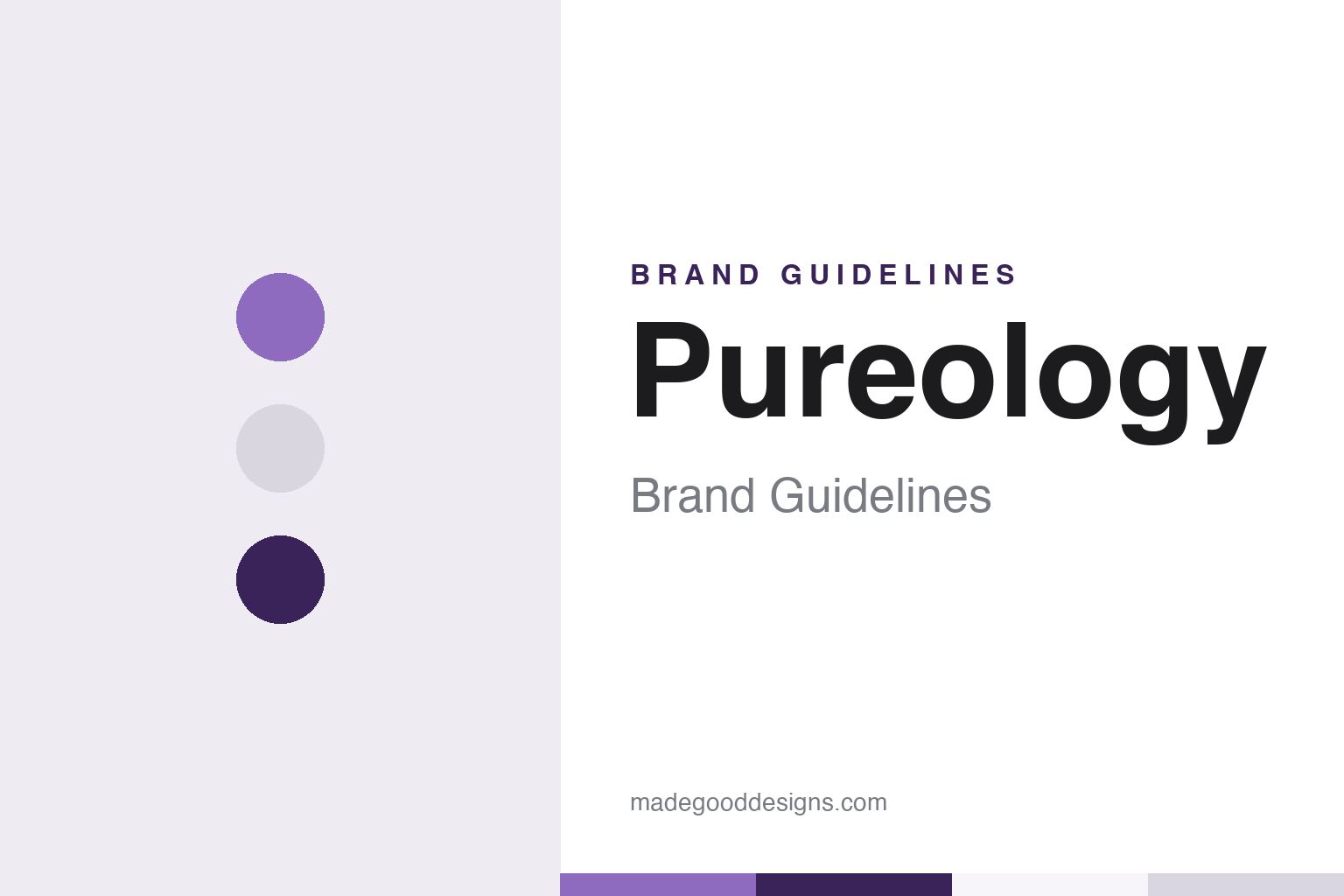
Pureology Brand Guidelines
The Irvine colour-care line L’Oréal has owned since 2007.
Aa
Two constants: a purple, plum and pearl silver palette and a clean geometric sans register. Abstract homage — not a Pureology product or mark; no bottle, label or logo is reproduced.
A hairdresser’s colour-care line from Orange County
From an Irvine start-up to a brand in L’Oréal’s salon division.
Pureology began in Irvine, California, in 2001. Its founder was the American hairdresser Jim Markham, who built the business with his wife and partner Cheryl Markham, English Wikipedia says. The Orange County Business Journal profiled the company in March 2007, when it traded as PureOlogy Research LLC — the name was then written with a capital O in the middle — and sold its shampoos, conditioners, hair sprays and styling creams under the name PureOlogy Serious Colour Care. The paper described a line made for colour-treated hair and sold through high-end salons and spas in the United States, Canada and Puerto Rico, with Markham as founder and chief executive.
Markham was no newcomer to hair care when he started it. The same profile noted that he had earlier founded Abba Pure & Natural Hair Care, and English Wikipedia says he started Abba in California in 1989 and sold it in 1997. The company today explains its own name as a blend of two ideas, “pure” and “ology,” and says simply that the brand was founded in California.
Outside money arrived early. The private-equity firm TSG Consumer Partners lists Pureology among its past beauty investments, giving 2004 as the year it invested and the holding as exited. In May 2007 the exit came: Cosmetics Business reported on 10 May 2007 that L’Oréal had acquired the brand through its US subsidiary for an undisclosed sum, and that L’Oréal’s leadership saw it strengthening the group’s Professional Products Division in high-end salons, with potential to take it worldwide. WWD covered the deal the same day under the headline “A Colorful Deal,” and the private-equity newsletter Buyouts headlined its 14 May 2007 report “TSG Finds Buyer In L’Oréal.” English Wikipedia says the business then moved from Irvine to L’Oréal’s US headquarters in New York.
L’Oréal has owned Pureology since 2007. Inside the group it sits with the other salon brands of the professional division, among them Kérastase and Redken. Markham went on to found another colour-care company, ColorProof, in 2011, English Wikipedia says.
Colour
One bottle shape, stood on its base and on its cap.
The best-documented piece of Pureology design is its bottle. In January 2012 the design news site Dexigner reported a relaunch of the range in a new pair of sculpted, curved bottles by Robert Bergman, founder of the packaging firm Mpakt and a former creative director at L’Oréal. The trick was that the two bottles come from a single mould: the shampoo stands on its base and the conditioner stands upside down on its cap, so that on the shelf the pair appear to lean into each other. Dexigner said the new shape replaced an earlier bottle with a thin neck, adding a wider neck and a flip-top cap, and that the range moved to a pearlescent, silvery palette. The same report said the Pureology logotype was modernised and moved from the centre of the pack to its upper right.
The trade magazine Beauty Packaging returned to the bottle in August 2014, crediting the shape to “Robert Bergmann of Bergmann Creative” and quoting him on the idea of a bottle that works “right side-up and upside-down” so that one mould makes two bottles. The magazine described a flat cap that lets the conditioner stand inverted and said the brand used the paired bottles across all of its shampoos and conditioners. It reported that the new Strength Cure collection was set apart with vibrant purple caps on light purple bottles.
Colour has long done the sorting. Estetica reported in February 2012 that each regimen used a colour-coded system, and Glossy wrote in 2020 that a 2015 refresh had introduced the brand’s colour-coded packaging. Both Estetica and Beauty Packaging reported that the company called the new design its “Zero Waste” shampoo and conditioner packaging, made from HDPE plastic with 50% post-consumer recycled content, and Estetica added that the cartons were FSC-certified and made from recycled fibre. Estetica quoted Shae Kalyani, then vice president of US marketing for Pureology, saying the formulas themselves had not changed.
Typography
Design and documentation.
The seven brands in this group are all hair-care names: KEVIN.MURPHY, Sachajuan, Maria Nila, IGK, Virtue, Fekkai and Pureology. Hair-care brands in general sit at many different points in the trade, from small houses that still carry a founder’s name to labels that now belong to much larger beauty groups, and a single brand can be sold everywhere from a hairdresser’s back bar to a department store or an online shop.
A hair-care brand’s identity is usually carried less by any one formula than by a bottle, a name and a colour code on the shelf, because the company behind the name may have changed hands, moved its offices or grown far beyond the salon or city where it started. That makes the questions behind each name worth asking plainly: who started it, who owns it now, and how its packaging and name have changed over time.
Each guide separates what independent sources record from what the company says about itself — its founding story, its owners over time, its packaging and how its look has changed — and marks plainly what rests only on the company’s own word. None of these guides assesses what a product does for hair; claims about ingredients or results are the companies’ own.
Aa
A clean geometric sans for a salon colour-care register. (Specimen set in Jost, a sans-serif STAND-IN; NOT the Pureology logo.)
Pureology
A 2020 relaunch, a new line and the same paired bottle.
The brand’s biggest reset under L’Oréal came in 2020. Glossy reported on 8 July 2020 that Pureology had relaunched with reformulated products, new packaging, a new approach on Instagram and a new line: “serious color care” gave way to “professional color care.” The relaunch had been shown to hairdressers in February and soft-launched on the brand’s own website in June. According to Glossy, the range was cut back to about 30 products and reorganised by need — hydration, strength, smoothing, toning, volume, texture and hold — and Ulta, Amazon and Sephora.com were being added as retail partners from August. The company says its formulas are vegan and free of sulfates, parabens and mineral oils.
The collection names have stayed on the packs through these changes. The brand’s website in 2025 listed collections including Hydrate, Strength Cure, Nanoworks Gold and Color Fanatic, alongside litre-size bottles, and it still described Pureology as a colour-care brand founded in California.
The spelling has settled too. Early on the company wrote its name PureOlogy, with a capital O, and paired it with “Serious Colour Care” in British spelling; today the brand writes Pureology, and its line uses the American “color.” The official site is pureology.com.
For a design guide, Pureology shows how one clever bottle — a single mould used both upright and upside down — together with a colour code by collection can give a salon brand a shelf presence that has carried through a change of owner and a relaunch. Compare Kérastase, the luxury salon house of the same L’Oréal division, and Oribe, another salon-born American hair-care brand now owned by a large group. For this guide we use purple, plum and pearl silver with a geometric sans, an unofficial interpretation; no product or logo is reproduced.
Explore & save
Keep Pureology’s identity on hand — save it to a board in the Made Good inspiration library.
Pureology identity set
Pin the Pureology purple, plum and pearl silver palette and the clean geometric sans register to your own board.


